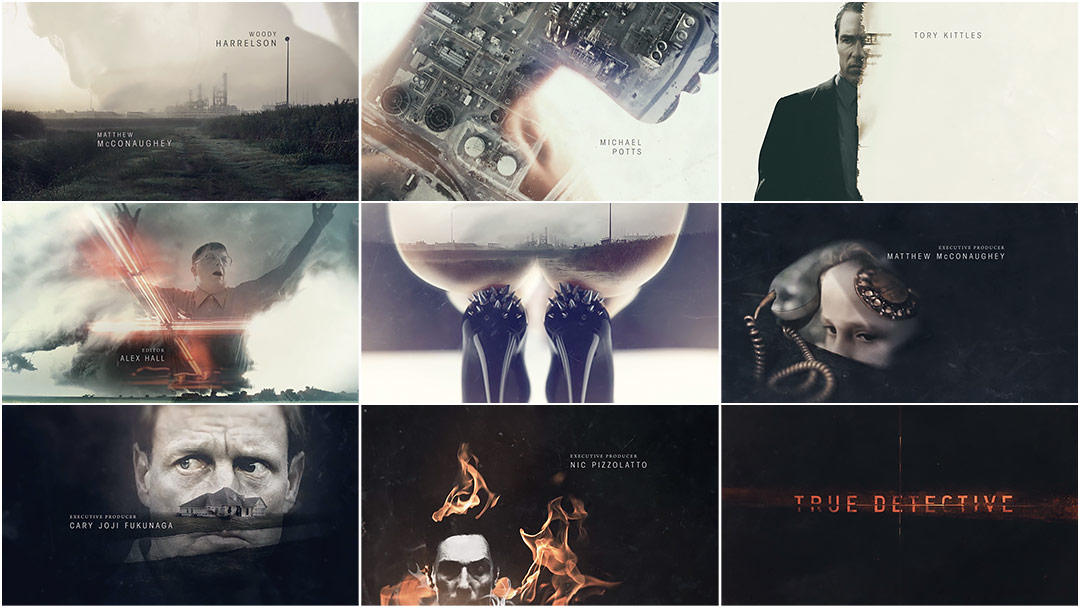


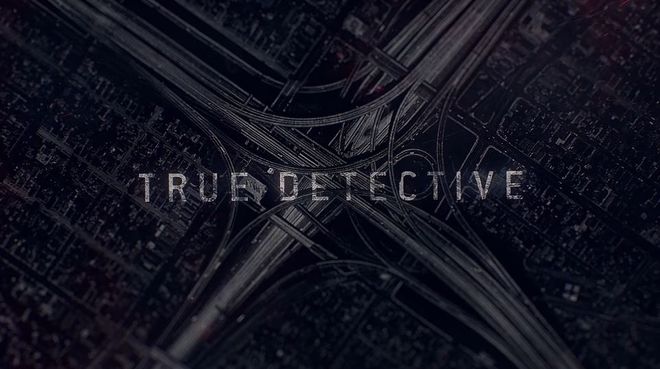
Travel to the underbelly of America. Louisiana. The Gulf Coast. Purgatory, USA. A sopping, poisoned wasteland where industry and old time religion meet somewhere in the sugarcane. This is a place haunted by people – good and bad and everything in between – fractured souls who cling to the edges of society and themselves, walking contradictions struggling to get by and simply be. It’s here that two detectives – a broken stranger and a slightly bent local – get wind of something sinister. Among the roach motels and refineries, a serial killer plies his terrible trade against the put-upon: Murder as ritual sacrifice. The cane is burning in the field. The fire eats it all away.
Elastic’s affecting titles for HBO’s True Detective make one hell of a case.
*Winner of the 2014 Outstanding Main Title Design Emmy
Creative Director PATRICK CLAIR details the creation of the title sequence for us.
PC: The project was produced by the wonderful and talented Jennifer Sofio Hall at Elastic and directed by myself through our studio Antibody. The team at Antibody in Sydney, led by Senior Designer Raoul Marks and with compositing and animation support from the good folk at Breeder, based in Brisbane, completed the design and animation phase. It was a truly transnational production.
When we were initially briefed, Nic Pizzolatto, the showrunner, and Cary Fukunaga, the director, spoke a lot about how the landscape and setting of the show revealed the characters and reflected their internal struggles. The show is set in Louisiana in the ’90s, with a strong presence of the petrochemical infrastructure and the pollution of the physical landscape. We read scripts for the first three episodes before even considering the visual execution. Story is always the most fundamental part of our design process, so it was great getting a good understanding of the writing before we began to explore visual ideas.
Visually, we were inspired by photographic double exposures. Fragmented portraits, created by using human figures as windows into partial landscapes, served as a great way to show characters that are marginalised or internally divided. It made sense for the titles to feature portraits of the lead characters built out the place they lived. This became a graphic way of doing what the show does in the drama: reveal character through location.
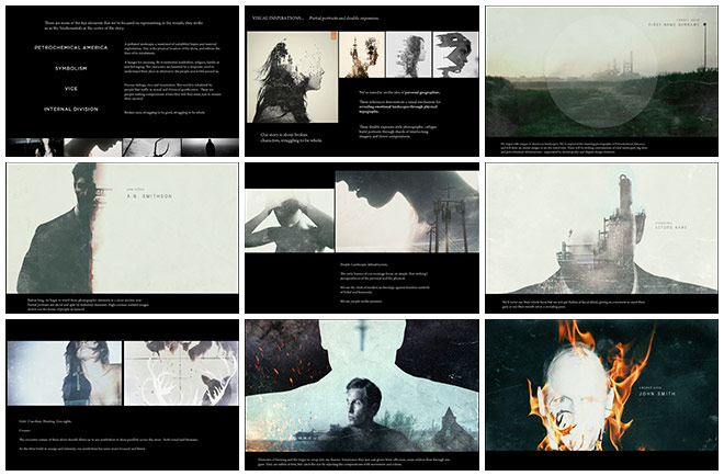
Original pitch materials
As soon as Nic and Cary explained the show, I had an unusually clear idea of what I wanted to pitch. Thankfully, they responded really well and we were off and running. I love the double exposure style, and the fact that we used the same reference images as their production designers and cinematographers meant that there was a close alignment between the live-action and our contribution.
As for the music, the production had already chosen a beautiful track by The Handsome Family called "Far From Any Road," so we had a great basis to figure out the structure of the piece. Fire is a key element in the show, so it made sense to build from lightness into darkness, and then burn the whole thing down. There's a real intensity to Nic's writing, so that allowed us to push into very apocalyptic imagery in the title reveals.
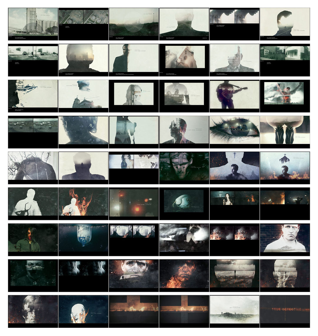
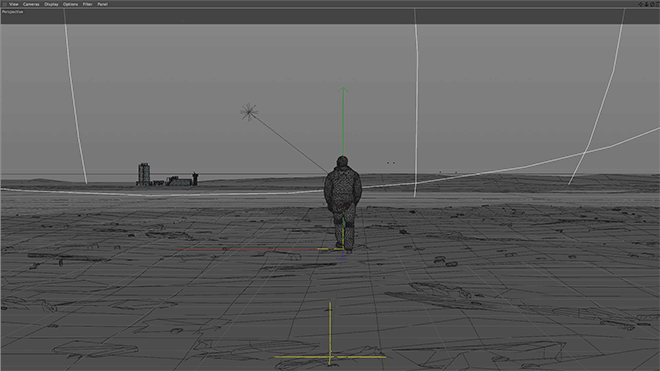
Storyboard
We boarded out the sequence with full photographs very early on. The production was inspired by the work of photographer Richard Misrach. We started with that and also folded in other evocative and strangely beautiful shots of pollution, prostitution, and wildlife across the Gulf Coast. We didn’t have to use much imagery from the show itself. Many of our pictures of the cast come from the rushes, but they’re abstracted to the point where they don't feel part of any specific scene.
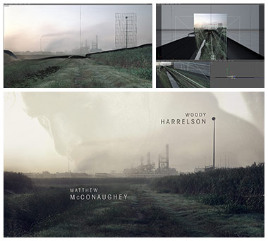
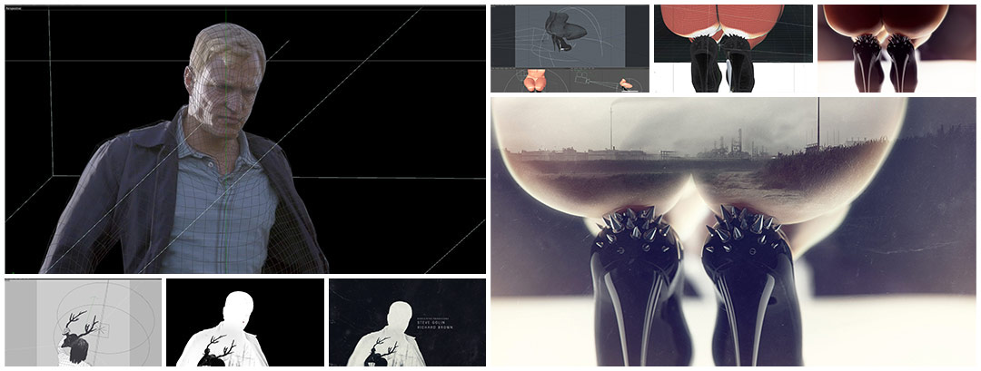
3D process breakdowns
As we started to plan the movement and animation, we faced some interesting challenges. We wanted the titles to feel like living photographs. But the footage was too kinetic and jumpy and stills were too flat and static. Many shots feature footage that has been digitally slowed to extreme degrees. The digital interpolation and artefacts created by slowing footage down often looks strange or tacky, but we found that in this case it evoked a surreal and floaty mood that perfectly captured what we were after. Some shots were dragged down the point where they are hardly moving at all – 10% or 20% of their original speed. These gave us striking and smooth character portraits to use as slow-mo windows onto our landscapes.
Then, we took the shots from Misrach and others, and built them out as 3D projected scenes. We created low-poly geometry for truck stops, oil refineries, and more, and then projected landscape shots overtop, painting in details. Very slow virtual camera moves would then fly gently through these spaces, bringing them to life in 3D. These landscape and portrait elements would then be combined in a single comp with more spatial animation, focus effects, and lots of texture.
Layer compositing examples
It was important to have light and dark dirt and marks running through the pictures with a really gentle undulation between pale yellows, greens, dark blues, and light flares. In some cases we also went so far as to create digital doubles for some characters. In one shot, the spiked heels of a stripper and the skin of her backside were built in 3D, allowing us to pan past material that had only been captured in a single still shot.
The final cut was then stitched together with photographic distortion effects and lots of optical glitches to emphasize the double exposure technique and meld the animation with the music. Animated flame elements play a colourful and destructive role in pushing the sequence toward its climax.
Throughout the process, Cary, Nic, and everyone from both the production and the network were enormously supportive and encouraged us to push the creative as far as possible. It was a great experience and a really successful collaboration for all involved.
Supplementary: True Detective season two main title sequence by Elastic.
Support for Art of the Title comes from

FIND THE PERFECT FONTS. USE THEM EVERYWHERE.
Related
-
Game of Thrones
interview
-
Carnivàle
summary
-
Deadwood
title only
-
Halt and Catch Fire
interview
-
Six Feet Under
interview
-
Mad Men
interview