


When discussing watershed moments in the history of title design names like Saul Bass and Maurice Binder often crop up. But decades before Psycho or Dr. No introduced moviegoers to the true potential of title design, an unknown designer left an indelible mark on the craft with The Cabinet of Dr. Caligari (Das Cabinet des Dr. Caligari). The 1920 film, directed by Robert Weine, was undoubtedly a major turning point for the art of title design.
The Cabinet of Dr. Caligari follows the titular doctor (Werner Krauss), a deranged hypnotist who uses a troubled sleepwalker named Cesare (Conrad Veidt) to commit a series of murders. Described by critic Roger Ebert as "the first true horror film," Weine’s masterwork of German Expressionist cinema also features the first true horror movie title sequence. Featuring sharp, angular typography designed to match the disturbing subject matter and twisted visual landscape of the film, the highly stylized titles and intertitles of Caligari echo the lettering found in the work of contemporary Expressionist illustrators like Josef Fenneker.
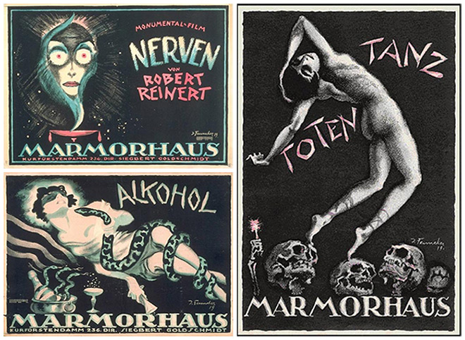
Image set: Posters by expressionist illustrator Josef Fenneker
When appraising the legacy of Caligari’s innovative opening titles, it’s important to consider the state of title design in those early days of cinema. During the silent film era, film titling was a utilitarian affair; title sequences plainly listed cast and crew, while intertitles were used to convey dialogue between characters as well as narrative or descriptive information in the absence of synchronous sound. Whether it was the title sequence or the title cards, the key for early title designers was clarity and readability for the audience – simple text on black cards framed with basic ornamentation was the standard. Occasionally the type or framing would be slightly more elaborate, sometimes including cursive flourishes or the initials of the studio or the director, but anything more was generally considered superfluous. Caligari ignored these established rules.
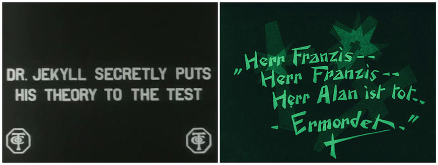
Intertitle comparison: Dr. Jekyll and Mr. Hyde (1912) and The Cabinet of Dr. Caligari (1920)
In his text German Expressionist Film, scholar John D. Barlow highlights Caligari’s use of misshapen typography, archaic spellings, excessive underlines, and exclamation points in its titles and intertitles. These stylistic choices mirror the fantastical tone of the film, as well as its exaggerated sets, lighting, and makeup, keeping moviegoers immersed in the mad, mad world of the devious doctor. Toned type also adds to the unsettling feeling of the film. Contrary to popular belief, not all movies made during the silent era were black and white. The original title cards in Caligari were toned in green, blue, and brown.

Situational typography in The Cabinet of Dr. Caligari
In addition to its groundbreaking title sequence and intertitles, The Cabinet of Dr. Caligari also features one of the earliest known examples of situational typography interacting with a scene through the use of visual special effects, in this case stop-motion animation.
During a climactic scene in which the doctor descends into madness, the wall standing between the intertitle text and the on-screen action breaks down completely. The phrase “Du Musst Caligari Werden” (“You Must Become Caligari”) appears out of thin air, repeating, growing out of the very trees, the manifestation of his insanity.
For the 1921 North American release of The Cabinet of Dr. Caligari, the titles and intertitles were created by pioneering film title writer Katharine Hilliker. Hilliker, who would eventually go on to become a screenwriter and playwright, also wrote the prologue and epilogue of the US release print. The designer of the original German intertitles remains a mystery.
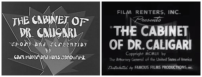
Examples of English-language title cards for The Cabinet of Dr. Caligari
Title Design: uncredited
Titling (US version): Katharine Hilliker
Music: Giuseppe Becce
LIKE THIS ARTICLE?

HELP US KEEP SHOWCASING GREAT TITLE DESIGN. BECOME A PATRON TODAY.
Related
-
The Wizard of Oz
title only
-
Frankenstein
summary
-
They Came From Within: B-Movie Title Design of the 1940s & 1950s
feature
-
Soylent Green
interview
-
Six Feet Under
interview
-
Are You Afraid of the Dark?
interview