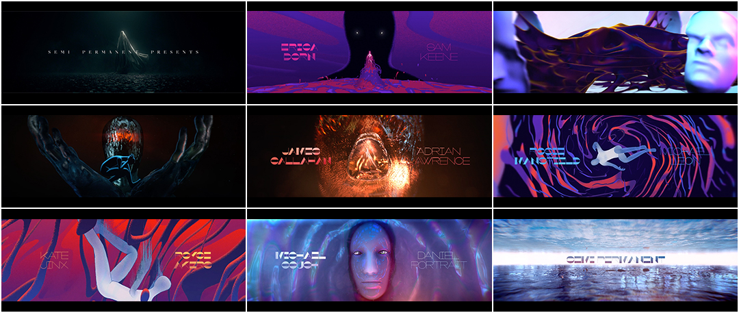
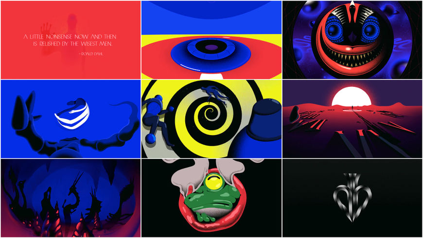
"Beauty is truth, truth beauty" wrote English poet John Keats in 1819. "That is all ye know on earth, and all ye need to know." For creative directors Hazel Baird and Heidi Berg, however, Keats's eternal chiasmus is incomplete; their truth is so much more. In their opening to Semi-Permanent Sydney 2019, Truth is a savior and a shadow, a creator and a cannibal, a phantasmagoria pieced together by a wide-ranging crew and bursting with darkness, colour, and inspiration.
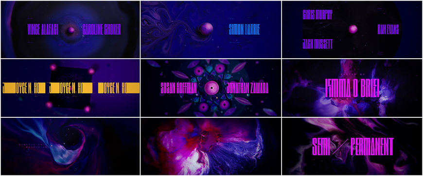
In 2018, when creative director Joyce N. Ho emailed Semi-Permanent organizer Murray Bell to inquire about the opening titles for the well-known festival, it seemed like a shot in the dark. But it was also a bellwether, a sign of things to come. Ho’s titles were a smashing success. She also became the first woman in the festival’s nearly 20-year history to helm its opening titles. Fast forward one year and another gorgeous opening for Semi-Permanent has emerged—and with a similar genesis.
The shape-shifting, media-melding titles for the 2019 edition of the festival come care of Baird, Berg, a team of animators and designers at LA-based studio Elastic (Game of Thrones, True Detective, Westworld), and several far-flung collaborators. After reading about the process behind the 2018 titles and learning that Ho had thrown her own hat into the ring, Elastic design director Hazel Baird decided to do the same. Baird reached out to Bell and landed the gig. What came next is eight months of rigorous after-hours work, a host of stops and starts, soul-searching and soundscaping, cel animating and CGI, and, eventually, a stunning piece of motion design. The finished product brings together a wide range of influences, stirring together body horror and Greek myth, grim sculptural forms and noisy, saturated illustrations. It is a testament to the importance of knowledge sharing, the beauty of collaboration, and the power of asking for what you want. Sometimes, the most vital step to achieving a goal is having the courage to ask.
A discussion with Creative Directors HAZEL BAIRD and HEIDI BERG.
First, congratulations on this piece! Tell me a little about how this project started.
Hazel: I emailed Murray around November of [2018] to ask if he wanted to do the titles with Elastic and he was really happy about it and excited. I’ve been here at Elastic for a couple of years and I got to know Heidi quite well. I didn’t want to do it on my own. I thought we would do a good job together so I asked her to help out.
Heidi: Hazel sent me a text message, saying, “Do you want to do a project together?” And I thought she meant, like, a personal project. I was like, “Yeah, sure, whatever!” [laughs]
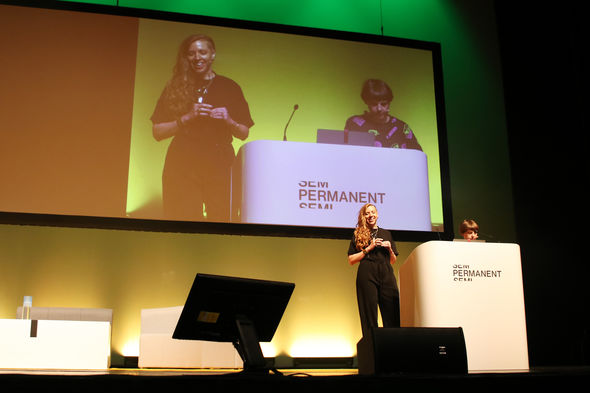
Heidi Berg and Hazel Baird presenting their work at Semi-Permanent 2019 in Auckland, New Zealand
Semi-Permanent has been around for a long time. What was your impression of it before this? What did it mean to you, as a designer?
Hazel: I had it in the back of my mind as a goal because I followed it for years. It’s the oldest festival – it’s like 18 years old. I had never been. They asked us to talk at New Zealand and we did that a week ago. It was an amazing experience. The other thing that was driving it was the title sequences themselves – the ones in the past that have been done. The fact that we had the opportunity to do something creative and tell a story was appealing. Murray was very much, like, “Do what you want.”
Tell me a little about how Joyce N. Ho's work influenced you.
Hazel: I love Joyce’s Semi-Permanent titles. The influence with Joyce was actually her interview where she mentioned that she contacted Murray and he basically said, “Why not?” I thought, I’m going to do exactly the same! In that way, it influenced me.
Opening titles for Semi-Permanent Sydney 2018 with creative direction by Joyce N. Ho
So it was her confidence, the fact that she asked if she could create the 2018 titles, that inspired you?
Hazel: Yes, it was her confidence. That “If you don’t ask, you don’t get” attitude that she had. They can only say no. I thought, I work at Elastic!
Heidi: I always assumed, and most people we talk to assume, that, “Oh, how are you so lucky to have Murray contact you to do these?” When Hazel told me she just contacted him to do it, and Joyce just contacted him, that’s such an important lesson. You can approach someone and say, “Hey, could I do this?”
Hazel: Raoul [Marks] just did that as well. He approached Murray, it wasn’t the other way around.
As designers, you’re used to briefs determined by a client but with this, you had to determine your own brief, right?
Heidi: That was a huge struggle at the beginning. How do we create our own parameters? When we started on Semi-Permanent, there was Hazel and me and Jeff Han and Felix [Soletic] trying to come up with concepts. The only thing we had to go on was the theme of the Sydney conference which was “Truth.”
Hazel: It’s always difficult, isn’t it, when a client says, “Do what you want”? It’s the worst thing they can say to you!
Heidi: [laughs] Yeah, you’re like, WHAT?
Hazel: Truth, and that was it! We were like, Fuck. For a month, we were just scratching our heads. And then Heidi bounced in one day and said, "I have an idea!"
Heidi: I drew the worst storyboard.
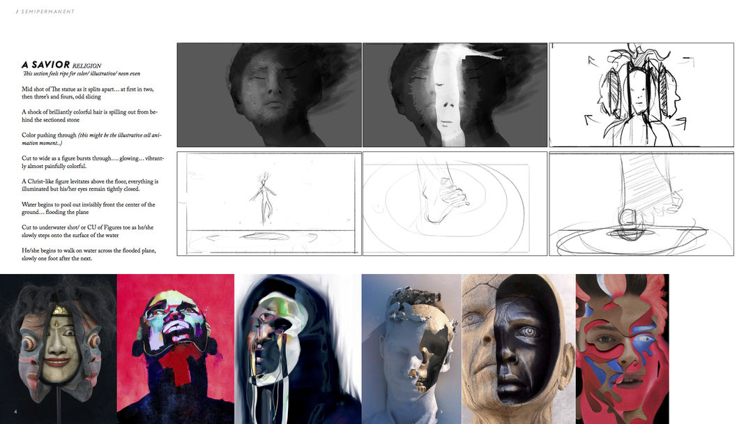
IMAGE SET: Initial rough storyboards by Heidi Berg
Heidi: We had a lot of conversations about what truth means, how ambivalent that is, how the definition for everybody is different. How that manifests. I started to come up with ideas. We started to get to this place of making Truth our protagonist, the hero of the story. Maybe using different forms to visualize Truth as a character that goes on the hero’s journey.
Hazel: I got Elastic’s blessing and they gave us a small budget of $50,000. Elastic were very supportive. They could have easily said, “No, you’re not doing it” but they let us and left us to our own devices where possible. I am very grateful to them. They understood that it wasn’t going to interfere with our other projects. The majority of the designers, at the beginning, worked for free but when we came to the animation stage about four or five animators were actually getting paid at Elastic. So we started the design phase in probably February and then we started animating round about April.
Let’s dive into it creatively. The piece starts out dark and then moves into light...
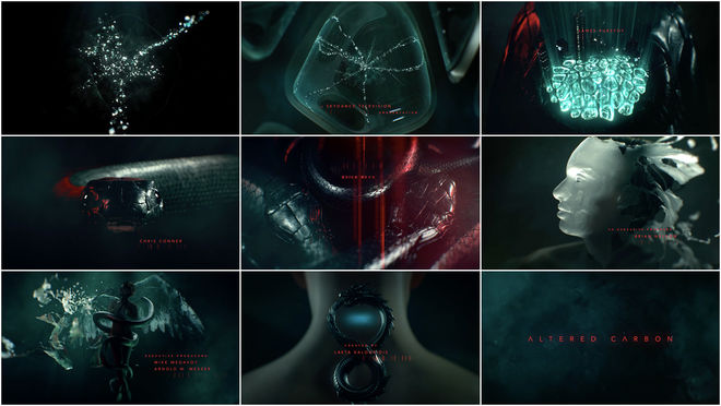
Hazel: We wanted to make sure it started out really dark, so that people would think it was a typical Elastic title sequence where you know, it’s very beautifully lit and there’s a statue and there’s cloth… and then it completely changes. That’s what we tried to achieve.
Altered Carbon (2018) main titles, created by Elastic
Hold on, let’s talk about that idea a bit, because it's been noted in recent years: this idea of a “typical Elastic look”—
[Hazel and Heidi laugh]
Was stepping away from that liquid, slick, statuesque aesthetic something you consciously wanted to do?
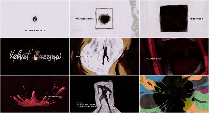
Hazel: There’s so many talented people here at Elastic. The clients often expect a certain look when they come to Elastic so when you do try and do something different, or you pitch something different, they either don’t go for it or they go for something that’s “Elastic-esque.” Personally, sometimes I’m trying hard to do things slightly different. When I did the titles for Velvet Buzzsaw, I wanted to go more into illustration.
Velvet Buzzsaw (2019) main titles by Creative Directors Neil Kellerhouse and Hazel Baird and the team at Elastic
How do you maintain that balance between your established brand and this market saturation of a trend and wanting to push the envelope for your team creatively?
Hazel: Exactly. We still want to make nice-looking stuff but maybe go at it with a slightly different angle. I have a degree in graphic design so I’m more into the graphic side as well. You can push the graphic side when you do a commercial. Right now we’re working with Samsung and that’s quite graphical at the moment but it’s difficult to do a title sequence that’s purely graphical.
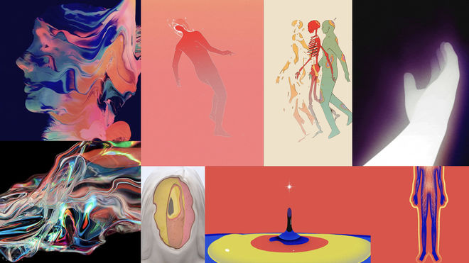
Slide of stylistic references shown during Heidi Berg and Hazel Baird's presentation at Semi-Permanent 2019
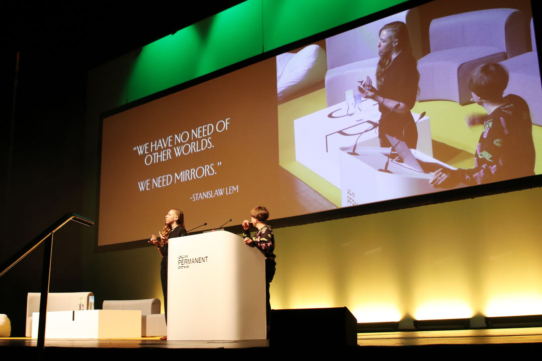
Heidi Berg and Hazel Baird presenting their work at Semi-Permanent 2019 in Auckland, New Zealand
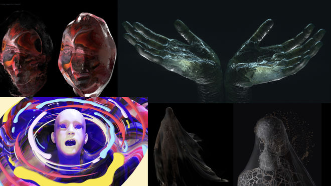
Slide of stylistic references shown during Heidi Berg and Hazel Baird's presentation at Semi-Permanent 2019
Your stylistic references for Semi-Permanent feature stills from other title sequences. Tell me about some of your influences.
Heidi: Right. When we started to gather visuals that we were attracted to, we did this whole breadth of research. We wanted to make sure we pulled enough colourful moments that I feel like Elastic maybe isn’t doing much anymore. Buck did a video that we really loved.
David Blaine: Beyond Magic (2016) main titles, created by Buck
Heidi: The David Blaine one was so well done and so mind-blowingly good. It kept such a good sense of colour. Buck is so good at that. We wanted to take a cue from their motion and colour. We also wanted to make sure we didn’t lean too far in one direction and get trapped in illustration or 3D.
—Hazel BairdI was really into body horror. It was Society, the 1989 film, where it’s a metaphor for the rich sucking the poor dry.
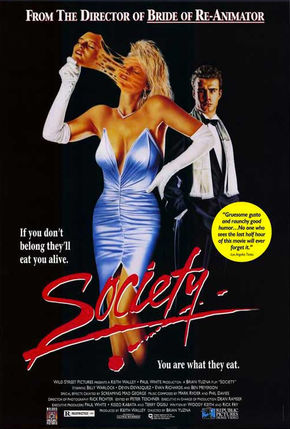
Society (1989) film poster
There was a phase when we were really drawn to these old masks from different eras of human civilization. One section had this character pulling faces off and there was something so beautiful about these really old masks that were so graphic and terrifying and modern at the same time.
Hazel: Oh, I was really into body horror. It was Society, the 1989 film, where it’s a metaphor for the rich sucking the poor dry.
Heidi: And that kind of fed into the Cronus stuff. But in the beginning we had this very grotesque body horror imagery that was also very colourful! [laughs] We loved that and we thought, What if we did this with cel animation?
But not horrifying?
Heidi: Right, not horrifying. In the beginning we were going in a bit more of a horror direction… We were hoping that was going to be cel animated but it was just too much work and not enough time.
—Hazel BairdWe knew it had to be dark at the beginning and then it had to be colourful. We knew it was going to turn from 3D into cel.
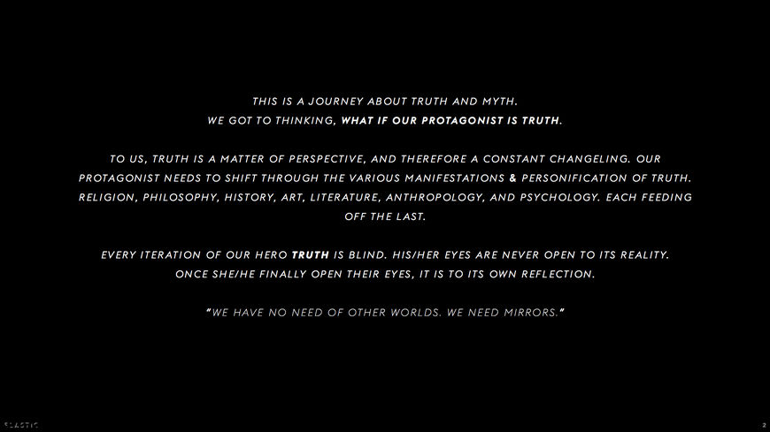
IMAGE SET: Storyboard and design brief images by Hazel Baird and Heidi Berg for the Semi-Permanent 2019 titles
The Void / Veritas
Hazel: We knew it had to be dark at the beginning and then it had to be colourful. We knew it was going to turn from 3D into cel. We went through a lot of iterations with Margherita Premuroso, who’s an incredible illustrator, and she did a lot of design. It was a matter of her and another guy, Daniel Moreno, who’s based in Portland, going back and forth, and then we’d start to merge their work together. He did all that noise stuff and the sky – this style that had noise over it – that we really liked. He would take Margherita’s illustration and add that to it, and then he would do the camera move at the beginning with the Savior, after we come out of The Void / In Veritas, the camera move that turns around. He was doing all that in Cinema 4D. It was a matter of us saying, “The colour isn’t right, this is what the sky should look like here…” And then he’d quickly change it, we’d go back and forth.
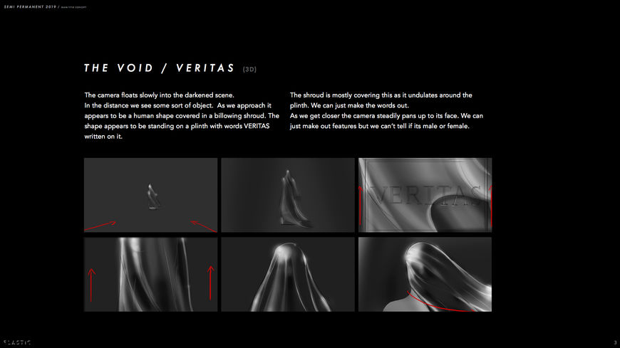
"The Void / Veritas" storyboard page by Hazel Baird and Heidi Berg
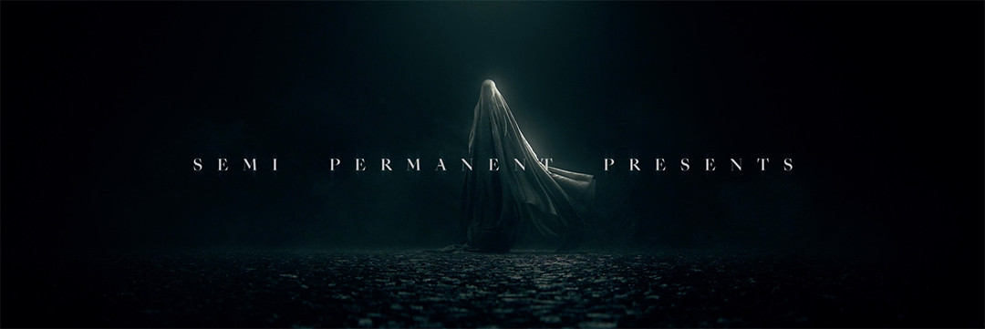
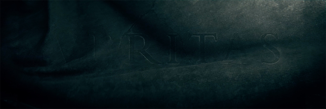

A Savior
Hazel: We wanted the camera moves to be quite graphical and not moving very much. We actually only have one rotation and that’s in The Savior–Shadow bit. That was important.
Heidi: The Savior–Shadow rotation and then also when the two faces pull out at the end.
Hazel: When we had previz people, they would go crazy with the camera moves, and it was hard just to tell them, “No, we want it static, we don’t want the camera moving very much.” And they were like, “What?” They didn’t seem to understand that. They thought it was more dynamic if you take the camera and it’s hoisting around.
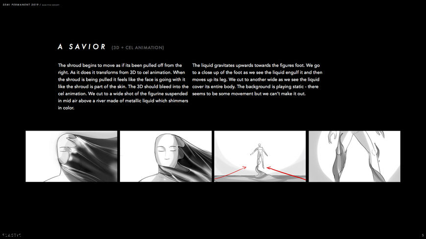
"A Savior" storyboard page by Hazel Baird and Heidi Berg
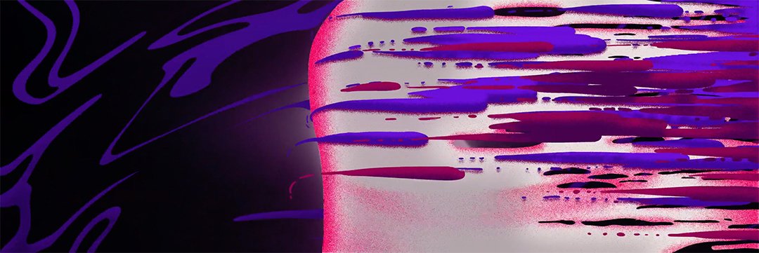
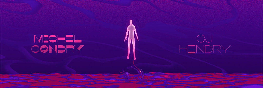
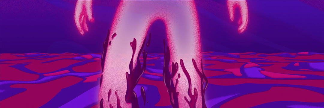
Were you aiming for more of a detached or calm energy, with the static camera?
Hazel: I think so, yeah. It’s kind of like an art gallery and you just want people to look at it. You want viewers to be immersed.
Heidi: We felt like there was so much going on in terms of the concept, the ideas, the characters themselves. There is a power to each one that you want people to focus on and not get too distracted by camera moves.
The Shadow
Hazel: I like the bit when The Shadow comes up and it starts to get really frenetic. I love the skies and the character falling from the sky section.
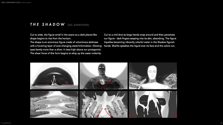
"The Shadow" storyboard page by Hazel Baird and Heidi Berg
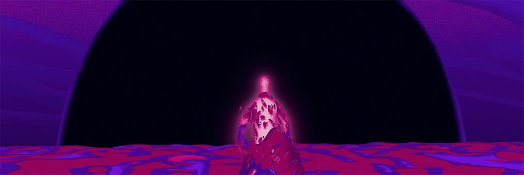
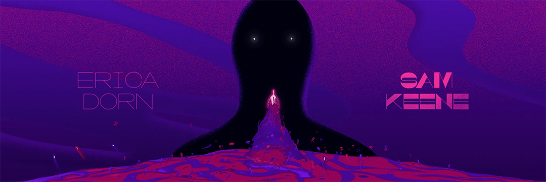
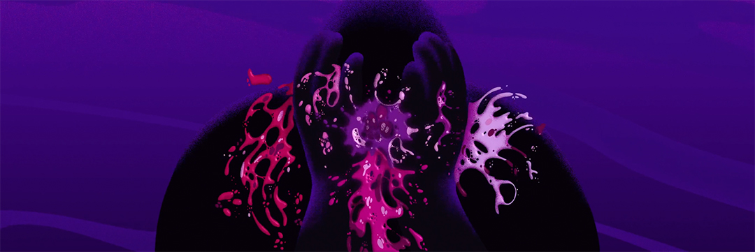
A Mimic/The Many
Heidi: The Mimic and the Many, that was going to be cel animated, but we almost broke our cel animator. Poor Margherita. The multiple faces ended up in 3D as well.
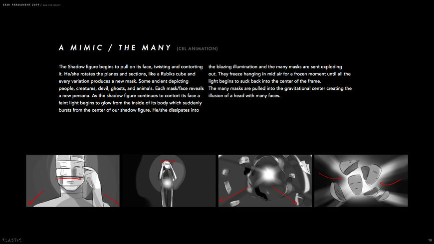
“A Mimic / The Many” storyboard page by Hazel Baird and Heidi Berg
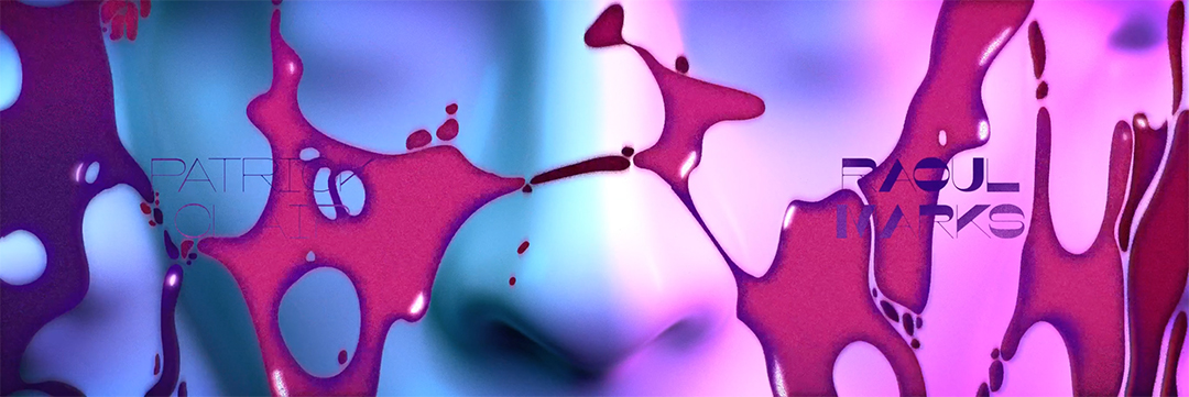
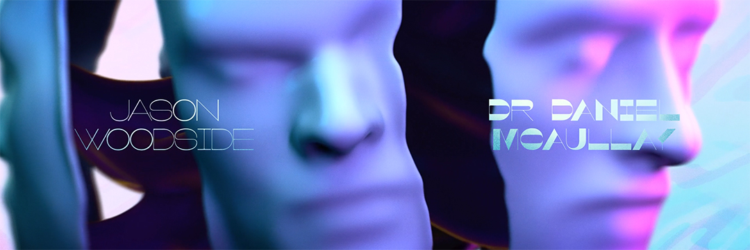
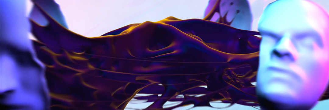
Siddhartha
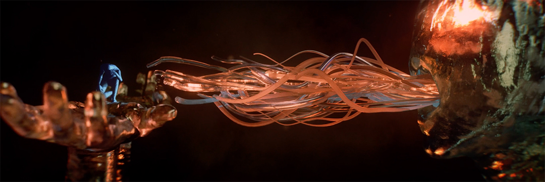
Heidi: Siddhartha gives birth to this little human form but then Siddhartha transforms into this grotesque Cronus figure who wants to consume what it has just created, in a way. In the end that’s what causes Cronus to break apart. For me, Siddhartha moving into Cronus, conceptually, I really like. The glass is just really beautiful and everything about it.
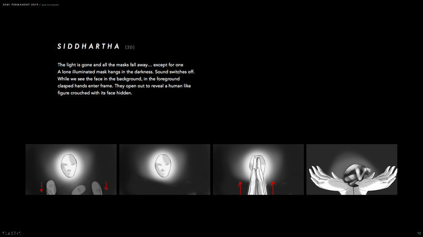
“Siddhartha” storyboard page by Hazel Baird and Heidi Berg
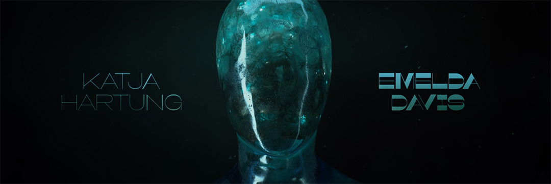
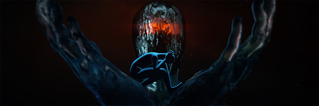
Cronus
Tell me about Cronus. This is the Greek myth you’re pulling from?
Heidi: Yes, so when we got into Cronus, Felix had this idea of Truth being the older generation eating the younger generation. In the myth of Cronus, he ate his children out of fear and greed. We wanted to blend that into this idea of time, that dual meaning of Cronus.
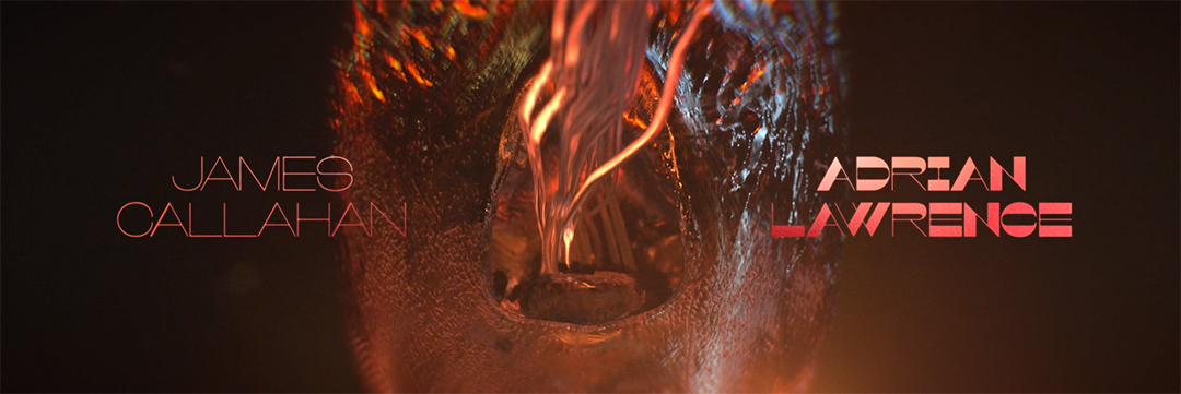
Hazel: Ethem Cem, who was in Turkey, came up with these amazing stills for Cronus really quickly and as soon as we saw them we knew it was right.
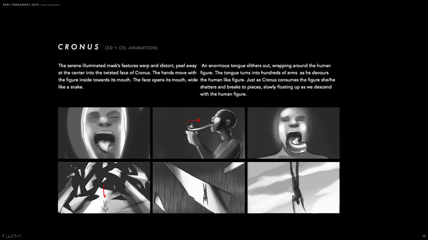
“Cronus” storyboard page by Hazel Baird and Heidi Berg

The Human Condition
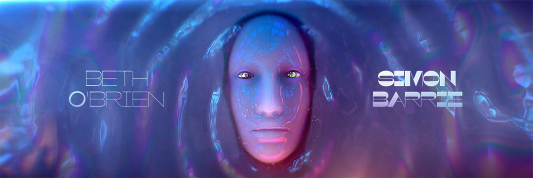
Heidi: The falling section for The Human Condition, through the clouds, before we get to the water – I think there’s something both musically and just illustratively really nice about that. It has a bit of emotion to it.
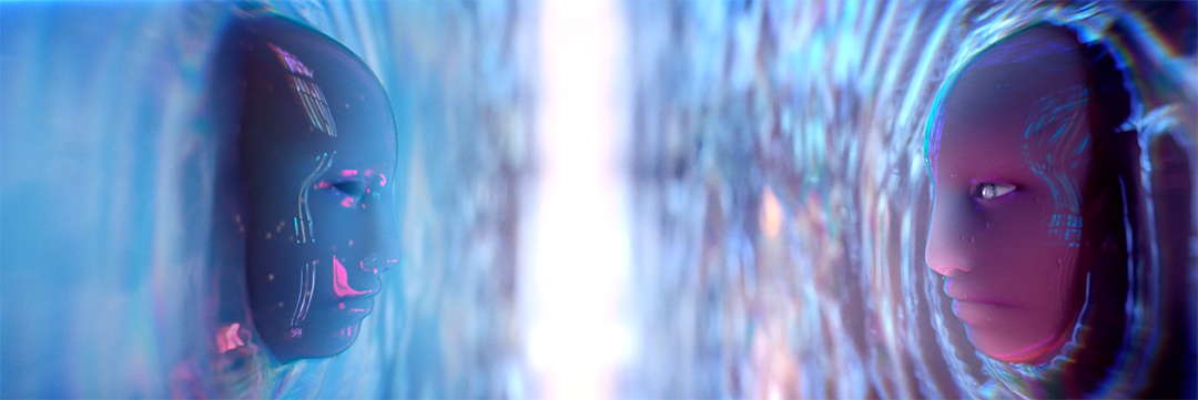
Hazel: I like the way the camera turns round and they both look at each other. I think that’s really nice and I think the music’s really nice at that point as well.
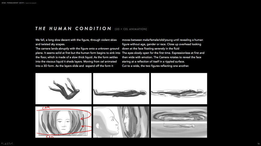
“The Human Condition” storyboard page by Hazel Baird and Heidi Berg


Tell me about the music. Was that created to video or was there a back and forth?
Heidi: I reached out to Antfood because they make amazing, weird sound effects, such interesting soundscapes. They were immediately down. They started to build different soundscapes and chapters to go along with the concepts we were making, up until they went to Macedonia and had the whole thing orchestrated.
Hazel: They were really excited. They had a 50-piece orchestra in Macedonia add to it.
VIDEO: The Antfood team discuss their process creating the music for the Semi-Permanent 2019 opening titles
How did the symphony orchestra come into the picture?
Heidi: That was a surprise! We didn’t know they were doing that. When they responded to the pitch, they had a little blip in there about maybe recording with a live orchestra and we thought, Let’s talk about this when we get there… There wasn’t money involved and time was of the essence. They actually made it happen and I’m just blown away. It was so helpful to have Antfood as a partner, in terms of elevating the picture with the sound and music.

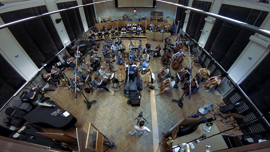
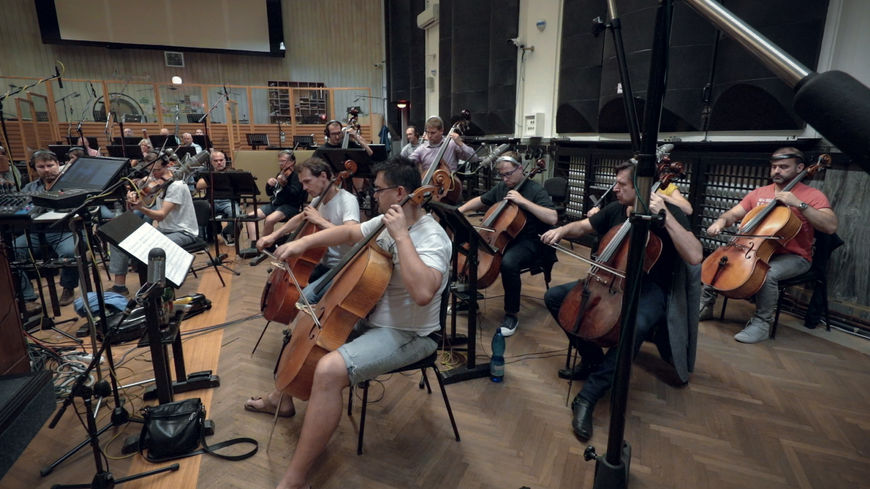
The FAME'S Macedonian Symphonic Orchestra. More info.
What software and tools were used to put it all together?
Hazel: The tools were After Effects, a mixture of Cinema 4D, a little bit of Houdini for the liquid stuff. Margherita just uses Photoshop to animate. No one used Flash on it – it’s all Photoshop. I know that Sekani Solomon, when he did the intro, he used RedShift, and Marvelous Designer for the cloth. That intro was done slightly differently but everything else was Cinema 4D, Octane, AfterEffects, and Photoshop.
Last question. Looking back now, if you’d known at the start how much it would need to finish, do you think you still would have done it?
Hazel: It was very, very stressful, and I’ve said before, I’m never going to do it again!
[both burst out laughing]
Hazel: But I loved it at the same time. Being at Semi-Permanent and talking about it was like… I almost cried at the end. I was relieved and sad at the same time.
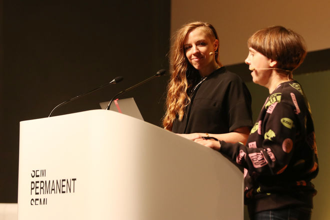
Heidi Berg and Hazel Baird presenting their work at Semi-Permanent 2019 in Auckland, New Zealand
Heidi: It hurts but it’s a good pain. You’re stronger for it. It was so valuable and rewarding to work with all these people, to see it come together. End of a chapter. It was almost 8 months.
Hazel: It was hard work. It was very touch-and-go at times.
Heidi: Yes, it was very tough-and-go! My spirits kept getting lifted by the artists. Their professionalism, their integrity, and their willingness to see this through. It was so valuable. The pain and the struggle brings the strength.
Hazel: Overall, it’s an experience that has changed me slightly. I have a different perspective. It’s been invaluable because I understand how to work in a new way. To let go, to not take things personally, to separate work and friendship. I’ll never forget it.

