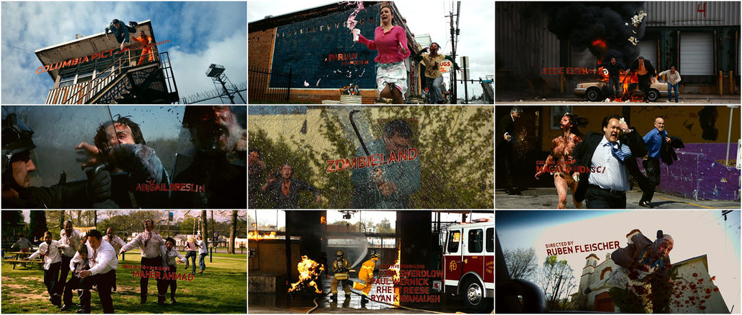


Featuring the second best use of classic Metallica (the first being Joe Berlinger and Bruce Sinofsky's Paradise Lost: The Child Murders at Robin Hood Hills) the title sequence to Zombieland does not back down. Flashes of jarring death slathered with slow speed splatter document a kinetic finality that does not force its humor. We see every black bauble of biohazardous blood upsurge and dot the landscape of a crippled Earth.
A discussion with Creative Director BEN CONRAD at Logan.
Detail the work that you were responsible for in Zombieland.
BC: I was responsible for the main title sequence and the rules that are featured throughout the film.
How involved were you with the live action slow motion photography?
The slow motion photography was the director’s concept.
Did the ‘rules’ stem from the title graphics or vice versa? Or were both always planned that way?
The rules and title sequence evolved separately, but in the end came to a more understated simple approach. The goal was to integrate the type into the film and propel the narrative without becoming heavy-handed. The film is essentially a comedy, and we felt that punctuating the humor with a simple typographic approach was the way to go.
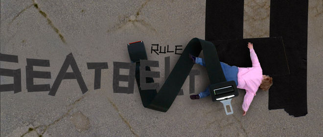
‘Rule’ explorations
How were the particular title card shots determined? An early cut shows a different order of shots, so when was this locked down?
As the concept for the title sequence evolved, the marriage between type and image became more apparent. Certain shots that at first felt perfect in an initial edit found a new place as the type began to take shape.
And what about the placement and interaction of the typographic elements? What were the various stages that went into producing those shots?
The interactive animation of the type first started with the rules and eventually made their way into the main title sequence. We wanted to seamlessly integrate the type into the scene, making the type become another character. We were inspired by the tension between beauty and horror that the slow motion footage created. The goal for the type was to respond to that horrific grace, to react to the movement.
Main title playblast
First our lead designer, James Wang, set the type; this was then handed off to our 3D team who would model and texture the type. After the modeling and texturing was in good shape it would be handed off to an animator to apply the motion. During this time a lighting artist would be applying looks, eventually the animation would be approved and the lighting would be further polished until finalized.
This particular job was accomplished using the requisite Adobe suite of tools and Maya. Our pipeline was essential in accomplishing this job, a labor of love that creates an ease of use for the creative team while being simple enough for production to effectively do their job. Vincent Wauters, our lead compositor and vfx supervisor, as well as vfx supervisor Stephan Kosinski were essential in developing and implementing a superb pipeline for this job.
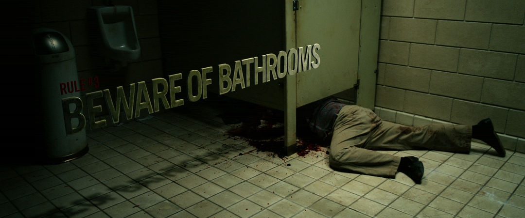
‘Rules’ final examples styleframes
How were the “rules” onscreen graphics constructed?
The “rules” were constructed to be an onscreen punctuation to the setups in the narrative. Technically the rules were created in Maya and textured and lit to match whichever scene the type would live.
Did you always know it was going to be Metallica’s “For Whom the Bell Tolls” for the underlying music?
“For Whom the Bell Tolls” was a musical choice that the director, Ruben Fleischer, deserves all the credit for. We became briefly involved in that process, but it was always Ruben’s vision.
LIKE THIS FEATURE?
HELP US SHOWCASE MORE GREAT TITLE DESIGN. BECOME A PATRON TODAY.
Related
-
ParaNorman
interview
-
Ernest Scared Stupid
interview
-
The Walking Dead (Seasons 1 & 2)
title only
-
Dawn of the Dead
summary
-
True Blood
summary
-
Ginger Snaps
interview