In 1996, the design of cinema was in a great state of flux. The tools of the trade were becoming more advanced and computer-generated visual effects were quickly infiltrating many aspects of the process.
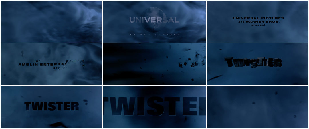
At the Los Angeles branch of agency R/GA, designers Kyle Cooper and Garson Yu collaborated on the slam dunk, blink-and-you'll-miss-it opening to blockbuster Twister. The film is a fine example of the mid-90s technological evolution, itself straddling many a divide. Its plot centred around a group of scientists struggling to prove that their prototype, affectionately called DOROTHY, could be successfully deployed in the midst of a tornado. The team's low-tech resourcefulness and faith in their intuition would give them a leg up against their high-tech competitors.
Similarly, Cooper and Yu would use a number of surprisingly low-tech solutions in the creation of this title sequence, looking to classic Hollywood cinema and techniques of old, like using fabric and dry ice. Pairing that low-tech sensibility with the slick cool of burgeoning digital effects allowed Twister's opening to feel at once organic and sophisticated.
In this excerpt from her 2003 book Kyle Cooper: Monographics, Author Andrea Codrington discusses Cooper's contribution to the opening titles:
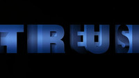
The sequence’s creative direction takes much from Cooper’s early graphic experimentation, and revolves around a digitally manipulated typeface that appears one minute in the vortex of a storm cloud and is gone with the wind in the next, breaking away like so much trailer-park debris. The massive bluish-grey cloud, hovering mid-screen as if in the eye of the storm, is accompanied by an ominous wall of sound that whips into a windy frenzy to blow the main titles to smithereens.
Andrea Codrington is an editor and writer specializing in design and visual culture. She is the co-author of Pause: 59 Minutes of Motion Graphics and sole author of Kyle Cooper: Monographics.
Twister was both the first Hollywood feature film to be released on DVD format and one of the very last to be released on HD DVD, both formats now, of course, drifting away into obsolescence.
To delve deeper into the construction of the Twister title sequence, we spoke to Designer GARSON YU, formerly of RGA/LA, who established yU+co. in 1998.
Tell us about your process. What was it like designing for Twister in 1996?
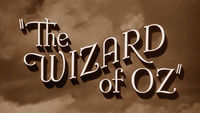
GY: In those days, I had more time to think and contemplate. The ’90s was the turning point for title design because digital effects were just starting to influence the way we design titles. I looked at lots of different techniques in order to figure out how to create the tornado. At that time, digital effects were not that advanced and would cost more time and money to create a convincing effect. I had to be inventive and creative. It was more about the process. I always believe that learning from the past and being aware of what has been done before is a way to find a solution for what we do now. I looked at how Wizard of Oz created the tornado back in 1939.
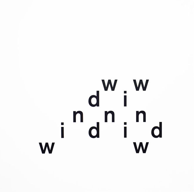
Wind by Eugen Gomringer from his constellation poems
It was the process that completed the piece. There was the physical shoot for the elements. There was digital compositing. There was sound and audio to complete the powerful eerie opening.
But all of these started from imagination and storyboarding. Storyboarding in Photoshop and creating photo-realistic style frames was key to helping define how we would execute the sequence. Designing the concept and storyboard was just the beginning. Once the general storyboard was approved by Director Jan De Bont, I had to create a detailed shooting board for the VFX team.
Then I decided to make a physical tornado out of muslin fabric. We created a giant turning cotton ball in the shape of a tornado. We shot dry ice at high speed to use as smoke elements. The entire piece was composited digitally using all of the practical elements. When I designed the sequence, I thought of everything as object-oriented. The Warner Bros. shield, the typography, the debris, were all treated as objects. In the ’90s, the idea of seeing titles as an object was new to title design. It's because in the late ’90s we were facing the transition from optical film compositing to digital effects. The media that we employed was affecting how we as title designers thought of the solution. It was inventive at that time, in my opinion. It certainly was the beginning of blending visual effects and title design.
My goal was for the audience to have an immersive experience inside the tornado. When we are inside the tornado everything is quiet; the audio is key to creating suspense. Nowadays, it's common to say we want to give the audience an immersive experience. The word “experience” for moviegoers is a household term now but it wasn't back then.
How did you decide on the typeface—Helvetica? Did you consider others?
International Typographic Style, also known as Swiss Style, is a style of graphic design developed in Switzerland in the 1950s. It emphasizes cleanliness, readability, and objectivity. Many of the early International Typographic Style works featured typography as their primary design element.
See examples of posters.
That was Helvetica Extended Bold and Black. I was very into concrete poetry, the work of Eugen Gomringer. International Style and sans serif was my favorite at that time. Also I wanted to see the typography as objects like big blocks. I didn't consider others at all.
What was your collaboration with Kyle Cooper like at this time?
Kyle has always been an inspiration to me. A great friend and a great colleague. We collaborated on many film title projects. Back in the day, once he knew the direction we were going in, he would let me run with it. He was also very busy with other responsibilities. I would always check in with him and share some thoughts of how to make it better. It was a great collaboration. I miss working with him. I wish we could still get together and share inspirations.
Looking back, how do you feel about this sequence?
Twister is my favorite work I have done. Because I was working with Kyle at that time, we pushed each other to do better work. We always pushed ourselves to unfamiliar territory. I was excited to see the result. I never could tell what the end result would be until I went through the whole process. I see this sequence as art because it was all about the process. It was the process that made this sequence different from all other title design at that time.
Discover more Kyle Cooper
KYLE COOPER: MONOGRAPHICS
By Andrea Codrington

