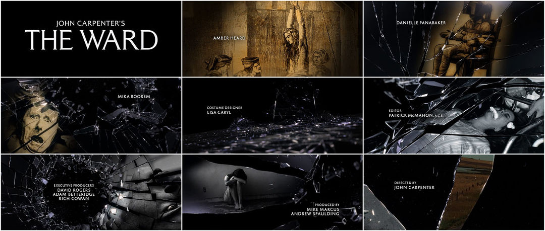


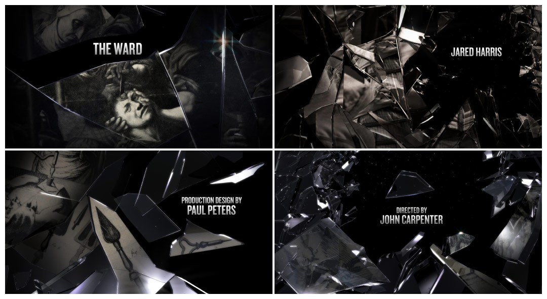
In clever shadow play, the title type is the very thing you pass in the darkness that makes your blood run cold. With shifting shards and a spine-tingling soprano, the opening titles to John Carpenter's The Ward create a graceful unease. Fractal lobotomies and fractured woodcut prints fly, the images depicting men and women wracked to the tools of torture. We are shown the early days of mental health practices in which similar and yet more evil devices were used to "cure.”
The designers, Gareth Smith and Jenny Lee, known for their work on Up in the Air and Juno, exacerbate the already robust sense of dread that exists regarding the sensed helplessness. The system is broken. The shards cut deep.
A discussion with GARETH SMITH at Smith & Lee Design (formerly Shadowplay Studio).
Give us a little background on Smith & Lee Design.
GS: Jenny Lee and I began our collaboration on Thank You For Smoking, and have since designed a number of other sequences for film and television, including the sequence for Juno. The title sequence for The Ward was the final major project completed at Shadowplay Studio before we shut down last year. For a variety of reasons we decided to close shop and move on to new things.
How did this project for The Ward come to you?
A producer we had worked with on a previous project recommended us to one of the producers on The Ward! She, in turn, invited us to pitch for the job.
Did you meet Director John Carpenter? What was that like?
I have to admit I was a little intimidated because I was meeting one of my favorite directors from my childhood! John Carpenter was a really fun and nice man during our pitch meeting, but before we started talking about ideas, he enlisted me to be a part of a small prank that he wanted to pull on a producer who was running late to the meeting. Mr. Carpenter told me a line to say to the producer when he arrived. As we waited and chatted, Mr. Carpenter frequently interrupted to get me to practice the line, and gave me acting notes to help me make it sound more convincing.
Haha! He was directing you?
Yeah! When the producer arrived, we all shook hands, introduced ourselves, and I said my line: "I really want to thank you for doubling the budget of this sequence!" He saw through it instantly. I guess I should just stick to design and not venture into acting!
Haha, right. So, what came next? How did you proceed?
First, we were given the script to read and told that Carpenter was interested in creating a sequence that showed images of the brutal treatment of the mentally ill throughout history. The main purpose of the sequence was to create a sense of dread of the place that the film takes place in. It was intended to make the audience feel disconcerted and apprehensive of what they are about to witness.
We quickly came up with the idea that ended up on screen, but of course had no idea how on earth we'd be able to pull it off – it was quite ambitious!
Initial styleframes
We created some initial styleframes that demonstrated the breaking glass concept. This allowed us to do a little initial exploration with developing computer-simulated glass. We then pitched the concept, and soon found out that Mr. Carpenter was interested in pursuing what we proposed.
We then started the very long, involved process of creating the sequence. There were two significant hurdles that we had to overcome: first, creating photo-realistic, slow motion shattering glass, and them embedding images onto that glass; second, we had to research, acquire or create the images that would eventually appear on the glass. This all had to be done with a very limited budget, but we had a generous amount of production time. That made all the difference.
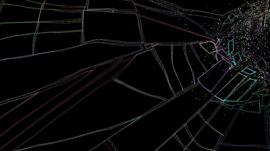
VFX Breakdowns
The shattering glass effect was a computer simulation. Under Ari Sachter-Zeltzer's supervision, our VFX artist built panes of glass with a variety of crack patterns. He then virtually hurled objects through the digital glass, and the shattering effect was recorded as a 3D animated sequence. He then showed me how to move the camera around in 3D space, and I was able to explore the various shattering panels of glass to find the shots that we would use to cut together a sequence.
Production photos
After we worked out the various shattering animations and decided which angles we were going to view them from, the rest of the CG effort was spent on dialing in the lighting and rendering of the glass. By carefully placing reflection objects and adjusting material properties, we could sculpt the lighting and sparkles as the glass shatters.
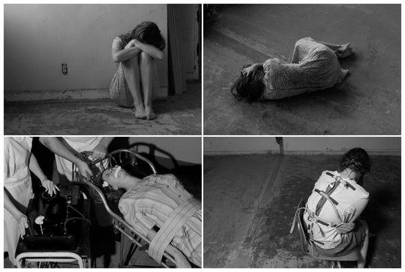
The research process involved a combination of exploring various historical image collections and staging photographs. We put together a still photo shoot to create the photos that appear during the second half of the title sequence like the images of the lobotomy, electroshock therapy, the woman in the straightjacket, etc.
We cast the actors, acquired the costumes and props, and shot the images in a building that had a creepy-looking abandoned floor that was under construction. That close-up shot of a hand strapped to the gurney is my hand, actually. Also, I almost got a concussion when the prop gurney we rented mysteriously collapsed to the floor!
How did you work with the music? When did that come in?
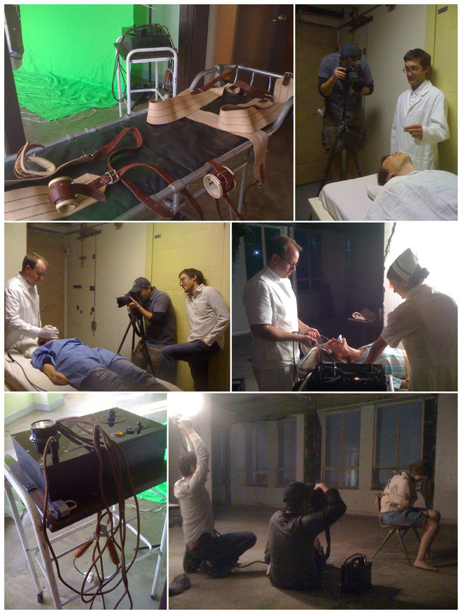
On set photos
The music was composed after we finished the entire title sequence. We chose a temporary track to edit to that had a steady rhythm to it. The composer was able to use the pacing that we had established and then created a piece of music that fit perfectly with the visuals. This was the first time we've had a title sequence with a score that was written after we were done, so it was exciting to hear it for the first time. I love how it turned out.
What elements of this sequence are you most happy with?
My favorite moment is probably the final transition into the film itself, where the camera flies into a large piece of glass and into the shot of the police car driving down the road. I love it when a title sequence seamlessly moves you into the film. That's something we really try to achieve in all of the sequences we create.
Now Available
WiggleType by Smith & Lee Design
Created by the team who brought you the JUNO opening title sequence, WiggleType is hand-drawn, animated typography for motion graphics designers, filmmakers and animators.
Use promo code “AOTT” to unlock 20% off!
Related
-
American Horror Story
title only
-
Up in the Air
interview
-
Se7en
interview
-
The Conjuring
interview
-
Crave
summary
-
Thank You for Smoking
title only