


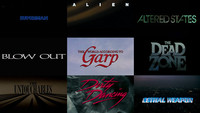
In the late '70s and throughout the ’80s, Richard Greenberg of R/Greenberg Associates spent much of his time applying his particular typographic approach to title design, using type both as structure and as obstruction, setting the tone for the film to follow. The Greenbergs' iconic practical effects work on films like Superman (1978) and Alien (1979) established them as industry players, but the work that followed allowed them to emerge as an important voice in design for film. This included Altered States, The Dead Zone, Blow Out, and many others, all featuring type in a conspicuous, structured way, created using primarily practical effects.
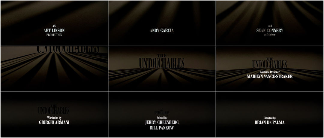
The late '80s brought about many a technological innovation, and so the Greenbergs – as they are wont to do – embraced these changes with gusto. Thus, though the style of the artwork in the title sequence for The Untouchables harkens back to tropes of the Western and film noir, the shadows were in fact created digitally. As the shadows flicker across the credits and the title is finally revealed, the effect is one of a slow build – a luxurious prelude to a compelling potboiler.
Title Designer RICHARD GREENBERG speaks about his work on The Untouchables in this excerpt from our feature article R/Greenberg Associates: A Film Title Retrospective.
And The Untouchables?
Richard: That movie was beautifully shot in color. I thought it would be great to do something that was black and white, some very film noir titles to contrast it. I had an art director that I was working with and we kept looking at shadows. I got the idea that the shadows should be actually cast by the word. And the art director kept saying, “It’s boring.” Finally I just looked at him and said, “It’s supposed to be boring.” I wanted it to take its time. That’s how I thought about this stuff; I didn’t want it to be rushed. I guess it was in reaction to what was so prevalent at the time: news graphics and stuff that was all so rushed. And it’s only gotten worse.
Support Art of the TItle
Related
-
R/Greenberg Associates: A Film Title Retrospective
feature interview
-
True Lies
summary
-
Blow Out
summary
-

Altered States
summary
-
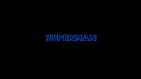
Superman
summary
-
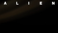
Alien
summary