For mob boss Tony Soprano, power is about staying in motion.
As Tony drives out of the Lincoln Tunnel and into New Jersey, through a gray area of smokestacks and signage, toll booths and turnpikes, viewers are given glimpses of a man in transit: a lit cigar, ringed fingers, glowering eyes in the rearview. Pieces of the city and pieces of the man are cut together – aligned, made equivalent. His commute, here highlighted, creates a portrait of a kingpin as much a product of his environment as he is apart from it, an island in a stream of traffic.
Although The Sopranos is clearly descended from some of cinema’s great gangster sagas – The Godfather, Scarface, Goodfellas – the show’s title sequence immediately sets it apart from its predecessors. Where The Godfather introduced the Corleone clan with a mournful waltz, Tony Soprano is introduced by way of Alabama 3’s “Woke Up This Morning,” an appropriately rousing track about taking what’s yours. Tony’s a mob boss of some means, but he drives his own car. His kingdom lies beyond the bustle of the big city, far removed from the tradition both he and the series have inherited.
Where The Sopranos does resemble its ancestors is in its typography. Like the title sequence to Goodfellas, the credits type is basic but mimics the action of a vehicle, zooming in and out of frame. Similarly, the logotype and colour scheme are an obvious allusion to The Godfather, though the central object of each title card (there, the hand of a puppeteer, here, a gun) signals a slight difference in management style. These stylistic choices are a fitting homage and a necessary passing of the torch to the next generation of wiseguys.
When it first aired in 1999, The Sopranos was only the second hour-long television drama that HBO had ever produced, the first being Oz. The titles helped lend the show a credibility and gravitas normally reserved for cinema, giving it a stronger foothold in the mind and memory of the audience.
Tony’s drive out of the city is a calm between two storms. A threshold between the family business and family, this otherwise mundane journey is the viewer’s own entry point into a world made bloody by ambition and avarice. By virtue of framing, editing, and a choice song, the title sequence establishes him as a figure singular in his status – and a man not to be overlooked. Out here, in the noisy solitude of the New Jersey Turnpike, perched in his oversized SUV, Tony has it all.
A discussion with The Sopranos creator DAVID CHASE and logotype designer BRETT WICKENS.
When did you start to think about the title sequence for the show?
DC: I guess after HBO said they were going to make a series out of the pilot, which would have been 1998. I always had the idea for the journey from New York to New Jersey.
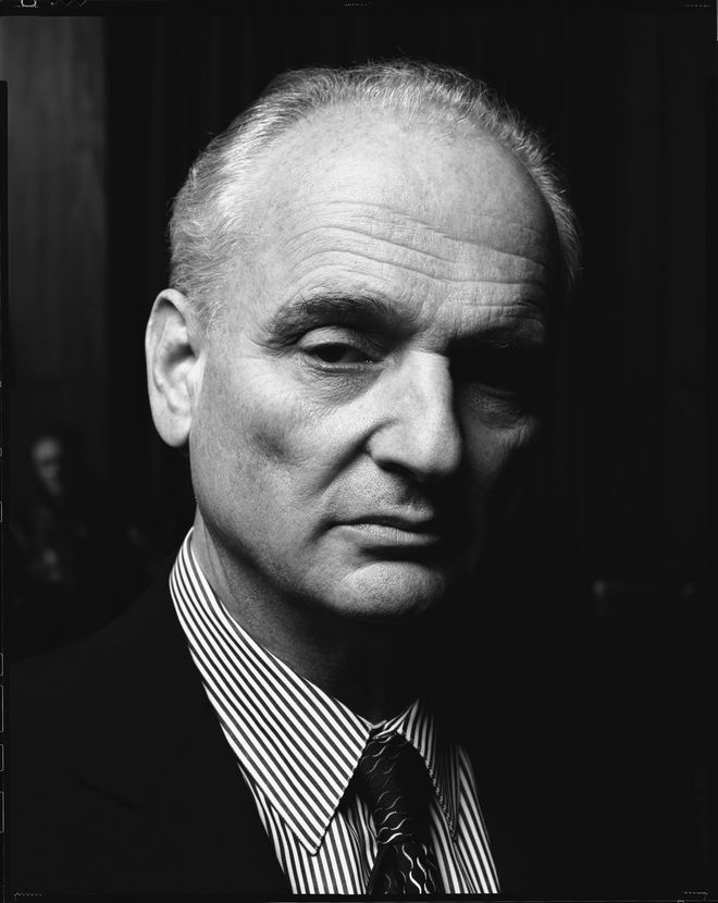
The Sopranos creator David Chase
Photo © Timothy White / HBO
Where did that idea come from? Did you look at older films, especially Mafia-based films? Those tend to focus on simple typography, but The Sopranos title sequence seems different, in terms of showing locations and the journey.
DC: I guess I mostly wanted to show that we were in the New York metropolitan area but specifically New Jersey. A lot of people had told me that nobody’s going to care that the show is in New Jersey or even notice it. But I wanted to be sure that [the location] was imprinted. That we were not dealing with Rome, we were dealing with one of the provinces.
I came up with the idea, we all discussed it, and I went on a scout in the scout van with Allen Coulter and Phil Abraham and everybody. I showed them the places I wanted to shoot. I said, just close this whole thing down here – and they did. I was not involved with the live action shooting. I had to go back and do some post-production work on the pilot and then our editor, Sidney Wolinsky, put it together.
Did you have any other concepts aside from the final with Tony driving from New York to New Jersey?
DC: There were no other concepts.
Bernie Brillstein and Brad Grey were founders of production company Brillstein-Grey Entertainment, which packaged programming and managed talent, and with whom David Chase had signed a development deal for The Sopranos.
Well, there were no alternate concepts, but for a long time HBO and Brillstein didn’t get it that we didn’t show the regulars. We didn’t show anybody else from the show so they made us do a bunch of shots where we drove past the pork store and you saw Christopher and Dr. Melfi getting out of a car and some other nonsense. They wanted us to include that in the sequence and we all looked at it and said, “No. It’s not going to happen.”
Did you have to fight a little bit to get your particular vision through?
DC: It’s always a struggle. It’s always a discussion. For example, at one time I wanted to use a different song every week for the titles to play over. And Carolyn Strauss [from HBO] said that’s not a good idea. I said, ‘Why is that? It seems like it’s real different and....’ She said, ‘Because with a TV show title you want it to be such that when people in another room hear it they go, Oh, the show’s on the air, and they come running.’ I said, ‘That makes sense.’
There was a lot of creative discussion about it. For example, I didn’t want to shoot the stuff with Christopher at the pork store; I just thought that was ridiculous but we did and once they saw it, they kind of agreed it didn’t work. We didn’t really have any knockdown, drag-out fights though. It was all done internally. Allen Coulter directed it, Phil Abraham shot it, and Sidney Wolinsky cut it together under my supervision. So it was simple.
—David ChaseI always wanted the audience to feel that the episode they were seeing was happening now.
How important was establishing the mood and the tone of the show with the sequence?
DC: Extremely. What I mostly thought about was making this a really good piece of film for the title sequence. I looked at it as its own little movie and… It’s interesting because where the title sequence ends – him coming up the driveway and right before that, he’s going on a road between two rock formations – I grew up right there. I went up and down that road, gosh, thousands of times in my life. And right where the Sopranos’ house is there used to be completely woods; there was a swim club there – an artificial man-made lake but set deep in the woods. My wife, as a child, belonged to that swim club.
All that was playing in the back of my head and I can’t tell you exactly why but it was very important… It was very important to me to show that The Sopranos was taking place in a place where there was still contact with nature, where there were still woods and streams and rocks. That’s why it goes from New York to a more wooded setting. Those wooded things played all the time during the show. There were the ducks and the bear and Tony’s garden and the wind – that was all very important to me.
Right, and in terms of introducing Tony, it seems like the shots of him were all about the different sections and parts of him, as well.
DC: Yeah, you don’t really see him completely until he steps out of the car. You see his eyes in the rearview mirror, you see his hand on the steering wheel, you see the cigar, you see his shoulder. And then there’s the reveal when he gets out of the car. That’s just the way I like to do... to have a sense of mystery and suspense.
What about the theme song, “Woke Up This Morning” by Alabama 3? How did that come about? Had you known that song before starting to work on the show?
DC: Yes, I was aware of the song before. At that time I lived in Santa Monica, California and there was a great NPR radio station there, KCRW. They had great DJs and a great music supervisor. They played a lot of stuff you never heard anywhere else. I heard this song and I kept it in the back of my mind. I think we tried to use it within the pilot before we knew whether we were even going on the air. Just as a piece of music in the title. Once HBO said the show was going to be a weekly series we tried out four or five other songs against that title sequence and this was the best one.
What else did you consider?
DC: Well, when I say ‘the best’ I don’t mean the best song. This was the most interesting fit. There was “Complicated Shadows,” the Elvis Costello song. There was “Where Have all the Good Times Gone” by The Kinks. There was “You Better Run” by The Rascals. And I think the thing we used as a temp title was a dance track by a group called Funky Green Dogs or something like that.
The sequence doesn’t really change over the various seasons but one thing that did change was the Twin Towers shot, which was removed after September 11th. Can you talk about that a little bit?
DC: Whether it was stretching the point or not I always wanted the audience to feel that the episode they were seeing was happening now. I felt that to have the Twin Towers still in the mirror would be saying that the title sequence was not happening at the same time as the episode. It was kind of like bookkeeping. That’s really what it was about in terms of the unities: time, space, and whatever.
What about the logotype design? Let’s have Brett Wickens chime in here. Brett, how did you become involved in designing the logo for The Sopranos?
BW: HBO contacted us to create the identity for an upcoming series called The Sopranos. At the time, I was VP Creative Director at Frankfurt Balkind Partners (now Bemis Balkind) in Los Angeles. We created campaigns for most of the Hollywood studios and quite a few television networks. As was often the case, production hadn’t started yet, so we received a script.
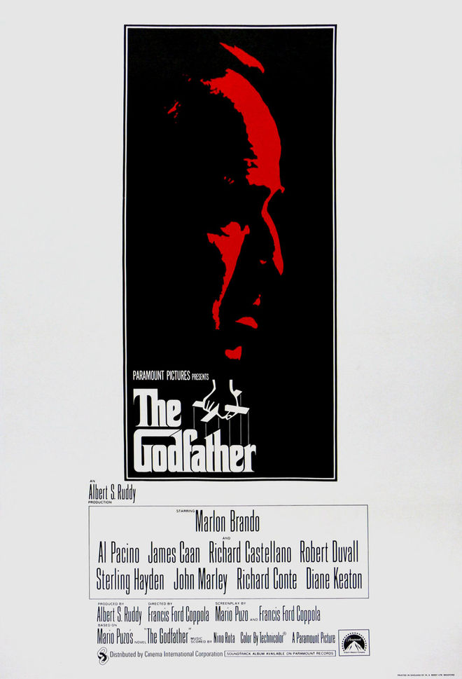
The Godfather poster, 1972
I remember being handed the Sopranos script and thinking that the title referred to opera singers, which didn’t seem very interesting! So I put it on my desk and it sat there for a few days, unopened. When I did actually read it, it was clear that the name had thrown me! It was a pretty interesting story about a mobster spending time with a shrink.
So, how did you start? What were your inspirations?
BW: I felt it was pretty important to overcome any preconceptions that the name might imply. It needed to be obvious that this was not about singers, but mobsters. I remembered the classic The Godfather poster; there was a lot of black and red, and the ‘marionette’ metaphor for the logo. I felt like the logo needed to be red against black, and it needed something quick and symbolic to steer it into the right territory.
How did you proceed?
BW: Well, we were also working on the marketing launch campaign for the series at the time, so it involved several designers and writers. And there was a lot of sketching! I looked through my archives and unfortunately I don’t have anything left except the final logo. And memories!
I recall a couple of the other ideas, though: one had Tony Soprano leaning back on a couch that was actually a giant upside-down gun. Another had him in a business suit swinging a baseball bat. But illustrations didn’t seem right. The Godfather had that great image of Marlon Brando, but the logo was something separate and very distinct that could live on its own. I then had the idea to turn the ‘r’ in “Sopranos” into a gun – simple yet powerful.
Corey Holms was my design assistant at Frankfurt Balkind. He created the mechanicals of the artwork from my sketches. We drew the final logo in Adobe Illustrator, having sourced a good prop gun – one of many we looked at – and scanned it to establish the outline.
The typeface as [it appeared later on] is a newer font that did not appear in the early days. I am assuming HBO changed that. Originally, we worked with Compacta.

Sopranos logotype original, using Compacta (left), and revised
David, when did you encounter the logotype and how did that fit into your vision?
DC: They presented [Brett’s design] to me and I think that’s the only one they showed me. Everybody said it was great and we just went onto the next piece of business! In a way, frankly, I thought it was kind of corny with the gun in there! [laughs] But I could also see that it was attention-grabbing. In retrospect, now, I’ve seen so many title designs with not only that typeface but the red and the black, too. For a while it was incredible.
Also, with the typeface, the font in the main title was kind of a problem. How were we going to get that onto the screen and off since the car is going forward? The problem was the thing was in motion all the time. Then you’d put text on there and it was just standing there – it was killing the whole thing.
Ilene Landress, the line producer and later one of the executive producers, she was important in that. I think she maybe even picked out the font and then we had the idea of whisking it off to the side. I forget who came up with the idea to have it wipe on and wipe off. She was the one who kept goading me, ‘You’ve got to take a look at these things.’ I remember I approved that and said, yeah fine, but I always thought, ‘That’s a little weird. It doesn’t seem to really work but I have other things to do.’ Now it seems like so much a part of it!
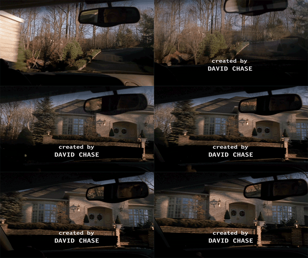
Example of moving type
I wasn’t really into that stuff, though. The main titles I was into. The advertising? Initially… I would drift off during those meetings. I began to realize how important it is but I didn’t realize it until later. I don’t know what made me not have a title designer. It was probably money, it was probably budget. And I just didn’t like a lot of what I was seeing.
Right, ’90s television title design had a lot of that kind of freeze-frame, floating head stuff going on. Did you have that in mind when you were working on these? Did you want to intentionally step away from that?
DC: I wanted it to be different. They all seemed the same to me, all those title sequences with the freeze-frame and the color separation and the high contrast where half the face goes into black. I was bored with all that!
BW: For the most part, marketing people in LA feel comfortable buying things they have seen already. If it was a success before, then surely it will be a success again! Being at the vanguard of design is not one of LA’s strengths. But in this case, for the logotype, it was right to be obvious. The name had such potential for misunderstanding – at least, in my opinion – that it needed to be tipped over the edge with something dangerous to disrupt it.
So, which title sequences do you like? What are some of your personal favorites, either from TV or film?
DC: What are my favorites, of title design? I really liked Dr. Strangelove. I really liked North by Northwest. The titles from Se7en are pretty good. I thought it was great, actually. Obviously, everybody loves the Pink Panther titles.
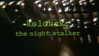
I worked on a show that I thought had a really good title sequence. It was called Kolchak: The Night Stalker. It was on in the mid-70s or something like that, with Darren McGavin. I had nothing to do with the title sequence – I was just a lowly writer – but I thought they did a really good job. The strange whistling – it was creepy. It was good.
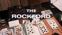
You know what was another good title sequence on a show that I worked on? The Rockford Files. I thought those were good titles. In fact, isn’t he in a car, now that I think about it? It’s stills but he’s driving down the freeway or something like that! It might be the… there are traffic jams or something. I just remember liking it a lot. It really established its place. It really showed you where it was.


