


Perhaps more than any other film title sequence, Saul Bass's contribution to Billy Wilder's The Seven Year Itch marks a turning point in both the relationship of the title sequence to its film and its independent value as a pop culture art form. Previous studio title sequences were often the product of in-house art departments staffed with tradesmen hunched over drafting tables, turning out hand-painted title cards in short order. While elaborate in design and unique unto themselves, these cards nevertheless followed a prescriptive format, usually superimposed via transparency over matte-painted backgrounds.
Hollywood had become self-important and incestuous after World War II, itself just having won its own battle against Broadway for box office rights; television wasn't even on the radar yet. "Go Big or Go Home" was the new motto, apparent in everything from Ford westerns and Hitchcock psycho-thrillers to Wilder comedies and epic Hawkes period dramas.
It was fertile ground for innovation and new top-billed talent, even while the process of filmmaking itself became an assembly line, streamlined by increased public demand and stone-bleeding studio executives. Title sequences, considered only artful legal filler and often played before the theater curtains were even opened, were little more than cogs in the machine, as were their creators. As such, there was little incentive or rationale for breaking the mold.
A post-war economy also meant more suburban homes and more television sets, thus more advertising agencies and networks on the hunt for the new best thing. From this came a new generation of designers inspired more by pre-war European art and theory than American trade. Paul Rand, Maurice Binder, George McGinnis, and Saul Bass were among them. Television and advertising became the place to be — rather than the movie theater.
Hemorrhaging talent and profits, Hollywood threw open its gates and mingled with the common folk, stealing all they could the way back up. By the mid-'50s, pop culture and the arts proliferated mainstream film, influencing their content, design, and packaging — the latter accomplished by the very designers who had previously worked to persuade consumers away from theaters altogether.
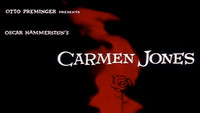
It was in this context that Saul Bass began working in film, first designing posters and logos, then migrating to title design on Carmen Jones (1954), where director Otto Preminger suggested he create a sequence based on his poster design. "At one point,” said Bass, "…Otto and I just looked at each other and said: 'why not make it move?' It was really as simple as that." (Bass on Titles, 1977)
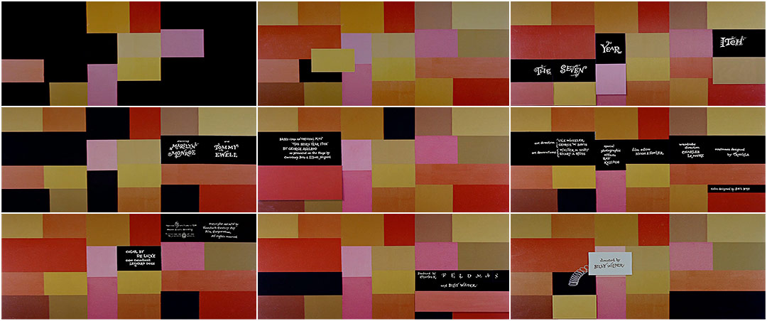
While his Carmen Jones titles are graphic in nature, The Seven Year Itch is Bass's first all-graphic sequence, and arguably his first signature title work, using stop-frame techniques to reveal the script title cards hidden underneath an evolving panel of animated earth-toned squares. Loosely choreographed to Alfred Newman's polyphonic score, the squares also play off each other's actions, giving the sequence a staccato pacing further broken by its intermittent editing style.


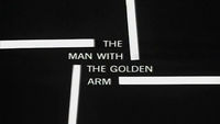
The Man with the Golden Arm poster
Just as central to the sequence are the jazz-inspired hand-painted titles of lettering artist Harold Adler. A giant of Hollywood lettering and a frequent collaborator of Bass's, including his previous Carmen Jones titles and the iconic The Man With the Golden Arm poster, Adler painted a total of 28 individual cards for the sequence, most comparable in size to a postage stamp.
The Seven Year Itch's critical and box office success were kind to Bass, cementing his A-list status and placing him at the center of a title design sea change, first apparent in the many comedies in the film's wake, then outwards as he migrated into thrillers and dramas. Supported by three other title projects in 1955 alone and a fruitful future relationship with Hitchcock, Bass's trademark blend of stop-frame animation, original type, symbolism, and graphic design would become common industry language by the end of the decade.
Titles Designed by: Saul Bass
Lettering: Harold Adler
Discover more Saul Bass

SAUL BASS: A LIFE IN FILM AND DESIGN
By Jennifer Bass and Pat Kirkham
Related
-
Carmen Jones
summary
-
The Man With The Golden Arm
summary
-
Anatomy of a Murder
summary
-

Grand Prix
summary
-

Seconds
summary
-

Goodfellas
summary