


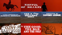
In this excerpt from our feature article A Fistful of Titles: The Westerns of Iginio Lardani, contributor BEN RADATZ discusses the opening to The Good, The Bad and The Ugly, designed by Iginio Lardani.
Lardani’s titles for the trilogy’s capstone The Good, The Bad and The Ugly are presented almost as an anthology of his previous two sequences, combining the pacing, duotone coloring, and silhouetted horsemen of his first entry with the kinetic typography of his second. He also incorporates high-contrast photography and liquid and sand effects, which are used both as optical mattes for shot transitions and as backdrops for the title cards.
It is Lardani’s most confident entry in the Dollars Trilogy, experimenting with multiple formats and techniques with little attempt to mask their origins. The typography in particular is decidedly anti-academic, mixing typefaces that would otherwise clash, harmonized here through their presentation and formal typesetting. Combined with Morricone’s genre-bending score, it is a tour de force, a love letter-cum-art film tribute to the Wild West.
To create many of the optical effects in the sequence, Lardani repurposed a multiplane Pace 1 camera, often used by cel animation studios, instead superimposing elements like oil, paint, and photography to build layered graphic composites. “The camera is set vertically and under it there’s a bright flat surface, illuminated with lights that come from below, or from above,” recalls Alberto, who often assisted his father. “…He used this as if it was a painting canvas, only the opposite way. He subtracted color from a black film. It’s as if you were doing an oil painting.”
Lardani was equally resourceful with other in-camera and practical effects, using water to guide the paths of ink trails and coffee grounds to simulate blowing sand. “He poured some coffee powder and filmed it using this high-contrast film and the camera reversed,” said Alberto. “Basically, he placed the coffee and filmed it with the camera upside down. It looked as if the wind was taking it away.” He also fixed hand-tinted filters to the camera, reducing the amount of post-coloring needed to create the sequence; simulated aging was accomplished by re-photographing film stills through panes covered in ochre jelly. “Simple in a way,” said Alberto, “but the important thing is that he carefully considered the result. Because now this sort of thing does not have the same effect… you can do anything electronically, but you should think that these were very peculiar things. They were not seen anywhere else.”
Though not explicitly credited, it is assumed that Lardani is also responsible for the standalone title cards found within the film, designating which players are indeed the good, bad, and the ugly.

Image Set: The first set of standalone title cards featured in the movie, in the order in which they appear, likely lettered by Iginio Lardani

A standalone title card from the second set, which appears toward the end of the film. These title cards appear in the same order as the previous set, but the colours are changed.
Read more about Designer Iginio Lardani and the Dollars Trilogy in our feature article A Fistful of Titles: The Westerns of Iginio Lardani
Title Design: Iginio Lardani
Music by: Ennio Morricone
LIKE THIS FEATURE?

HELP US KEEP SHOWCASING GREAT TITLE DESIGN. BECOME A PATRON THROUGH PATREON.
Related
-
A Fistful of Titles: The Westerns of Iginio Lardani
feature
-
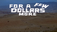
For a Few Dollars More
summary
-
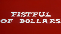
A Fistful of Dollars
summary
-
The Untouchables
summary
-
Butch Cassidy and the Sundance Kid
summary
-
Face to Face
summary