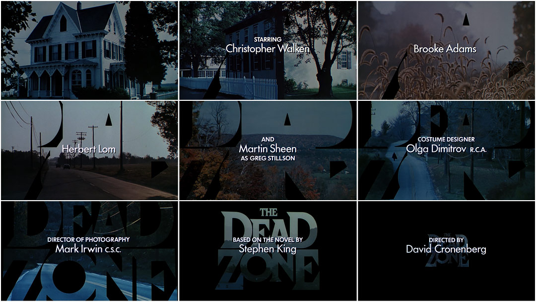


Black shards slowly fade in, superimposed on scenes of placid suburban homes. The pieces are eerie, disjointed, coming into view in a puzzling way. The negative space of the title typography instills a sense of slow encroachment, straddling that grey area between what's present and what's just beyond our grasp.
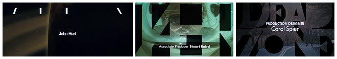
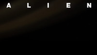
Throughout the ’80s, Title Designer Richard Greenberg often used type in this way, both as structure and as obstruction, typographically setting the tone for the film’s motifs. The titles for David Cronenberg's The Dead Zone are a kind of parallel–inverse of an earlier technique used in 1980's Alien. Those titles feature a disjointed version of Helvetica Black, imbuing the opening with a sense of unease. The letters are broken into pieces, the space between them unsettling. Altered States, from 1980, uses another sans-serif typeface, a slightly modified ITC Avant Garde Gothic. The letters invade the space, becoming a lens for the scene, the tone almost stifling. This technique and the use of type as a lens can be seen again here, in The Dead Zone – this time, of course, in negative.
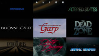
Alien, Altered States, and The Dead Zone title stills
Read more about the work of Title Designer Richard Greenberg and current RGA CEO Robert Greenberg in our feature article R/Greenberg Associates: A Film Title Retrospective.
Titles Designed by: R/Greenberg Associates, Inc.
Support Art of the TItle
Related
-
R/Greenberg Associates: A Film Title Retrospective
feature interview
-
Alien
summary
-
Superman
summary
-
True Lies
summary
-
Blow Out
summary
-
The Untouchables
summary