Art of the Title

  • Title Sequences
  • Designers + Studios
  • Titles
  • Features
  • Designers
  • Studios

Recent

  • An Update from the Editor in Chief

    An Update from the Editor in Chief

    An update from Art of the Title's Editor in Chief

    View article

  • Top Five: Chloe Okuno

    Top Five: Chloe Okuno

    Director and screenwriter Chloe Okuno discusses her favorite title sequences including horror from the '70s  and '90s and how important sound design is for setting tone

    View article

  • Liaison

    Liaison

    We dive into the latest from title designer and Emmy nominee Saskia Marka for sultry thriller Liaison

    View article

Recommended

  • Shōgun
  • Silo
  • The Beekeeper
  • Beetlejuice
  • Zardoz
  • Batman
  • Enemy
  • He Got Game

Classic

  • Casino
  • It’s a Mad Mad Mad Mad World
  • The Good, the Bad and the Ugly
  • Medium Cool
View all features View all titles

Designers

  • Aaron Becker •
  • Aaron Sorenson •
  • Alan Williams •
  • Alejandro Damiani •
  • Allison Brownmoore •
  • Alva Lundin
  • Amanda Koh •
  • Ana Criado Zahonero •
  • Andrew Doucette •
  • Angus Wall •
  • Anna Lindqvist
  • Anthony Farac
  • Anthony Goldschmidt
  • Arisu Kashiwagi •
  • Art Clokey
  • Audrey Davis •
  • Barbara Laszewski Garner •
  • Belinda Bennetts
  • Ben Conrad
  • Benedetta Cappelloni
  • Ben Radatz •
  • Ben Smith •
  • Beth Li
  • Betty Green •
  • Bhakti Patel •
  • Bill Kroyer •
  • Bonnie Siegler
  • Brian Mah •
  • Bryce Wymer •
  • Catalina Matamoros Puerto
  • Charles de Lauzirika
  • Chuck Braverman •
  • Claire Typaldos
  • Clarissa Donlevy
  • Clemens Wirth •
  • Daniel Kanemoto
  • Daniel Kleinman •
  • Danny Yount •
  • Dan Perri •
  • Darius Ghanai
  • David Clayton
  • David Daniels •
  • David Fincher •
  • David Penn
  • Dean Wares
  • Deborah Ross
  • Derek W. Hayes •
  • Don Record
  • Douy Swofford
  • Drew Goddard •
  • Duarte Elvas •
  • Edd Kargin •
  • Edgar Wright •
  • Elaine Bass •
  • Elinor Bunin Munroe
  • Ellen Kahn
  • Ennio Morricone
  • Eric Anderson •
  • Erin Sarofsky •
  • Ernest D. Farino
  • Etsuko Uji
  • Felix Soletic •
  • Fernando Domínguez Cózar •
  • Filipe Carvalho •
  • Florence Deygas •
  • Francisco Sánchez de Cañete •
  • Frank Hillsberg
  • Galen Johnson •
  • Gareth Edwards •
  • Gareth Smith •
  • Garry Tutte •
  • Garry Waller
  • Garson Yu •
  • Geefwee Boedoe •
  • Geoff McFetridge
  • Grace Kang
  • Guilherme Marcondes •
  • Handel Eugene
  • Harold Adler
  • Hassan Rahim •
  • Hattie Stewart •
  • Hazel Baird •
  • Heather Brantman
  • Heidi Berg •
  • Helen Greene •
  • Henry Chang •
  • Henry Hobson •
  • Howard Nourmand •
  • Hugo Moss •
  • Iginio Lardani
  • Ilgi Candar
  • Jack Cole
  • James Baxter
  • James Ramirez •
  • James Ransom •
  • James S. Pollak
  • Jamie Caliri
  • Jamie McBriety •
  • Jared Hess •
  • Jarik Van Sluijs •
  • Jason Doherty •
  • Jay Bond •
  • Jay Johnson
  • Jean Fouchet
  • Jean-Luc Godard
  • Jeff Han •
  • Jeffrey A. Okun
  • Jenny Lee •
  • Jeremy Cox •
  • Jeremy Lasky
  • Jessica Hische •
  • Jessica Ledoux •
  • Jim Capobianco •
  • Jim Helton
  • Joan Lau •
  • Joel Hodgson
  • Joel Venti •
  • Johanna Weinstein
  • John LePore
  • John Likens
  • Johnny Kelly
  • John Wash •
  • Jon Poll •
  • Jorge Calvo •
  • Josh Schonblum •
  • Joyce N. Ho •
  • Julian van Mil •
  • Julien Widmer
  • Jurriaan Hos •
  • Karin Fong •
  • Kasumi Mihori
  • Kathie Broyles •
  • Kathy Zielinski
  • Kelli Miller •
  • Kevin Chandoo
  • Kevin Dart •
  • Kook Ewo
  • Krystal Sojourner •
  • Krystian Morgan
  • Kurt Mattila •
  • Kurt Volk •
  • Kyle Cooper •
  • Lauren Hartstone •
  • Laurent Brett
  • Leanne Dare •
  • Leanne Shapton
  • Lisa Bolan •
  • Lollie Ortiz
  • Lynda Kahn
  • Manija Emran •
  • Mara Smalley Midura
  • Marc Chartrand •
  • Marc Smith •
  • Marga Castaño
  • Margaret Dost •
  • Margherita Premuroso •
  • Marguerite Pomerhn Derricks •
  • Maribel Martínez Galindo
  • Mark Gardner •
  • Marlene McCarty •
  • Mary Meacham Hogg
  • Matt Bateman
  • Maurice Binder
  • Max Strizich •
  • Merijn Hos •
  • Michael Riley •
  • Michel François •
  • Michelle Dougherty •
  • Miki Kato •
  • Mimi Everett •
  • Mischa Rozema •
  • Moises Arancibia •
  • My Tran •
  • Nader Husseini •
  • Nadia Tzuo •
  • Nathaniel Park •
  • Neal Holman •
  • Nic Benns •
  • Nina Paley •
  • Nina Saxon •
  • Nirvan Mullick •
  • Olga Capdevila •
  • Olga Midlenko
  • Olivier Kuntzel •
  • Olney Atwell
  • Onur Senturk •
  • Oscar Wright •
  • Pablo Ferro •
  • Pablo González •
  • Pamela B. Green •
  • Patrick Clair •
  • Paul Donnellon •
  • Paul Julian
  • Paul Kim •
  • Paul McDonnell •
  • Pendleton Ward •
  • Penelope Gottlieb
  • Penelope Nederlander •
  • Peter Frankfurt •
  • Rachel Fowler •
  • Raleigh Stewart
  • Rama Allen •
  • Randall Balsmeyer •
  • Raoul Marks •
  • Richard Greenberg •
  • Richard Kenworthy •
  • Richard Morrison •
  • Richard Williams
  • Robert Brownjohn
  • Robert Dawson •
  • Robert Greenberg •
  • Ronald Searle
  • Sai Selvarajan •
  • Sally Cruikshank •
  • Sam Sparks •
  • Sandy Dvore
  • Saskia Marka •
  • Saul Bass •
  • Sekani Solomon •
  • Simon Cassels •
  • Simon Clowes •
  • Soyeon Kim •
  • Stefan G. Bucher
  • Stéphane Coëdel •
  • Stephen Faustina •
  • Stephen Frankfurt
  • Steve Fuller •
  • Steve Seeley •
  • Steve Tozzi
  • Steve Viola •
  • Susan Bradley •
  • Svenja Frahm •
  • Synderela Peng •
  • Tamsin McGee •
  • Teddy Blanks •
  • The Chiodo Bros. •
  • Tim Miller •
  • Tnaya Witmer •
  • Todd Hemker •
  • Tom Barham •
  • Tom Kan •
  • Upasana Nattoji Roy •
  • Victoria Vaus
  • Vijesh Rajan •
  • Wayne Fitzgerald •
  • Wenden K. Baldwin •
  • William Lebeda •
  • Xiaolin Zeng •
  • Yashoda Parthasarthy •
  • Yi-Jen Liu •
  • Yongsub Song •
  • Yuanchen Jiang
  • Zephyr
Grid view

Studios

  • 344 Design
  • Add a Dog
  • Alma Mater
  • Antibody
  • Aparato
  • Balsmeyer & Everett, Inc.
  • Big Film Design
  • Blac Ionica
  • Blue Spill
  • Blur Studio
  • Breeder
  • Chic & Artistic
  • Chiodo Bros. Productions
  • Click 3X
  • CREATOR
  • Curious Pictures
  • Digital Kitchen
  • Double Negative
  • DUCK Studios
  • Elastic
  • Ex Mortis Films
  • Filmograph
  • Flat-e
  • Framestore
  • Frederator Studios
  • Gentleman Scholar
  • Goldtooth Creative
  • Grand Jeté
  • Greenhaus GFX
  • Hornet Inc.
  • Huge Designs
  • Hush
  • Imaginary Forces
  • ISO
  • Laika
  • Laundry
  • leftchannel
  • Lipsync Post
  • Logan
  • Lucky 21
  • M & Co.
  • Me & the Bootmaker
  • Method Design
  • MK12
  • Molinare
  • Momoco
  • Nexus Productions
  • Nina Saxon Film Design
  • NuFrame
  • Oily Film Company
  • Pacific Title and Art Studio
  • Perception
  • Peter Anderson Studio
  • PIC Agency
  • Picturemill
  • Pixar Animation Studios
  • Plexus
  • Plucky
  • Prologue Films
  • R/Greenberg Associates (R/GA)
  • Rankin/Bass Productions
  • Rattling Stick
  • REANIMATION
  • Sarofsky Corp.
  • Saxon/Ross Film Design
  • Sci-FX Studio
  • Shine
  • Shynola
  • Smith & Lee Design
  • Smog
  • Struck
  • Studio Dialog
  • The Mill
  • The Morrison Studio
  • The Panics
  • Tomato
  • Troublemaker Studios
  • Twinart
  • VooDooDog
  • WERK
  • Weta Digital
  • Yellowshed
  • yU+co
Grid view
• Full interview available, click to view.

Signs (2002)

Signs
Swing away Merrill. Merrill... swing away.
—Graham Hess
  • Share
  • Tweet
  • Post
  • More

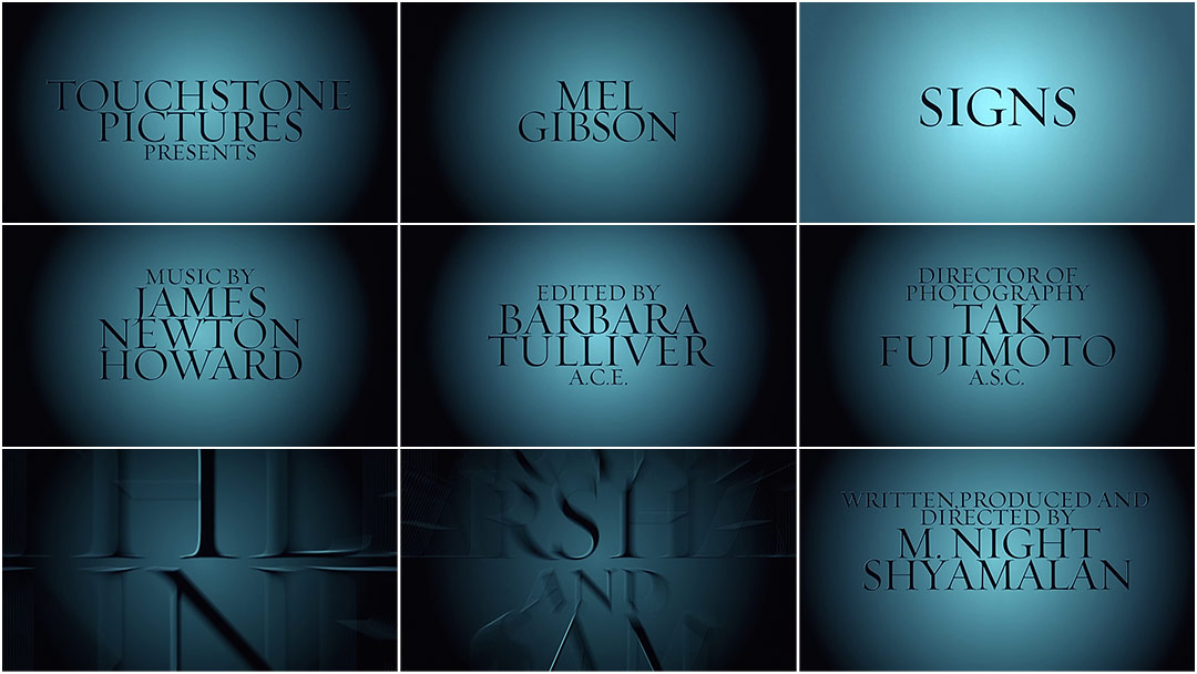
A sibilant breath is slowly drawn across catgut: in and out, up and down the strings of a violin. Matching the sighing notes of the unseen fiddler, a light diffuses out of the shadows before dissolving again – a malfunctioning flashlight in a darkened farmer’s field? Whistled by winds and bleated by horns, a frantic three-note motif replaces the calm respiration. Something is out there in the blackness. Bold words are glimpsed fleetingly in the flickering light, like names shouted into the empty night.

Employing only text, light, and shadow – along with James Newton Howard’s alarming and Hermannesque main theme – the title sequence for M. Night Shyamalan’s Signs relentlessly increases the tension before anything remotely suspenseful has even happened. Though it finishes on a name now synonymous with cinematic twists, Picture Mill’s main titles have a gleefully old fashioned tone that lays the groundwork for Shyamalan’s surprisingly twist-free scary movie opus.

  • Summary
  • Credits

Creative Director WILLIAM LEBEDA revisits his work on the opening titles and discusses their creation at Picture Mill.

WL: I got a call from Night and the editor Barbara Tulliver asking if I could take a look at the titles for Signs. I had done the titles for The Sixth Sense and he was looking for some fresh ideas for his new movie.

They had a temporary credit sequence mocked up with the music, but they just weren’t feeling it. He sent me – on a VHS, I think! – the temp sequence and the amazing James Newton Howard score. It had such a strong Bernard Herrmann vibe, but it just wasn’t being used to its full potential.

I asked Night if I could see the movie, but he refused, saying that it would be better if I saw it in the theater with an audience. I had seen the trailer, and knew it was vaguely about aliens and crop circles, but that was it. But the trailer was great – and scary. It felt more like a classic thriller… long shadows and creeping dread.

Signs is very much a classic monster movie in a modern setting and I think the titles capture that tone perfectly.

When I design for score-based sequences, I listen to the track over and over. And I think that Herrmann-inspired score sunk in permanently at some level… even now I can play it over in my head. And because the score was so critical, we decided to do short animation tests rather than boards. Boards wouldn’t capture the drama of the animation combined with the score, and that was the biggest part for me.

We did three or four tests for different concepts. We explored some super graphic stuff with abstract crop circles, and one concept that was 3D text moving into and out of a light source. That 3D one is still something that I refer to for other projects, even though Night didn’t choose it. We explored a variety of fonts that were reminiscent of the trailer work as well as some others that were more neutral, so the animation could really shine. Everything we presented was in a really reduced palette, either grayscale, black and white, or with a tiny hint of red. Almost no color at all.

Night really liked all of the other concepts, especially Epiphany and Revelation. But Requiem was such a strong statement, the boldness matching the boldness of the score, that there really wasn't much of a contest. Revelation is the 3D one that I still refer to... it's really special.

Five original title animation pitches from Picture Mill, from 05/23/02

The one Night chose couldn’t be more classic… it would be equally appropriate on a ’40s film noir as it is on Night’s sci-fi thriller. Signs is very much a classic monster movie in a modern setting and I think the titles capture that tone perfectly.

Around the same time as Signs, I think there was a lot of energy to make type either very small or distressed or adjusted thematically in some way – like crosses for “T”, that kind of thing – which is completely awesome. But something about the scale of that theme was demanding big type, as big as I could make it and still have the multiple-name cards fit on-screen.

I wanted something big on screen, but not horsey. And the thin Helvetica cuts feel very fashion-y to me. I wanted something a little gothic, like a horror movie, so I looked into thin serifs. And I finally settled on Requiem from Hoefler. I think I selected the display cut to have that razor edge sharpness, while being so large on screen. Coincidentally, I often think of Requiem as a slightly religious typeface, and Signs is very much a movie about faith. But there was no way for me to know that, since I hadn’t seen the entire movie. Sometimes things just work out that way.

Ms. Tulliver called and said she loved her credit because it came smashing in over her head in the theater!

Night edits his movies in Philadelphia, so we had to send VHS or ¾” tapes back and forth. Ridiculous! I frankly don’t know how we got anything done back then. Certainly it was a slower process, especially cross-country.

In terms of time, Signs is one of those sequences that came together very quickly. Once I had laid out the type for the screen, I worked closely with an animator and we talked about the feeling of the score, how it felt like motion; the slow and eerie dissolves, hard cuts, and fast, fast zooms were all in the rhythm. We just listened closely and animated carefully to maximize the drama that was already in the score. Ms. Tulliver called and said she loved her credit because it came smashing in over her head in the theater!

ID magazine

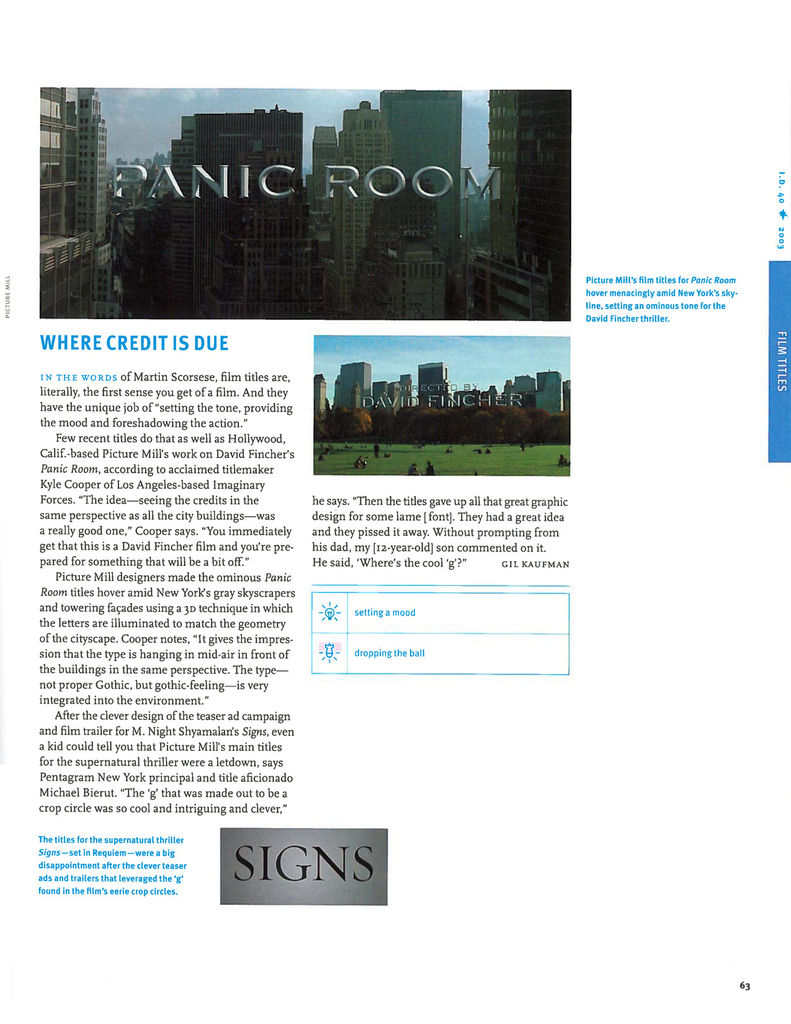
ID's 40 Best (and Worst) Designs of the New Century article on Panic Room and Signs

Regarding the color, the original pitch was black and white, and it was presented and approved in black and white. And then in final color timing, there was concern that the release prints wouldn't stay true greyscale. This was way before DI and digital projection, of course. And the prints would veer to green – or worse, pink or yellow – through the print process. So it was decided to make them a more deliberate color, and the cool blue grey was the choice. I never think of them as blue grey, even though in the theater – and on DVD – they are.

I had the opportunity to meet with Night in LA to show him the final version. He was in town while they were recording the score and I was able to be in the recording studio while the orchestra played the main title theme, while my temp animation played on screen behind the orchestra. Just fantastic. And after all that, I showed him the final version on ¾” tape in a small side room. And that was that! Kind of anticlimactic after seeing it performed live, certainly.

A couple of remarkable things came from creating the titles for Signs… first, it cemented a long working relationship with Night Shyamalan. I have designed all of the titles for his films since, and have had many occasions to work with him, including directing Second Unit on The Happening.

The second is far more dubious and hilarious. Signs came out the same year as Panic Room, and ID magazine ran a special Best and Worst edition the following year. And Picture Mill was named both the best AND worst title designer of the year for our work on Panic Room and Signs, respectively. Michael Bierut was quite critical of Signs, citing all sorts of missed opportunities. I am very proud of this. It might be my finest hour.

View the credits for this sequence

Main Titles Designed & Produced by: The Picture Mill
Title Designer: William Lebeda
Animator: Josh Novak

Music by: James Newton Howard

Support Art of the TItle

Related

  • Glass

    Glass

    summary

  • Split

    Split

    interview

  • The Untouchables

    The Untouchables

    summary

  • Alien

    Alien

    summary

  • Total Recall

    Total Recall

    summary

  • I, Robot

    I, Robot

    summary

Title sequence

  • Production Studio

    Picturemill
  • Title Designer

    William Lebeda
  • Category

    Film
  • Styles

    graphic, main title, modernist, typographic
Signs
  • Film Director

    M. Night Shyamalan
  • Release Date

    August 2, 2002
  • Aspect Ratio

    1.85:1
  • Studio

    Touchstone Pictures
  • Country

    USA
  • Language

    English
  • Reviews

    Reviews on Letterboxd
  • IMDb has full details

Article

  • Writer

    Will Perkins
  • Editor

    Lola Landekic
  • Published

    January 8, 2013

Subscribe to Art of the Title

  • Twitter
  • Facebook
  • Instagram
  • RSS

Support the site

  • About
  • News
  • Titles
  • Features
  • Designers
  • Studios
  • Sponsorship

Art of the Title is made with ❤ in Toronto and is supported by readers like you.

© 2007–2025 Art of the Title, LLC. All rights reserved.
Works appearing on Art of the Title are the property of their respective owners.

  • Gold Sponsor

    NOW OPEN! LET’S TALK

  • Silver Sponsor

    NOW OPEN! LET’S TALK

  • View full size
×