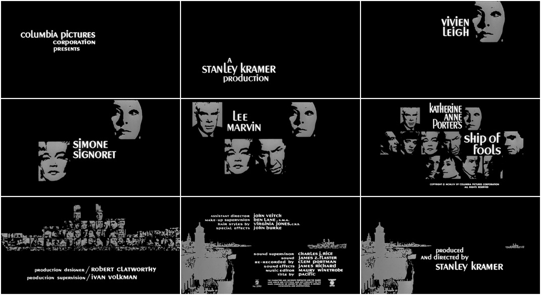


Director Stanley Kramer’s 1965 film Ship of Fools is a movie lost at sea. Despite being one of Kramer’s most critically acclaimed movies and winning two Academy Awards (Best Cinematography and Best Art Direction-Set Decoration, both in the now defunct Black and White categories), the film has largely faded into obscurity.
Made between It’s a Mad, Mad, Mad, Mad World (1963) and Guess Who’s Coming to Dinner (1967), Kramer’s Ship of Fools has all the hallmarks of a classic mid-60s Hollywood production: prestigious source material in Pulitzer Prize-winner Katherine Anne Porter’s 1962 novel of the same name; a sprawling international cast featuring the likes of Vivien Leigh, Lee Marvin, Simone Signoret, José Ferrer, Oskar Werner, and George Segal to name a few; and a high-gloss opening title sequence typical of the era.
Set in 1933, Ship of Fools follows the voyage of an ocean liner from Mexico to Germany. The title sequence introduces the audience to the vessel’s passengers and crew – the captain, a countess, the ship's doctor, a troubled divorcée, a young couple, a retired athlete – a microcosm of Western society in the lead-up to World War II. One by one their faces fade into view, arranged by class and creed, the portraits slowly forming the outline of the great liner.
Designed by Richard “Dick” Ellescas and produced by studio Pacific Title (credited as simply “Pacific”), the Ship of Fools title sequence was one of ten feature film projects handled by the prolific title design house in 1965. Ellescas, who was hired by Wayne Fitzgerald to help with the huge volume of work the studio was taking on at the time, would later become better known for his distinctive poster and album illustrations. His work here echoes the allegory central to Ship of Fools, setting the scene for a scathing commentary on the people and attitudes that allowed the Second World War to happen.
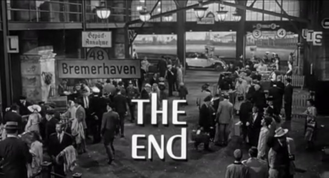
SUPPLEMENTARY: Ship of Fools (1965) end title card
Title Design: Pacific Title and Art Studio (as Pacific)
Head of Art and Design Department: Wayne Fitzgerald
Title Designers: Richard Ellescas
Music: Ernest Gold
Support Art of the TItle
Related
-

The Pride and The Passion
summary
-

It’s a Mad Mad Mad Mad World
summary
-
Murder by Death
summary
-

Auntie Mame
interview
-

Chinatown
title only
-

Bonnie and Clyde
title only