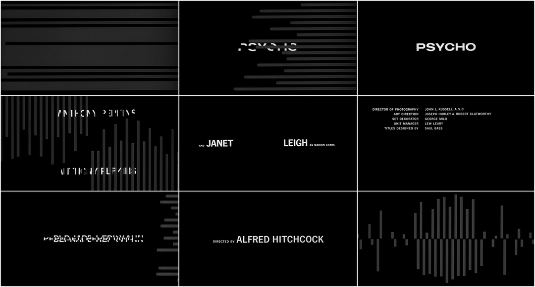


It's safe to say that after half a century of critical writing about Psycho, there are few stones left unturned. The same can also be said of Bass' now infamous opening title sequence. Designed on a $21k budget, it is likely his most significant and familiar accomplishment in the eyes of cinephiles and laymen alike.
Admittedly, Bass does not give his audience much to work with. Like the minimalists who came before him and his modernist contemporaries, Bass' favorite route from idea to execution was usually the shortest — and there are few routes shorter than the one taken in Psycho. He uses a series of simple white bars to usher in the sans-serif titles and escort them back out again. Although these lines come from different areas of the screen, they never once break formation or intersect. Likewise, the animation of these lines and the type itself are just as reserved — every object has a path from which it does not deviate. On, off, left, right, up, down, black, white — those are Bass's self-imposed restrictions on Psycho, and he employs them with dramatic effect.
There are two major currents running through Psycho: contrast and tension. Antagonist Norman Bates' dual personality provides the contrast, and the caper (or the Macguffin, as Hitchcock would have called it) brings the tension. In many ways, the film succeeds because it doesn't stray far from these core elements. There is very little comedic relief, for example. Romance and interpersonal relationships are little more than props. As far as plot husbandry goes, Psycho is about as streamlined and fuel-efficient as they come.
Therein also lies the brilliance of Bass' title sequence. In the space of a few short minutes, with his minimal toolkit and Bernard Herrmann's jagged score, Bass creates a parallel visual tension to the film that tells the audience everything they need to know about the plot, without saying much of anything at all. He artfully sets the tone by asking the viewer to read between the lines -- quite literally -- but he also asks that we read into them.
Title Designer: Saul Bass
Music: Bernard Herrmann
Discover more Saul Bass

SAUL BASS: A LIFE IN FILM AND DESIGN
By Jennifer Bass and Pat Kirkham
Related
-
The Title Design of Saul and Elaine Bass
feature
-

Ocean’s Eleven
summary
-

It’s a Mad Mad Mad Mad World
summary
-

Vertigo
summary
-

Bunny Lake is Missing
summary
-

The War of the Roses
summary