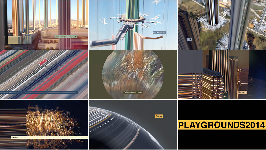


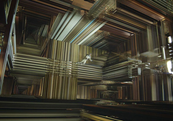
In bif’s magnificent title sequence for Playgrounds Festival 2014, glitch is elevated to craft. A cityscape is stretched and shorn, the subject torn loose, like someone placing a thumb and forefinger on a .jpg and pulling at its seams. Blocks of colour demarcate the space, moving from light to dark. Shapes stream in all directions, planes, trains, and automobiles gliding through vibrant Koosh ball landscapes of fluttering filaments.
As buildings pour into each other, the sequence drifts further away from the intimacy of the urban world. Distance and dimension meld together. The lines are pulled taut and then the title, cold and sober, shuts it down. This surreal journey, meticulously designed, is an exploration of form and technique and a joy to behold.
A conversation with Designers FABRICE LE NEZET and JULES JANAUD of the directing collective bif.
So, before we dive into the making of this sequence, can you tell us a little about your collective? What is the link between bif and The Mill?
Fabrice: Bif is a directing collective based in London who are represented by Mill+ – The Mill’s design and content origination division. We’ve worked at The Mill for the past 10 years.
So how did the Playgrounds Festival opening titles come to you? How did this all start?
Fabrice: We met Leon [van Rooij], the organiser, a few years back when he invited us for a talk at the festival, so a few months ago, we decided to contact him to see if he had someone in mind for the next titles.
Jules: We really wanted to work on a title sequence and Playgrounds was the perfect opportunity.
Fabrice: The brief was quite open: reflect the spirit of Playgrounds Digital Festival.
Jules: A few words we were given from Leon, including “experimental,” “artistic,” “eclectic,” “fun,” “animation.” Basically for us… a digital playground!
One of the main challenges was to come up with an original idea and also leave some room for experimentation. We decided to create a journey through surreal landscape made out of stretching pixels.

Mood boards exploring colour and atmosphere
What was your process for creating these titles? How did you capture the landscapes and the objects?
Fabrice: We started building a library of tests, exploring our concept in different ways before selecting the most convincing one. This is a full CG project based on photographs, which gave a realistic range of colour while being quite stylized.
Jules: We used various techniques to be able to stretch and animate the pixels in volume, using Maya software to create most of the shots.
Another challenge was to create something visually elegant and graphic but not too cold. We wanted to create a design piece, but something that wasn’t only pleasing to motion designers. Something that had humanity and emotion.

Early 2D render tests using landscape and city photographs
How did you work out the order of shots? Was there a structure or narrative you worked with, a system for treating each credit?
Jules: Knowing that we had to feature around 22 names in the sequence helped us to create the structure. We wanted the sequence to be abstract yet sophisticated.
Fabrice: We did some research first and then selected a few key shots as a base. We didn't restrict ourselves to a precise edit. We eventually came up with a minimalist narrative, a sort of journey through colourful landscapes.
Jules: Playing with the typography to feature the names was very interesting – we’ve seen so many unreadable titles in the past.
Have you seen the movie Interstellar? Its tesseract scene uses a similar kind of aesthetic – with objects leaving dimensional trails, or “world lines”. What do you think of that?
Jules: A lot of people mentioned the film to us so I had to go and see it.
Tesseract scenes from Christopher Nolan's Interstellar.
It’s definitely a coincidence, as the titles were actually released before Interstellar came out. I really enjoyed the film and I think it will be an ongoing theme and aesthetic. People will always want to try and stretch matter and time, no matter what!
When did the sound design and music come into play?
Fabrice: We were put into contact with Gavin Little from Echolab, and after two weeks of production, we sent him an animatic and explained the type of atmosphere we had in mind. He quickly understood our vision and came up with a proposal.
Fabrice: Gavin got the idea very quickly. We wanted more of an ambiance than music. It wasn’t an easy task because the schedule was tight and we were constantly changing the edit.
Jules: As well as ambient sound, we wanted a woman’s voice similar to that on the TV or radio in the background, but nothing too literal. Gavin played us a distorted Russian woman’s voice, which sounded perfect; strange and surreal whilst also bringing a human aspect to the piece.
Fabrice: Most of the sound design was done during the last week of production, after the edit had been locked.
We only had five weeks to find the ideas and produce the whole piece. It was a short amount of time considering it was only the two of us. We had to be clever and come up with efficient ideas.
How big was your team overall? Did you pull in anyone else?
Fabrice: The team consisted of just the two of us with final grading by Mill colourist Matthew Osborne.

Image comparisons: before and after visual effects
What is a title sequence to you? What do you think these titles lend to the festival?
Fabrice: Over the last 10 years, titles have become a method of visual experimentation for motion designers. When we got the opportunity to create a sequence for Playgrounds, we thought it would be a great challenge to embrace and a way to develop ourselves as motion designers.
Jules: Festival titles are very popular in motion design nowadays; the real challenge is to innovate. Titles are open to creative interpretation. Festival titles are almost like a standalone piece, whereas titles for TV and film are more of an introduction to someone else’s aesthetic.
Was this the first title sequence for you two?
Fabrice: Yes. Hopefully, we will have the opportunity to do another one soon!
Jules: It was a great experience and we’d love to do more.
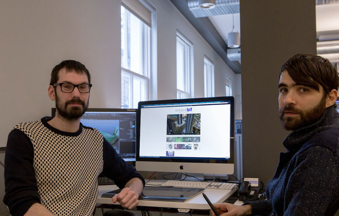
Team bif: Fabrice Le Nezet and Jules Janaud
Support for Art of the Title comes from
CINEMA 4D BY MAXON
Featuring an Unmatched Live 3D Pipeline with Adobe After Effects CC.
Related
-

Analogue/Digital Brisbane 2013
interview
-
Skyfall
interview
-
OFFF 2013 Cincinnati
interview
-

Deus Ex: Human Revolution
interview
-

Up in the Air
interview
-
Top 10 Title Sequences of 2014
feature
-
Top 10 Title Sequences of 2015
feature
-
Top 10 Title Sequences of 2016
feature
-

Top 10 Title Sequences of 2017
feature
-

Top 10 Title Sequences of 2018
feature
-
Top 10 Title Sequences of 2019
feature
-
Top 10 Title Sequences of 2020
feature
-
Top 10 Title Sequences of 2021
feature
-
Top 10 Title Sequences of 2022
feature