What would you do if suddenly confronted by your doppelgänger?
Most of us have contemplated this scenario at least once in our lives, but few of us would go down the dark path taken by Orphan Black’s Sarah Manning (played by the chameleon-like Tatiana Maslany) after she’s put in that very situation. In the show’s pilot episode, Sarah briefly and traumatically encounters herself, so to speak, eventually assuming the identity of a recently deceased double. From there it's down a rabbit hole of clones and conspiracy that challenges everything Sarah thought she knew and threatens the natural order of things.
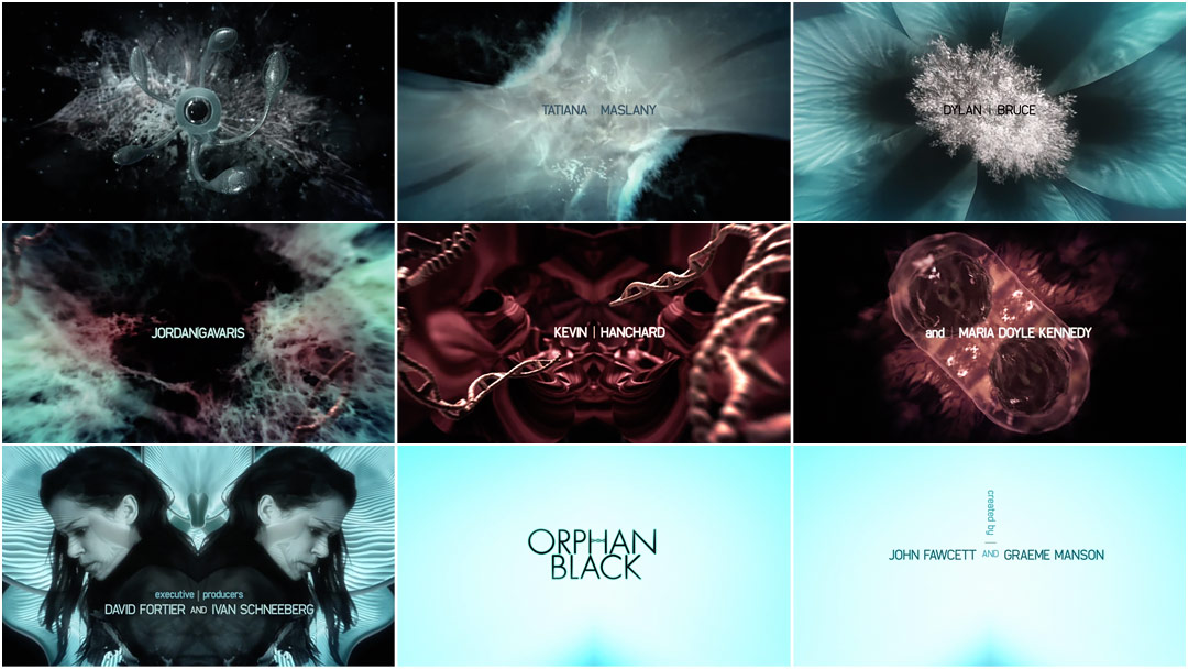
In Technicolor’s opening titles for Orphan Black, what begins as an apparent journey through the cosmos – complete with an alien encounter – soon becomes a twisting, abstract journey through inner space. Manipulated genetic material grows, divides, morphs and mutates, revealing the biological makeup of Sarah and her clones. Guided by a chorus of airy female voices and glitch hop courtesy of Two Fingers (aka Amon Tobin), this is a symbolic trip from not-so-immaculate conception to birth.
A discussion with Creative Director KEVIN CHANDOO of Technicolor Toronto.
Congrats on the big haul at the Canadian Screen Awards in January!
Thank you, Orphan Black cleaned up at the awards. Unfortunately, the Best in Main Title category was not present this year.
Give us a little background on yourself and your work at Technicolor Toronto.
After studying film and new media in university, I was compelled to find a job in the film and television industry, so I offered my services as a telecine assistant/tape operator. My role later transitioned to a designer/compositor, where I worked with many talented artists on feature and commercial content. It was during this time I experimented with my craft. Fifteen years later, I am still learning and exploring. I'm now the lead behind Technicolor Toronto’s Visual Effects and Broadcast Design department.
What was the first meeting about this sequence like?
It was interesting to say the least. I was invited to meet the show creators, John Fawcett and Graeme Manson, for whom I am very grateful for the opportunity and their vision. It was a casual meeting to briefly discuss the show concept and brainstorm. The idea of cloning isn’t a new concept, but I was intrigued by the mystery of the show. I did have the opportunity to meet the team at an earlier stage to discuss other aspects of the series, which gave me further insight to the lead character and multiple parts.
Biology Professor John Bonner's microscope films show the curiously collective nature of slime molds.
Courtesy of Princeton University.
During the briefing some ideas and concepts were thrown around the circle:
Abstract, Twinning, Orphans, Dark, Poetic, Soulful, Biological Mystery, Human Evolution, Patent Human Genetics, Synthetic, Random Selection, Black Humour
We also viewed some videos, which assisted in setting the tone the creators were pursuing: slime moulds, "Crazy" by Gnarls Barkley, mushrooms, and Fight Club.
Were you able to watch any of the show's episodes to inform the design?
Production had just started shooting and no cuts were available at that stage. I just received the first two scripts. Trying to keep track of all the characters was a challenge, but the story quickly pulled me in. I really relied on the initial creative brief and references to inspire and focus the design.
Could you tell us about the original concept for the title sequence and how it was developed?
It was a bit overwhelming at first, trying to create a concept that would complement the show in a cool way. I tried to keep certain guiding principles in mind during development. How to create a pretty blossoming flower based on fungus, was the first thing that jumped out at me. I felt this image was important to convey, for it was symbolic of Tatiana.
Some of the guiding principles were distilled from the initial client brief: Abstract, Human, Biological, Synthetic, Tatiana, DNA, Dark, and Poetic.

Original pitch concepts
Describe the progression from the initial mood boards to the final piece. What was the feedback process like with the show's creators?
There was a very good response to the initial mood boards, but the creators needed a clear walk through the sequence, since it was abstract and a lot was left for interpretation. A few frames were revised to help tell the story to our audience and the networks. Overall, the final sequence evolved, representing more human biology than botany.
The initial mood boards, though abstract, resonated with the clients. However, they were interested on what they all meant, how they transition and told the narrative. Revised boards and numerous animatics were used throughout the process. This really helped to distill the story and focus on the seamless transitions.
Initial “Embryo” animatic with temp music track “Genesis” by Grimes
Who did you work with on this title sequence and how big was the production team?
It was a relatively small yet talented team. Myself as creative director/compositor, Eli Guerron was the technical director/3D animator, Martin Krol did the 3D modelling, and Kate McColeman produced it.
Which tools and software did you use to put it all together?
We used Zbrush, Maya, Photoshop and After Effects loaded with various plugins.
When did Amon Tobin’s music come into play? Were you able to work with it from the start?
Amon’s music came late in the process. I ran with a few tracks from the initial brief that I played a thousand times to get me in the correct headspace... My usual practice. The two songs were "Genesis" by Grimes and "Crystal Math" by Ill Gates. Amon’s music was composed after a few versions of the sequence. Once received, there was some back and forth as I tweaked the comp to further marry the music.
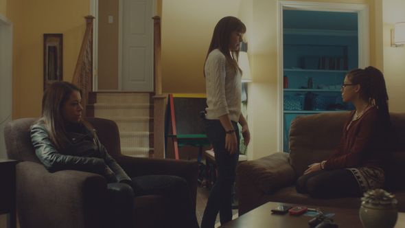
Orphan Black production stills featuring actress Tatiana Maslany in multiple roles.
Was there anything that took you by surprise when working on this?
I would say how supportive the executives, production, and networks were in creating an abstract sequence. Also, how a relatively simple design took weeks to visualize and tell the story we wanted.
What elements of the sequence are you most happy with?
I am most pleased with the opening shot and a particular part in sequence that the team and execs referred to as the ‘Vaginal Flourish’. I will leave that to the readers to determine.
There’s already an Emmy for television title design, but how would you feel about a possible Best Title Design category at the Oscars?
Being Canadian, I would first like to see Best in Main Title Design reinstated to the newly formed Canadian Screen Awards (CSAs). It would be inspiring to have Best Title Design represented at the Oscars considering the process, time, and sensibility put into design that is often taken for granted.
What are some of your personal favorite title sequences, either classic or contemporary?
Too many to list, but if I had to pick a few from past and present... Fincher’s The Girl with the Dragon Tattoo, True Detective and various titles from Kyle Cooper.
What excites you outside of design?
Travelling is exciting. Absorbing everything new around me that can be used as inspiration.
Support for Art of the Title comes from

CINEMA 4D BY MAXON
Featuring an Unmatched Live 3D Pipeline with Adobe After Effects CC

