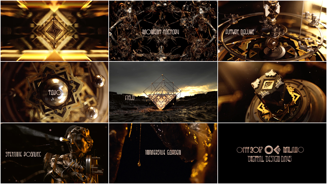


In the latest title sequence produced for creative festival OFFF, Director Onur Senturk presents an Art Deco-laced vision of a dark and twisting future where metallic figures contort into patterns and glowing machines operate with mystical serenity.
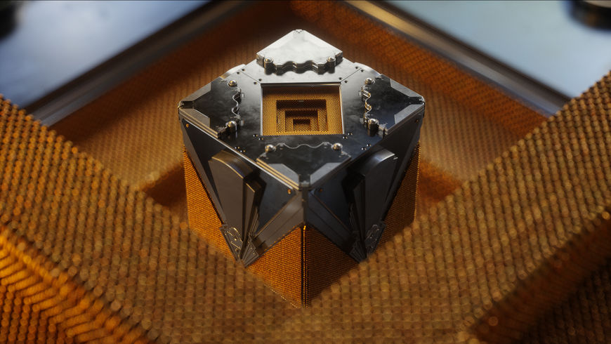
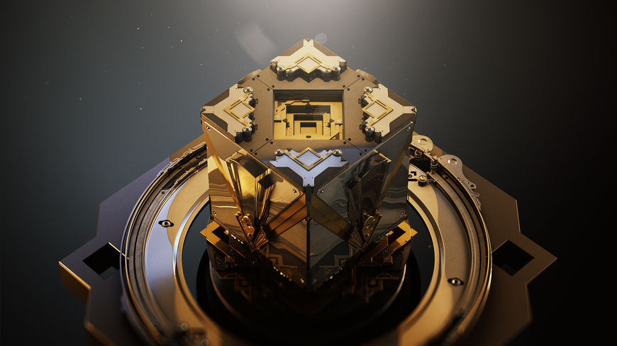
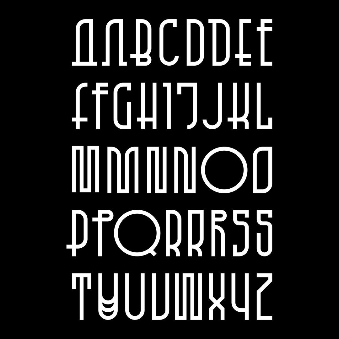
Like a cross between the smooth Kris Kuksi-inspired tableaux of Black Sails and the black ooze of The Girl with the Dragon Tattoo, with a dash of Deus Ex: Human Revolution, the sequence is a rotating world of mechanical forms on hollow, desolate lands and gleaming cityscapes. A series of textured cubes are reminiscent of the Transformers allspark, slowly spinning and repeating, while an android sports a projector oculus and a zoetrope hosts human figures leaping in infinite circles. Designer Craig Ward’s bespoke typography infuses the scenes with Art Deco flair as the obligatory names of festival speakers appear, providing cohesion and stabilization. The letters feature crossbars at their extremes, raised high and dropped low, giving them a lean and lanky appearance. The Os are perfect circles, gaping wide against the dark while the Ms shrug their wide shoulders.
In the world of festival title sequences, there is no budget, the work created through the good will and dedicated time of talented, hardworking craftspeople compensated only in exposure and travel stipends. It’s a privilege to be invited to create these sequences and a further privilege to have the resources to execute them. That these works are possible at all is a wonder, a testament to collaboration, the drive of a hungry heart, and the allure of an open brief.
A discussion with OFFF Milano 2017 title sequence director ONUR SENTURK and typeface designer CRAIG WARD.
Onur, this isn’t the first time you’ve created a title sequence for OFFF. In 2013, you created the opening for OFFF Cincinnati. How did you come to work on another for the fest?
Onur: These new titles exist because of a casual conversation between our sound designer Gavin Little and the event organizers. Other potential artists did not have time to do it and he mentioned me. Also, I was looking for an excuse to collaborate with Gavin again. So it was the perfect coincidence to do something together. Usually the brief for event titles is open to interpretation. Especially OFFF, which is about creatives – influencers around the world coming together.
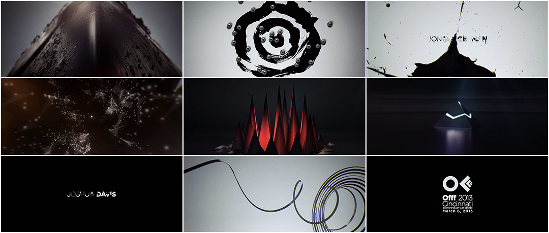
OFFF Cincinnati 2013 main titles, designed by Onur Senturk with typography by Ipek Torun
Craig, what is it about working in title design that attracts you?
Craig: I consider myself to be a storyteller and, whether it’s a book cover, an advertising slogan or an editorial headline, the brief for me is the same: to pull apart a story and try to find something visual with which to convey a mood or a theme. Title design offers you exactly that opportunity and I like that it requires you to think about music, pacing, editing, and form also. A lot of my headline work has a five-second window in which to be read, whereas a title sequence can be a few minutes long and that feels like a nice luxury.
Festival titles can be pushed anywhere you want in terms of style and tone.
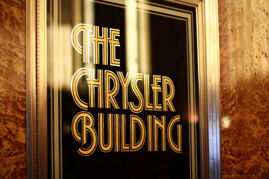
Image Set: Art Deco style and typography references and inspiration images
Initial typography test by Craig Ward
What do you like about creating title sequences for festivals?
Onur: There is a big freedom that comes with it. On commercial projects, there are many guides to follow, the brand strategy and mood is already limited. There is not much room to experiment and everything is there to convey a message from a brand. Festival titles can be pushed anywhere you want in terms of style and tone. There is little or no interference from the event. The only downside is that financially it does not bring anything.
—Onur SenturkAs creatives we are living in a world only proven by what is done by us. In order to get different creative projects, stepping out of your comfort zone becomes mandatory.
So compensation is out of the equation when it comes to this work.
Onur: Yes, therefore there were no restrictions. Since there is no budget that binds us together, the client pressure was not there. It was a perfect excuse to create a collaboration and I invited the artists I wanted to collaborate with. As creatives we are living in a world only proven by what is done by us. In order to get different creative projects, stepping out of your comfort zone becomes mandatory.
In your last piece for OFFF, in 2013, you said you were influenced by 2001: A Space Odyssey. You also mentioned Tarkovsky’s Stalker and Maya Deren’s Meshes of the Afternoon as favourites. Did you have film influences for this piece?
Onur: Yes. I always watch old and new together. Overall these titles are my attempt to build a world, using the Art Deco style as a unifying element. During and before production, I watched all of Guillermo Del Toro’s films, some Steven Spielberg films, some Ridley Scott, with documentaries and commentaries, trying to understand how they create and project their ideas to the screen.
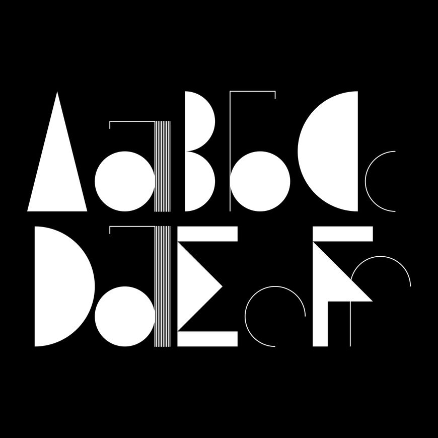
Craig: The simplicity of the Alien title sequence I think was an inspiration for my own letterforms here, and sets the mood perfectly.
Alien (1979) main titles, designed by Richard Greenberg
Onur: For sound and music, Bernard Herrmann was my only clear reference. Gavin and our composer Steve Lynch took the reference and built something new in the spirit of the ’60s and ’70s.
So how did you start? Can you walk me through your process?
Onur: Sure. For a while I was imagining doing an Art Deco-themed project and using metal, gold, and hard surface materials. My workflow starts with gathering references and preparing layout animation and editing before production. My second aim was to bring artists I admire to the project and create a great collaboration. First I asked Maxim Goudin. I like his style and approach, especially his design of machinery and his concept art. Craig Ward is one of the best graphic designers living today and I wanted his contribution as well. I emailed him with solid references and Art Deco style.
Craig: It was very much a moving target at that point but I was excited by the themes and what I saw. Onur was looking for something very futuristic, inspired by Art Deco. Some of the images referenced Fritz Lang’s Metropolis so I was looking for a way to imagine the evolution of Art Deco typography.
—Onur SenturkOverall these titles are my attempt to build a world, using the Art Deco style as a unifying element.
Metropolis (1927) main title sequence, designed by Erich Kettelhut
Craig: Some of my early sketches were too fussy and, as it happened, the style of the imagery became darker, more organic and intense as they progressed so it felt appropriate to simplify the type. We had talked about creating three-dimensional text and placing it in-situ in some of the vignettes and distressing, distorting, or destroying it but the “less is more” maxim proved correct as ever.
Behind-the-scenes clip from the tentacle shoot
Onur: Later on, I invited my olds friends Omer Kasimoglu and Ilhan Yilmaz and they joined. Murat Kilic joined. Our DOP Mehmet Basbaran – I’ve known him for years – he helped, especially on the live-action portion. Also Aynur Kazaz started with small contributions, like shooting behind the scenes, and later on solved some of the problems in the shoot.
During the layout process, I prefer to be quick and try to cover the entire duration as much as possible. It becomes easier to see where we are in the process and where is the failure. Maxim helped with the layout. After 14 or 15 versions of the edit, we had the timing locked.
CG/VFX started early in order to give more time for the preparation of the live-action segments. Most of the shots were rendered and composited beforehand. The orrery and cubes were designed by Maxim, so most of the objects feature his touch.
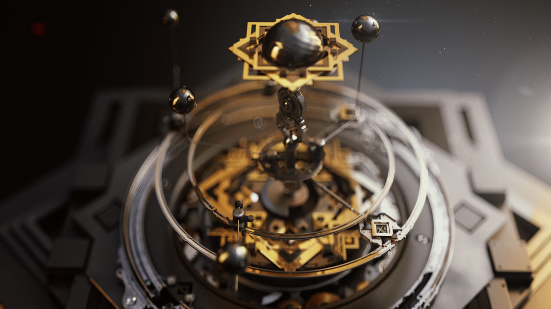
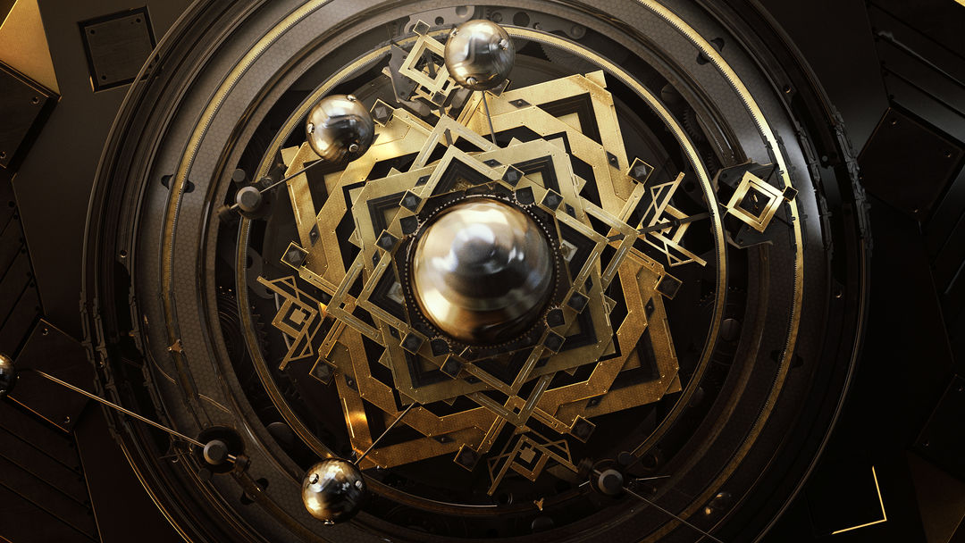
Orrery animation set-ups
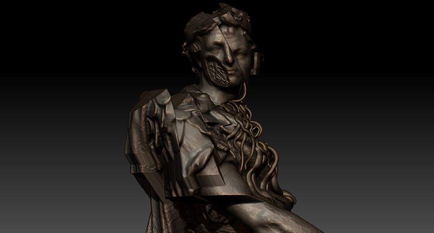
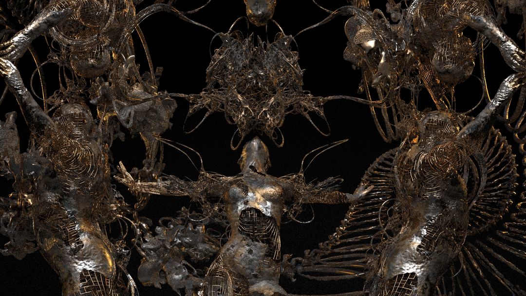
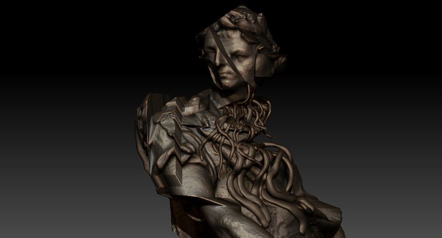
Onur: He also animated and did lighting and look development on materials. The city was designed by Murat, and then lit, rendered and composited by Ilhan. I designed the 3D zoetrope and did some of the 3D sculptures in the beginning.
Zoetrope animation test
Zoetrope animation test clips
Onur: For the live action I wanted to replicate the same lighting and we established that with two or three light sources. The sculptures were made by Omer and they were considerably small in size. We cheated by using camera and lighting to show them bigger than they were. We used a RED Epic with Prime Lenses and our DOP had experience with the equipment so with good framing, adjustments to the lighting and lack of background, I think we achieved the goal.
Onur: The first shooting day was one of the toughest set days I’ve ever had. During the shoot, most of the mechanisms did not work, the makeup took longer than it is supposed to – approximately seven hours – and some props were missing or never made in the first place.
Behind-the-scenes clip of arm special effects
Behind-the-scenes clips of body special effects
Onur: In order to compensate, we used more sculptures from Omer. His art saved us. It made me look from a different and wider perspective. On set you have to be one with the crew, working and reaching towards a single goal, to do the best you can within the given timeframe. Discipline and reliability is what makes a difference, especially in a filmmaking environment.
After the troubled shoot I took the materials and edited it all together in a couple of days. I composited some of the shots within the same week, hopped on the plane and off the plane in Milano to finish the titles in the hotel room.
Did you have a back-and-forth for the typography? How did that happen?
Onur: Not so much, actually! Craig did some variations on the type. Two or three versions later, he came up with what we have now. My only practical reason for using Art Deco strongly on this piece was in case some vignettes slip and go out of tone, I can balance it with a strong visual style. Under a strong visual language, it works.
Which tools did you use to create the font?
Craig: The font was drawn in Illustrator, and I created a quick and dirty working .otf file using the Fontself plugin so I didn’t have to hand-set every name. I set myself a very rigid grid with a purely geometric toolkit of parts to build the letters. The decision-making aspect, in terms of letter construction, is really fun. The style of the font sort of determined that a few letters didn’t sit well next to one another or became repetitive – like in a name with three Es – so it was useful to have alternates for breaking things up, adding interest, or just to play with. I always have a lot of fun with As and Qs.
And finally, was there anything that took you by surprise when working on this sequence?
Craig: The pace at which the team was able to create tests and pull together very detailed models alongside the CG imagery was pretty astounding. I thought the project would be a more drawn-out affair when Onur told me there was to be a mix of live-action effects and CGI, but it was determined by a tight deadline so everyone just went at it and did what they do best. The project was a pleasure and even if I never get another approach for title design, this was a great one to be involved with.
Support Art of the TItle
Related
-

OFFF Barcelona 2017
summary
-
Deus Ex: Human Revolution
interview
-
OFFF Porto 2015
interview
-
Bicentennial Man
summary
-
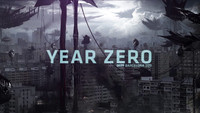
OFFF 2011 Barcelona "Year Zero"
interview
-
Agatha Christie's Poirot
summary