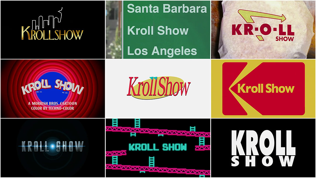


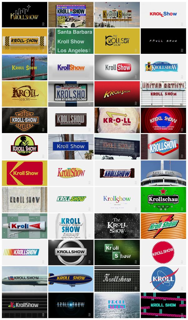
A rapid-fire postmodernist piss-take, the brief but striking main titles for Kroll Show are as much a mission statement for actor Nick Kroll’s sketch comedy show as they are a checklist of pop cultural touchstones. In dozens of dubstepping blasts, TGIF broadcasting, famous landmarks, reality television, blockbuster cinema, advertising, junk food, and corporate America are all roasted in a pithy cavalcade of Kroll-ified logos, brands, and signage. Full of fine print easter eggs for pause-pressers, the sequence strobes at the audience and ends before they know what hit them.
Jonathan Krisel, Kroll Show series director and executive producer, describes the process behind the sequence:
I am a big fan of title design and wanted to create something that was short and sweet – and in no way resembled a television show's titles. We use a lot of title sequences within the show, so to do another intro for the show itself seemed redundant. I just wanted a blast of energy to launch it. I had recently watched Enter the Void and of course was blown away by the titles. Apparently a lot of people were, because I found pretty quickly that Kanye and numerous others had aped the exact look of that opening. Since the Kroll Show inserts Nick into a lot of genres and does it convincingly, with a lot of attention to detail, I thought that putting his name into a lot of really recognizable logos and TV openings and blasting through it would be awesome!
For the music, I originally looked for a piece of music that was barely music. I scoured my archives of Boards of Canada, Autechre, and Squarepusher – music that is energetic and experimental. I wanted it to almost read as a glitch.
Cris Shapan, an amazingly talented graphic artist who I've been working with since the Tim and Eric show, drew a lot of the fonts from scratch to get the looks for the pieces. He was involved with the real Jurassic Park logo and I was excited to add that one to the mix. Each text treatment flies by in less than a second but Cris put so much detail into them. They are each awesome to behold. It all comes together really well and I think people will look forward to the intro each week. It pumps you up! And, just like the show, it’s all about inserting Kroll into highly detailed worlds with real characters that are tightly edited and directed.
Director: Jonathan Krisel
Editors: Daniel Gray Longino, Bill Benz
Graphics and Visual FX: Cris Shapan
Support Art of the TItle
Related
-
MacGruber
interview
-
Dexter
interview
-
Game of Thrones
interview
-
Enter the Void
interview
-
The Cabin in the Woods
interview
-
The Girl with the Dragon Tattoo
interview