Get to know the darkest corners of Hell’s Kitchen through the eyes of Jessica Jones. Played by Krysten Ritter, the titular superhero-turned-private-investigator is a hard-drinking, hard-hitting misfit whose troubled past has finally caught up with her. The line between private eye and voyeur slowly blurs as Jones haunts the rain-soaked streets, peering down alleyways and into foggy tenement windows, always watching, always being watched. Composer Sean Callery’s theme starts out slow and jazzy, but then takes on a frantic, frenzied dimension as her shadowy hunt continues — a hint of purple ever on the periphery.
Produced by Imaginary Forces with Creative Director Michelle Dougherty at the helm, the Jessica Jones title sequence stunningly transposes the distinctive painting style of Alias illustrator David W. Mack to set the stage for a complex and disturbing comic book yarn unlike anything Marvel has produced to date.
A discussion with Creative Director MICHELLE DOUGHERTY and Lead Designer ARISU KASHIWAGI of Imaginary Forces, and Illustrator DAVID W. MACK.
So how did this project begin? What was the first meeting about the Jessica Jones sequence like?
Michelle: There was a quick initial briefing call where they wanted us to be a blank slate for fresh ideas. They were open to anything and everything.
Arisu: My first meeting was with Michelle, who I’ve worked with very closely for many years at Imaginary Forces. She asked me to design several directions for the pitch frames.
What did you know about Jessica Jones as a character before this project came up?
Michelle: To be honest, I didn’t know anything!
Arisu: I wasn’t familiar with any of the comics, so this was the first time hearing about her.

Early logotype treatment for the Jessica Jones title sequence by Arisu Kashiwagi
How did you go about immersing yourself in her world?
Michelle: Ben Apley, our EP here, bought me the comic book Alias and gave me some information. I also did some research on her, read a fan site, read some of the Jessica Jones The Pulse issues. Immediately I liked this character… This flawed woman who was a superhero.
Arisu: I am based in Manhattan and my windows look out to a very classic New York-style building, so I was naturally inspired by all the changing activity and vignettes within those rows of windows – the patterns of light, colour, narratives, and graphic silhouettes. It is pretty amazing how much you can see and the number of windows out there with wide open shades. Though I’ve never witnessed half of the activities Jessica sees, I could understand our innate fascination with the rear window and that discomforting pleasure when catching a small sliver of a private act. So when I was brought into the Imaginary Forces LA studio for the project, I used all that as my personal inspiration to create my paintings.
Other important works of reference include Edward Hopper’s Night Windows and Gerhard Richter’s paintings in the way he blurs the demarcation of subject from environment.
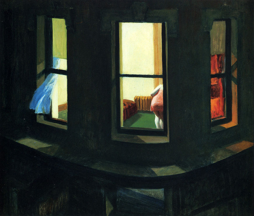
Edward Hopper's Night Windows, 1928
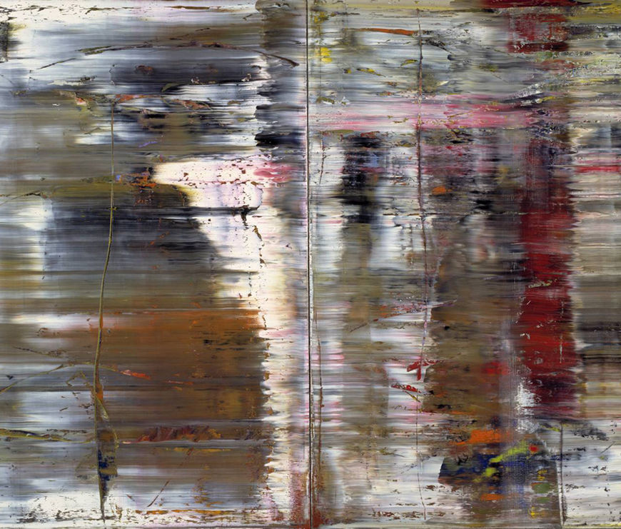
Gerhard Richter's Abstraktes Bild (726), 1990
David, you've got a lot of history with the Jessica Jones character and Marvel’s version of Hell’s Kitchen. Your cover art for Alias basically defined Jones and set the tone for her world. What was your reaction when you learned she'd be getting her own TV series?
David: I’m in Hell’s Kitchen right now. Literally in New York… and also story-wise on a Marvel story I’m writing that features Daredevil and the Punisher in Hell's Kitchen.
I began my work for Marvel as a writer on Daredevil, and I was a co-collaborator on the original Jessica Jones comic book from her inception as an idea for a book and I did all the cover art for every issue and some interior work as well. I’d first learned about the idea for the TV series years ago when it was in the earliest stages. I was very optimistic about the idea, and very happy for my co-collaborators on the book and character, Brian Michael Bendis and Mike Gaydos. I had high hopes for it.
So Michelle, what was the original concept for the title sequence and how was it developed?
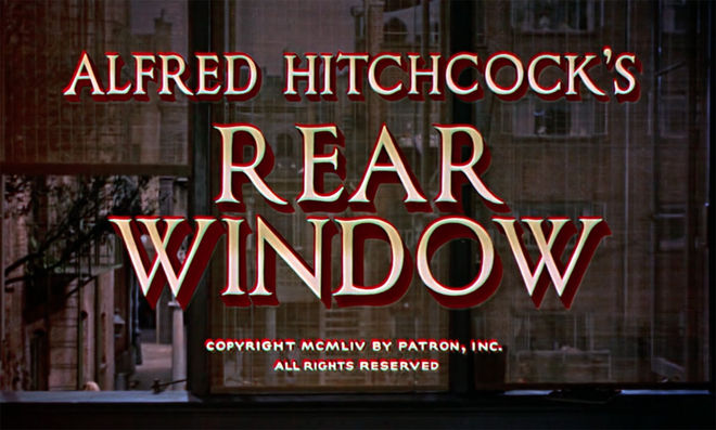
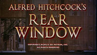
Michelle: I have always loved Hitchcock’s Rear Window. I would say it's one of my top five. I remember being fascinated by the concept of constructing a story through bits and pieces of information. Jessica Jones uses her camera and is also a private investigator so a voyeuristic approach seemed natural. Joan Lau headed the design for this concept. It was photo-real, rich and cinematic.
Rear Window (1954) opening title sequence
Michelle: I also thought about using the city as a character – Hell's Kitchen. I remember hearing that the Avengers are the superheroes you see in the sky and down on the ground were the Defenders. The light of the city, the dark spaces, the grit were all part of the place she investigates. I wanted this concept to be painterly in style and knew just the designer to do this: Arisu. She has an amazing sensibility and is fierce with the brush. I'm always moved by her work and she didn’t disappoint.
Arisu: Since there are so many painterly sequences already, we wanted this one to have a more modern, abstract look while also embracing the spirit of David Mack’s watercolour paintings from the original Jessica Jones comic books.
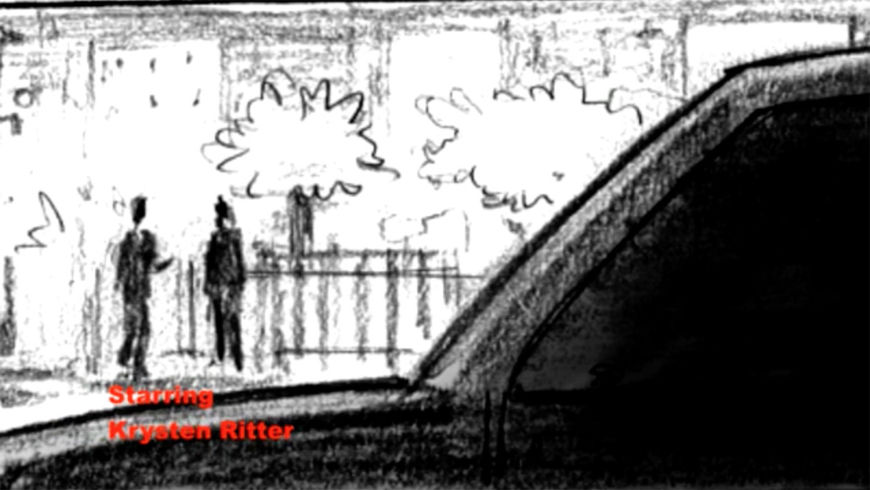
We based the concept off of Jessica’s PTSD and alcoholism, her blurry, unreliable point of view, and translated that visually using paint strokes that smear and obfuscate the scenes. We wanted her visions and memories to be triggered by light, and floating in black negative space. So the scenes would appear only in small sections of the frame, either blocked by a foreground element or contained inside of a silhouetted framing device.
Jessica Jones "Voyeur" concept boardomatic
Did showrunner Melissa Rosenberg have a vision for the opening? What was her response to your concepts?
Michelle: On our first call we were told that Melissa was open to anything we came to the table with. Then she responded to the boards that spoke to her and her vision. In the first presentation, she and the team loved the “Voyeur” concept and thought it supported the theme and liked how it was from Jessica’s perspective. They wanted us to explore the watercolour city some more, to look at David’s watercolour painterly work for the Alias comic book and Kabuki.
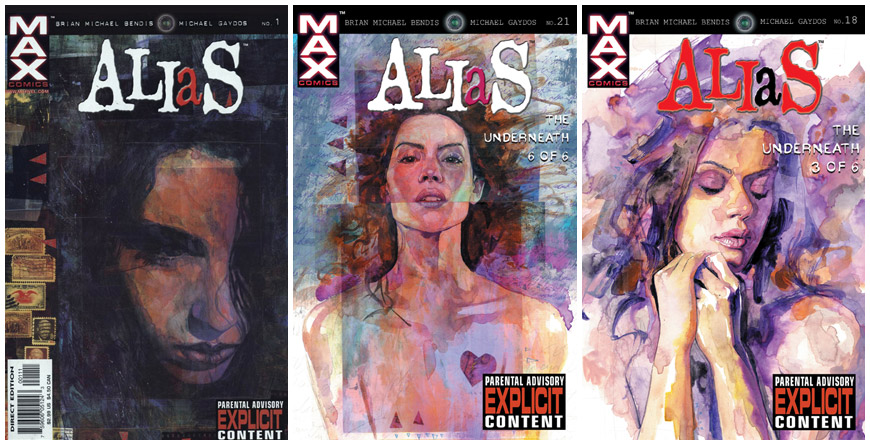
Image set: Alias comic book covers illustrated by David W. Mack
David, your art obviously had a big impact on the look and feel of the title sequence, but how did you actually become involved in the production?
David: I received an email from Joe Quesada marked "URGENT" and asking me to call him immediately. He explained that they were hoping to have me work on the title sequence.
He's creative director of the Marvel TV division now. He was the person who originally hired me for Marvel as a writer on Daredevil back in 1998. At that time Joe was drawing Daredevil and he hired me to take over writing after director Kevin Smith’s run on the character. During the course of working on Daredevil together, Joe became editor-in-chief of Marvel. And the Jessica Jones comic and character were created soon after that by my collaborator Brian Michael Bendis, who asked me to work on the book from its inception.
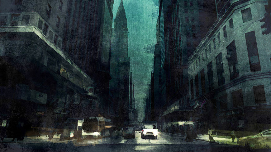
Concept art by Arisu Kashiwagi

Concept art by Arisu Kashiwagi
So how did the two concepts become the one we see on screen?
Michelle: They were not prescriptive that they wanted these two concepts to be merged but ultimately it seemed like a natural place to go. So, it became a marriage of two concepts.
I was surprised by Melissa [Rosenberg]. Her feedback, specifically. She wanted equality when it came to characters in the sequence. It opened my eyes. I think I was sleeping until I heard that note.
What were the next steps once you had the concept set? Tell us about the production process.
Michelle: When we started designing I wanted to create a graphic landscape. We had a live-action paint shoot where we mixed and scraped paint until we got some results that we were happy with. David came in to paint some elements for us that were beautiful and we incorporated those.
David: As with all Marvel TV and film things, it was a very secretive endeavour… I came into the Imaginary Forces studio in Los Angeles with lots of materials and paint to work on it.
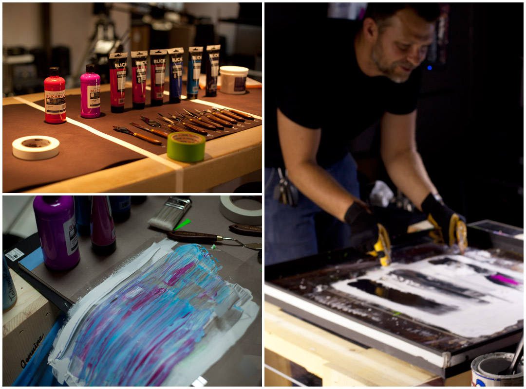
Image set: Illustrator David W. Mack creating paintings for the Jessica Jones title sequence at Imaginary Forces in Los Angeles.
David: I tried to bring a diversity of textures and tones and media. I painted some textures very thickly with a set of palette knives. And I also created a lot of washes in watercolour and acrylic to connect the look of the comic book to the TV series.
I tried to create cityscapes, buildings, alleyways, cars, street-level scenes in varying degrees of abstraction and realism so they could be layered on top of each other.
Michelle: Arisu and Joseph used paint elements from the shoot and layered them on the designs so the animators had a guide to know where to place them on the live-action elements.
Arisu: I received scanned brush strokes and some elements from David and included them in the frames. I first comped photographic elements together to figure out the overall layout and lighting. Once I reduced it to lights and darks, I painted over them using both Photoshop and handmade scanned brush strokes.
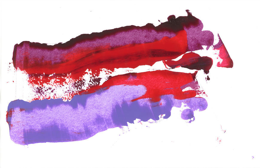
Scanned brush strokes
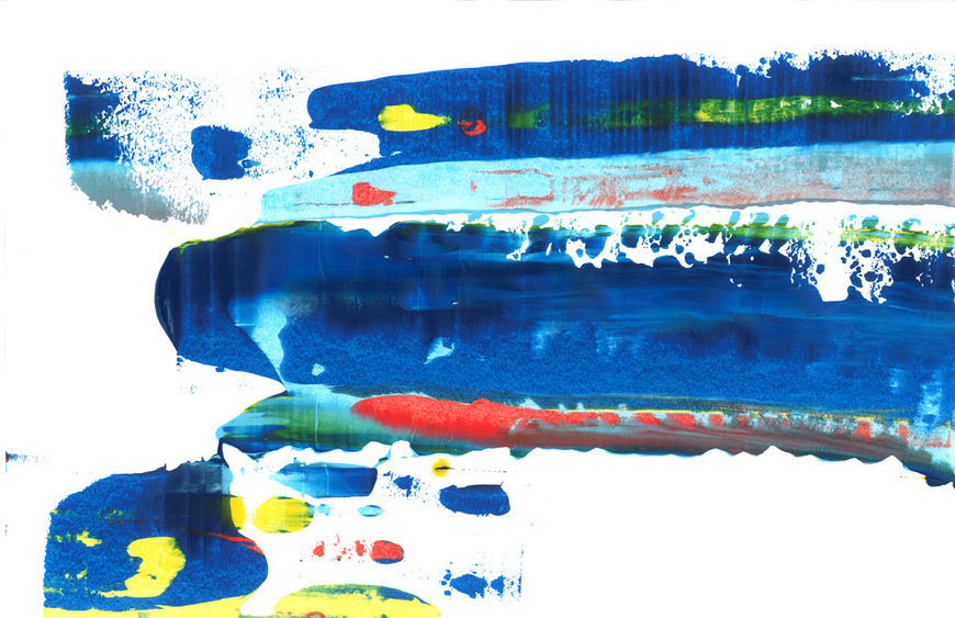
Scanned brush strokes
Arisu: The tricky part was discerning which brush strokes work where and at what angle so it doesn’t fight the lighting. It was a combination of rotating, warping, masking, and manually painting. Every stroke had to be kept on a separate layer for the animators to later put into their comps. Since we were working in 4K, my paintings were sometimes as large as 16K for scenes that involved panning.
One of the major challenges was figuring out the balance between abstraction and legibility: what percentage can be obscured with paint and what needed to be spelled out more clearly so it still reads as a figure or car. In this particular sequence, that challenge was pronounced even more because we wanted to keep it abstract and the paint had such an active role over the content.
Purple is a pretty important colour in the world of Jessica Jones. It links the comics and the show, particularly in the title sequence. How did colour factor into your process?
David: I often use shades of lavender and violet and let them mix together. I’ve written Killgrave – Purple Man – in Daredevil: End of Days, and created art and covers for his character on that series and for the Jessica Jones comic book, and I’ve used a range of purples for his character. And I would use a watercolour wash of lavender and violet on or around Jessica even without Killgrave in the image to suggest his influence on her.
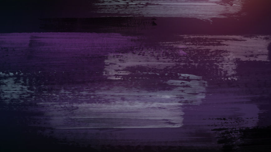
Purple brush strokes created by Arisu Kashiwagi
Michelle: I think usually I work in a more limited palette of colours and I had an aversion to the colour purple. I was surprised that I embraced it so readily and now have changed my mind about it… I feel like I should write a letter to purple and tell him that I'm sorry. I misunderstood you.
Let’s touch on the music: Sean Callery’s theme fits the sequence so well. At what point in the process did you first hear it?
Michelle: Our temp track was more brooding and dark – which we had been cutting with for a while – so this jazzy, rock version was a surprise. I thought it was such an interesting mix of jazz and rock. Eric started to do air guitar to it which made me love it more and more every day.
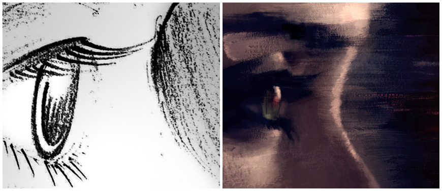
Image set: Eye storyboard versus final art
What are the differences between creating a comic book cover and creating something for a piece of motion design, like the Jessica Jones title sequence?
David: Movement, music, rhythm, editing. For a comic book cover, you are crystallizing it into one single image that grabs attention and communicates in that single bit of imagery. For titles you're thinking of the sequence and the arc of tone and rhythm. Both the cover and the opening titles are giving you context for how to view the story you are about about to experience. They are preparing you for the world you are about to immerse in. Other than that, the details of execution are quite different.
How big was the production team?
Michelle: It was a relatively small but powerful team. I initially worked with Ben Apley, the executive producer here, and Keith Bryant, who made all the meetings happen. They shepherded the job as it came in. Keith is a producer I work with often and I'm always amazed how he keeps his cool. He is probably flipping out on the inside but he has the best poker face. Our editors set the overall pacing beautifully and stayed late nights with me. The lead animators Eric Demeusy and Thomas McMahan ruled the design room we worked in. I am always humbled by their work.

A series of paintings created for the Jessica Jones title sequence
Michelle: Rod Basham, our Flame artist, helped with everything – the shoot, the comping, problem-solving. We had additional design support for Arisu by Joseph Ahn. The renowned David Mack of course, a small live-action team to capture the paint elements, an intern who beautifully handled animating the final eye shot. Some relatives in New York took some photos for me, too.
Plus, we had a team of designers that contributed to the initial pitch that won us the job.
Which tools and software did you use to put it all together?
Michelle: Photoshop, After Effects, Cinema 4D, Flame, Red Epic, and lots of paint.
Was there anything that took you by surprise when working on this project?
David: I was able to be on the Jessica Jones set while it was filming. I was able to see Krysten Ritter and David Tennant bring the characters to life on the set, seeing the designs and characters from the comic be made real. I had a similar feeling about that when I was on the set of Daredevil when it was filming.
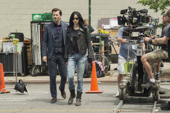
Actors David Tennant and Krysten Ritter on the set of Jessica Jones in New York.
In my first Daredevil story, I wrote the origin story of Wilson Fisk and explored his childhood. It was a very personal part of the story for me, that was based on some of my own childhood and on my father. And I was fascinated to see the origin of Wilson Fisk as a child make it into the TV show and to see Vincent D’Onofrio embody the character so well. To see Krysten Ritter and David Tennant embody Jessica and Killgrave gave me that feeling, too. There were a lot of personal things that went into my work on those characters… and then to see them acted out and embodied in life was a new dynamic.
David, this is your second title sequence project in the last few years, the first being Captain America: The Winter Soldier. Did you ever expect to work in this field?
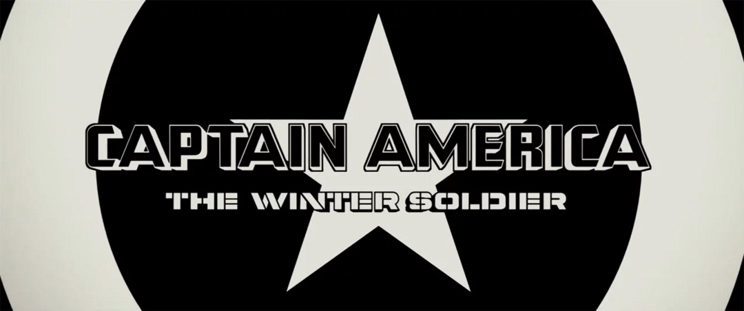
David: I worked on Captain America: The Winter Soldier with Erin Sarofsky, who I loved collaborating with and who brought me into that project. That was an incredible project as well and with a completely different aesthetic than Jessica Jones. I drew very stark high contrast black-and-white images for it.
Captain America: The Winter Soldier title sequence, designed by Sarofsky Corp.
David: I’m working on the opening titles for another film now. A documentary film called The Temple of Art by director Allan Amato and producer Olga Nunez. Some of my collaborators such as Neil Gaiman and Chuck Palahniuk are in the film, and I’m using quite a different set of approaches and materials for this sequence.
I love working in TV and film titles very much. I would love to continue to make more. I like the idea of contextualizing and preparing the experience of the film or TV story, or crystallizing something of it. I love the diversity involved and the creative collaboration.
What are some of your personal favourite title sequences, whether classic or contemporary?
Michelle: I love To Kill A Mockingbird, It’s A Mad Mad Mad Mad World, Bullitt, Se7en. To be honest, while I think that sequences can be beautiful pieces on their own, the true test for me is if it works when it is attached to the show or film. When I see the purpose attached to the design.
I fall in love with them when I'm watching. Like Fargo, I remember seeing that in the theatre and loved it. Although it is simple, it worked so well for that movie and at that time it seemed so modern.
Fargo (1996) title sequence, designed by Balsmeyer & Everett, Inc.
David: One of the wonderful things about working with Imaginary Forces on Jessica Jones is that they created some of my favourite title sequences, Se7en and Mimic being prime examples. I’m also inspired by the diversity of Saul Bass’s titles work.
What have you seen or watched lately that’s been exciting to you?
Michelle: I recently went to The Broad, a new-ish museum here in Los Angeles. There was a piece from Robert Longo that I hadn’t seen before, done with charcoal, which illustrated the Ferguson Police that I found to be moving.
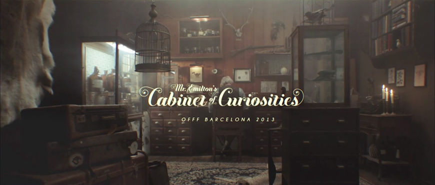
David: When I was speaking at OFFFest in Barcelona, where Sarofsky and I met, they did a kind of main titles for the entire speaking event that included all of the speakers. They were created by From Form. They had a wonderful texture and atmosphere and world that set the stage for the eclectic selection of designers speaking. I still really enjoy it.
OFFF Barcelona 2013 title sequence, designed by From Form
David: Musically, I’ve enjoyed this recent David Bowie Covers EP tribute by Amanda Palmer and Jherek Bischoff. Amanda saw a Bowie painting that I did when I heard the news of Bowie's death, and asked to include it in the art for the album. There is a haunting quality to the songs that has something cathartic in them.
SUPPLEMENTARY: The Making of Jessica Jones reel by Imaginary Forces


