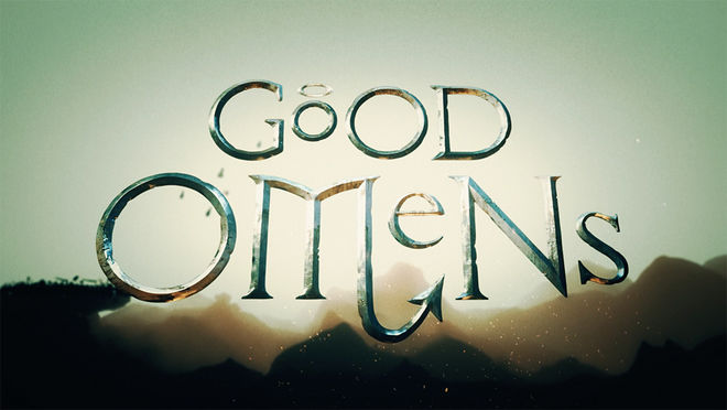
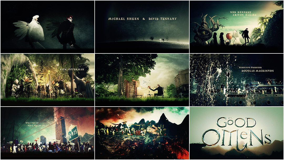
In the beginning was the word. But Aziraphale and Crowley were there, too. Soon there were also fruit-bearing trees and enormous stone cherubs, phone booths and spaceships, and people – so many people – all marching together on a bizarro pilgrimage toward their doom. This is the premise of the opening credits to Good Omens, the six-episode TV adaptation produced by Amazon Studios and BBC based on the popular 1990 novel of the same name by Terry Pratchett and Neil Gaiman.
The long-awaited series follows the unlikely duo of an angel, Aziraphale (Michael Sheen), and a demon, Crowley (David Tennant), as they pussyfoot towards Armageddon. Friends despite themselves, each has been assigned to bring about the end of the world but, having lived on Earth since the beginning of time, they’ve become a bit attached to it. The extra-celestial buddy comedy features a jolly cast that includes Jon Hamm as bureaucratic godsend Gabriel, a particularly unhinged Ned Dennehy as high-ranking demon Hastur, and Frances McDormand delivering – what else? – the voice of God.
To introduce this world is a ragbag opening of epic proportions created by Peter Anderson Studio and featuring music by composer David Arnold. The sequence combines the characters, humour and surreal tone of the series with 3D objects, live-action elements, and original 2D illustrations, finding a sweet spot somewhere between the otherworldly work of illustrator Dave McKean and the wacky collage of director-animator Terry Gilliam. Likewise, the theme by David Arnold reminds one of a circus; a carousel of harmonies with strings and choral arrangements moving up and down, alternating between a swaying waltz and a kind of carnival dirge.
This singular aesthetic and sound sets the show apart while introducing its narrative, stars, and offbeat humour. For Peter Anderson Studio, achieving this aesthetic meant diving into biblical media and medieval artefacts like the Bayeux Tapestry, shooting their own live-action elements on a travelator, creating spacesuits and original illustrations, and melding it all together into one brilliantly “bonkers” concoction.
A discussion with Creative Director PETER ANDERSON, Art Director RED ISAAC, and Senior Animator ALEX KNOWLES of Peter Anderson Studio.
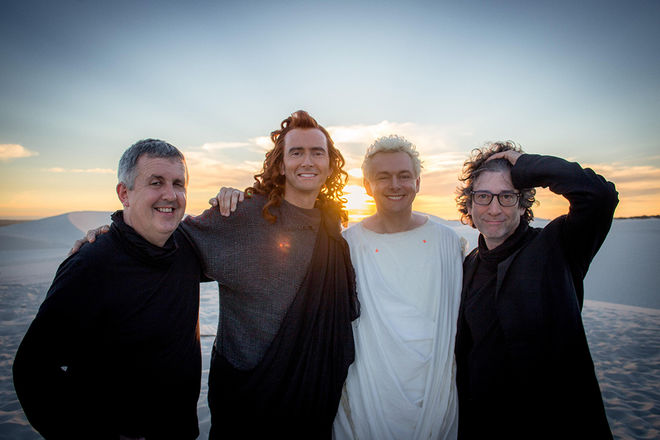
Good Omens executive producer Douglas Mackinnon, actors David Tennant and Michael Sheen, and author and showrunner Neil Gaiman on set.
What was the first meeting about this sequence like? How did this project come to you?
Peter: We had worked with Douglas Mackinnon on the [special episode of] Sherlock, "The Abominable Bride." He rang me up and said, “I have a very special project I want to talk to you about.” When I first met with him and Neil Gaiman I was blown away by their vision.
Red: They wanted something old and ‘crappy'-looking. We were given references of 1950s biblical films where the titles look incredibly low-fi. This slowly grew in ambition. The piece needed to communicate the main narrative of the series – the coming of Armageddon – but also the comical and fantastical tone, the friendship between the two leads, good and evil and its presence in everyone, the huge cast, both in numbers and characters…
Peter: Douglas said, “I want you to promise me that you will send me emails that end with ‘This might sound absolutely bonkers, but…’”
Red: Oh, they also wanted it to look like nothing that has ever been seen before in television!
Of course, no big deal! How did you set about writing the story?
Peter: Stage one of developing the title story was all about experimenting and pushing our own boundaries without seeing anything [from the show]. Stage two, the “starting point” concept, or “the real brief,” came from a discussion of our initial concepts with Neil and Douglas. It was here we knew the sequence needed to be epic and intimate at the same time. This was also massively helped by finally seeing some of the show.
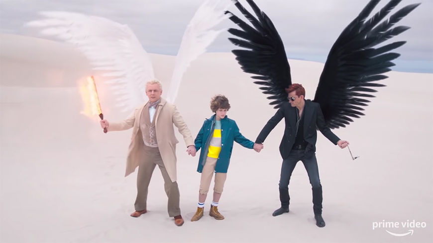
Still from Good Omens featuring characters Aziraphale, Adam, and Crowley. Watch the official trailer.
Red: We wanted to take viewers on a linear journey so we decided to start at the beginning of time to the end of the world so locations included the garden of Eden and then moved on to more contemporary scenes. We had Aziraphale and Crowley walking together at the beginning, leading the procession.
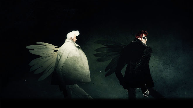
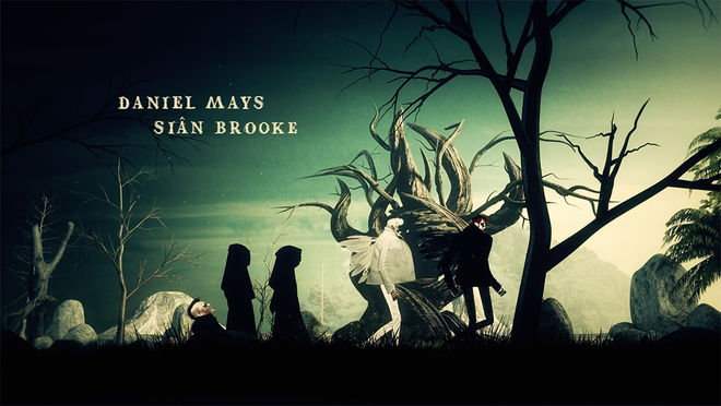
Red: Locations were chosen to create a strong relationship to the show such as the village of Tadfield. We also wanted to take the procession on a wider journey of the world, from the depths of the ocean to outer space.
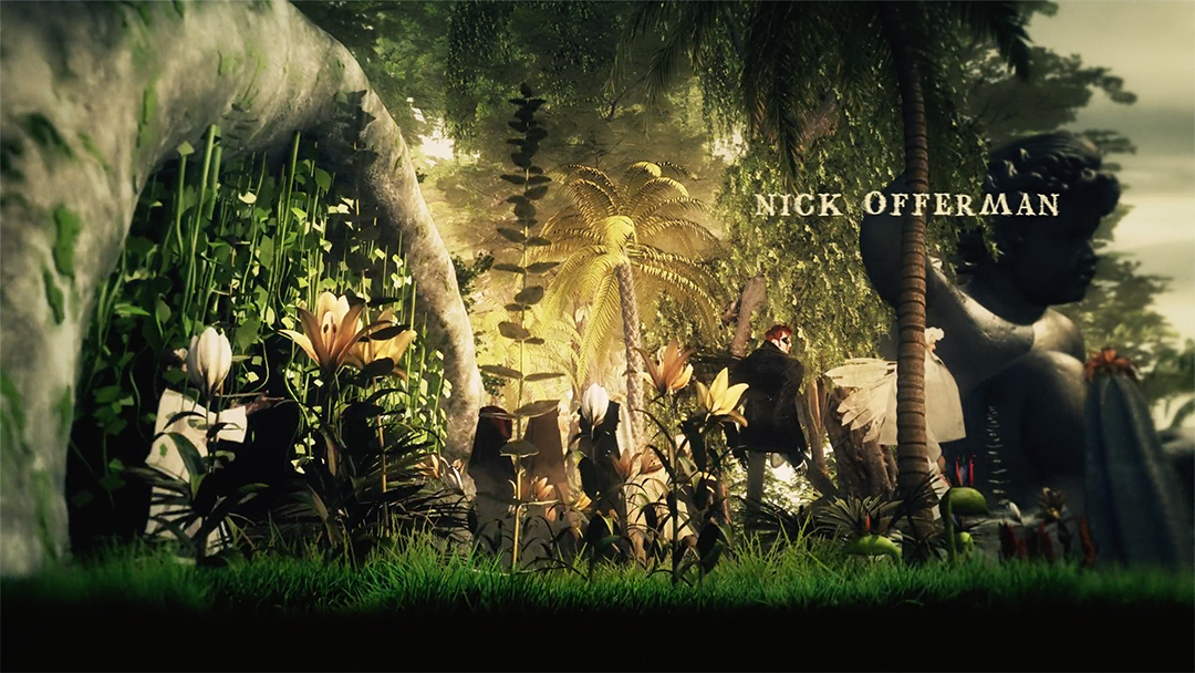
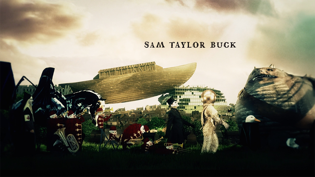
Red: As the environments were being built in 3D we worked on the second layer of storytelling. This was the relationship between Aziraphale and Crowley, one good, one bad, yet maintaining a friendship over centuries. In keeping with their individual missions we wrote a scene where Crowley sets a spaceship on fire and Aziraphale then performs a miracle to right the wrong. So strong is this friendship that they still toast the day over a glass of wine.
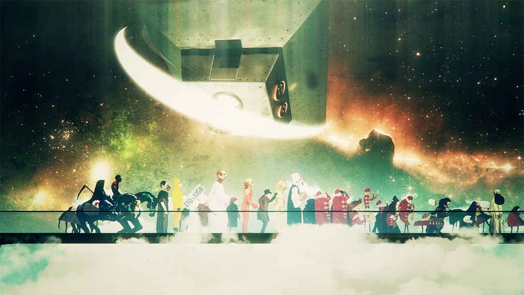
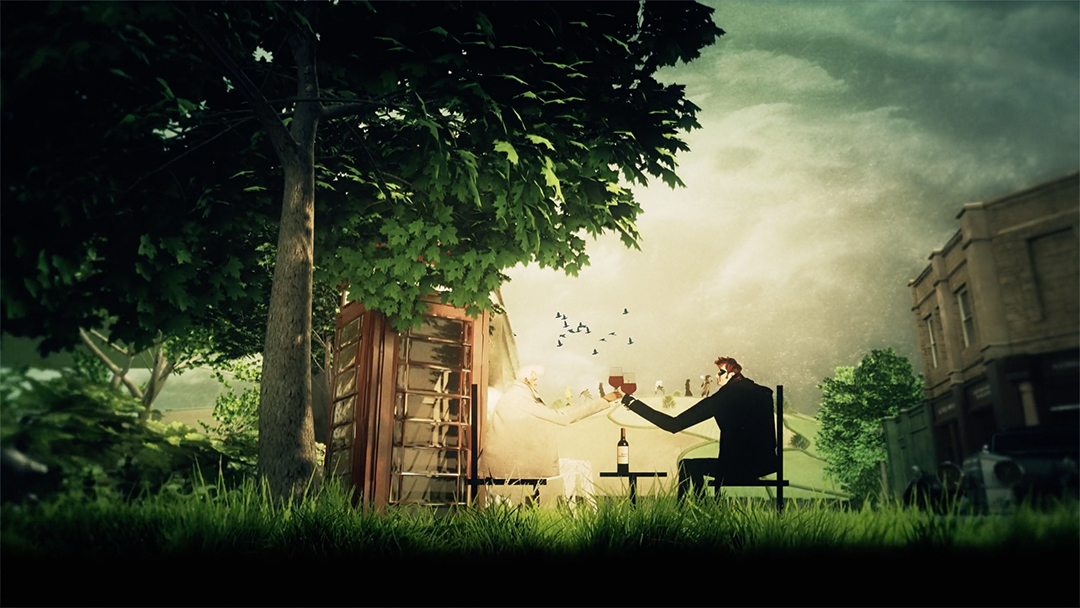
Red: It was important that we communicate those themes but that it turns out that there is good and bad in everyone. This determined the end of the story where everyone fell off the cliff and either fell to hell or flew up to heaven. We also gave each character either Crowley’s or Aziraphale’s faces.
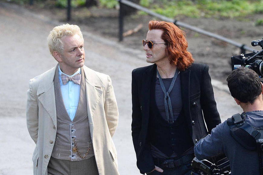
Good Omens stars Michael Sheen (Aziraphale) and David Tennant (Crowley) on set
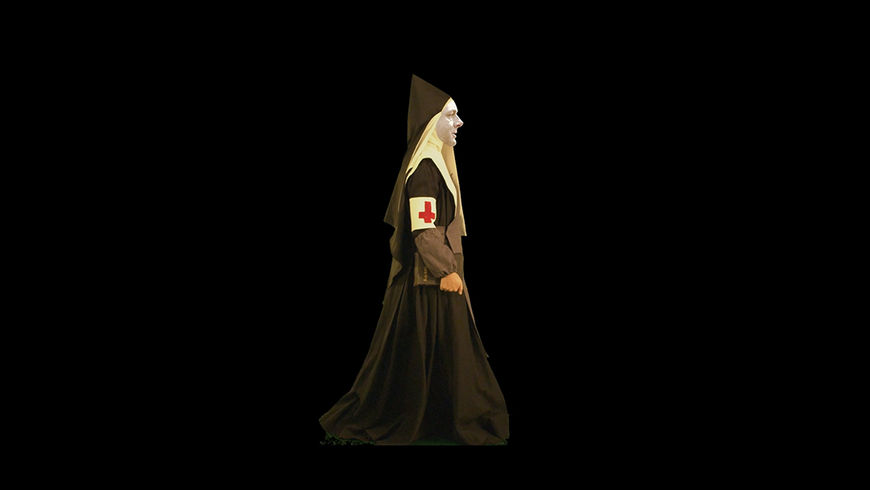
Nun character featuring Aziraphale's face
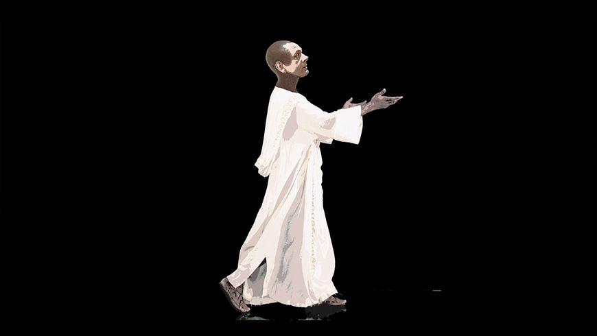
Character in white frock featuring Aziraphale's face
Right, looking closely at the characters, you notice that their faces are everywhere.
Peter: In one of my meetings with Douglas and Neil, Neil said there is good and evil in everyone and to a degree Aziraphale and Crowley represented this. It made me think: Wouldn’t it be wonderful to make all the characters in our march have a combination of their heads, in disguise? So we made a collection of Aziraphale and Crowley two-dimensional heads and tracked them to our live-action figures.
Alex: Graphically it was a great mechanism to tie the variety of styles together.
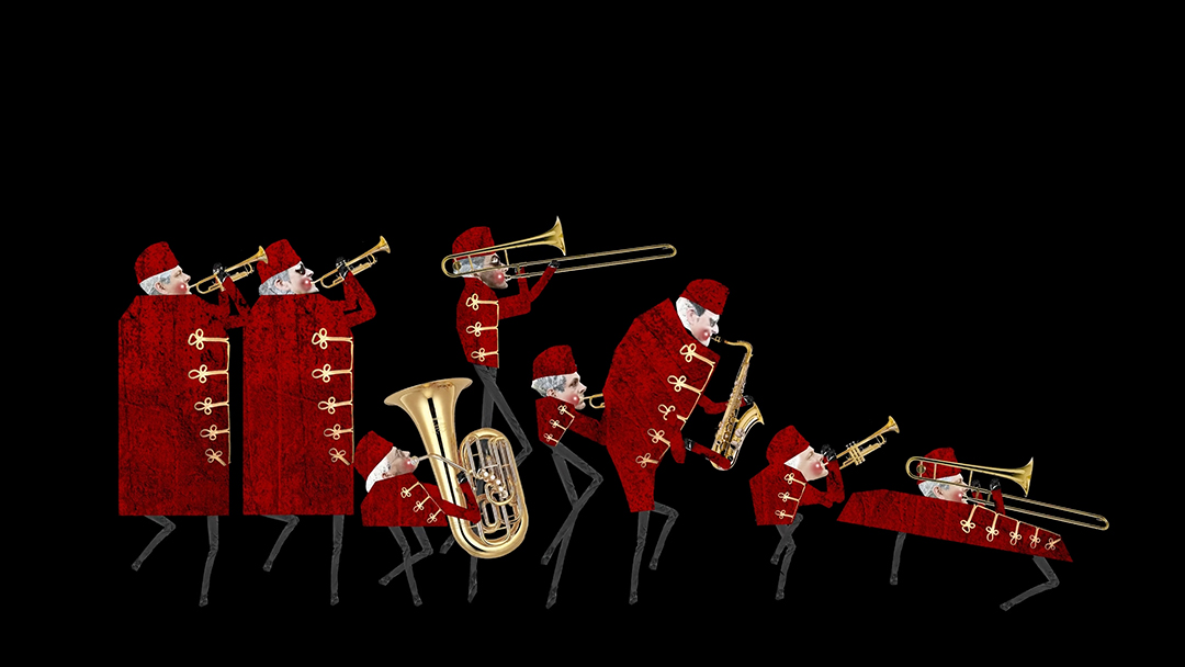
Early render of musicians featuring Aziraphale's and Crowley's faces
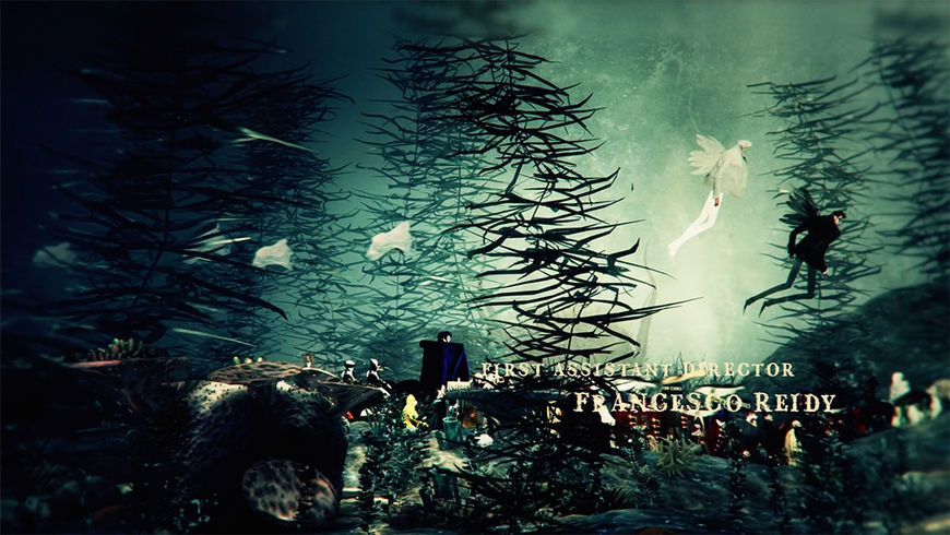
Red: We also wanted to allude to our current world which is growing yet destroying itself at the same time. We added little layers to communicate this such as trees unfurling and then dying and plastic bags floating in the water. There are lots of different symbols which point towards this if you look.
What was your pitching process like?
Red: We pitched lots of different ideas and lots of different visual styles. We were conceptualizing as a team for about six months during pre-production. Often a brief isn’t finalized until filming has been underway for some time, as the world starts to build and people come together. We built our Good Omens titles world alongside theirs.
Our concepts included a puppet show with God controlling the strings, an animated timeline of the beginning of time to the end of the world via a perpetual calendar, a paper set, the Bayeux tapestry…
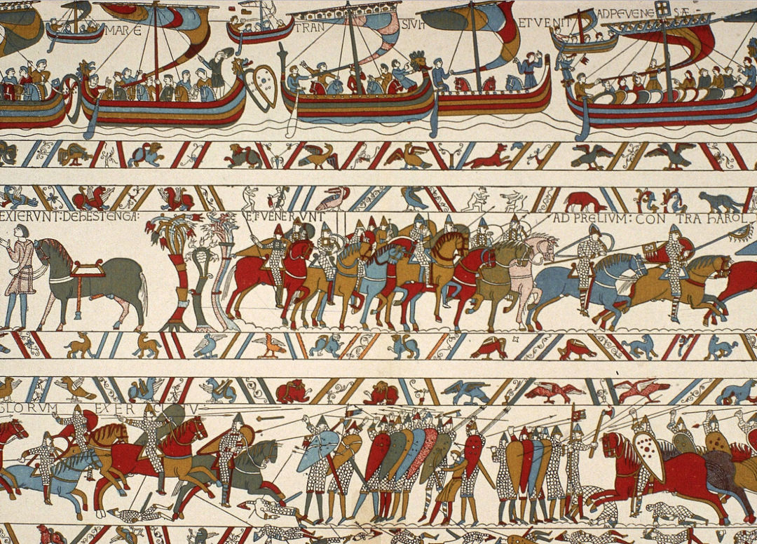
A section of the Bayeux Tapestry, an embroidered cloth nearly 70 metres (230 ft) long which depicts the events leading up to the Norman conquest of England and culminating in the Battle of Hastings. It is thought to date to the 11th century, within a few years after the battle. Learn more.
Peter: We didn’t want to leave any stone unturned. One early idea that we really liked was the purposely crappy world where we brought old biblical scripture illustrations to life – very much inspired by the Book of Kells – in a comedic paper cut-out style.
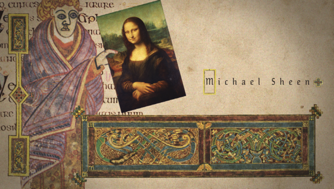
IMAGE SET: Early illustration and collage concepts by Peter Anderson Studio based on the Book of Kells, an illuminated manuscript Gospel book in Latin, containing the four Gospels of the New Testament and believed to have been created around 800 AD. Read more.
Peter: We loved the look but were worried that when we started animating it, it felt a little like Terry Gilliam’s work and, remembering that Doug and Neil had said they didn’t want it to look like anything they had seen before, we rejected it.
It was important to us that our final sequence was a Peter Anderson studio original – as much as you can in today’s media-rich subliminally influential landscape.
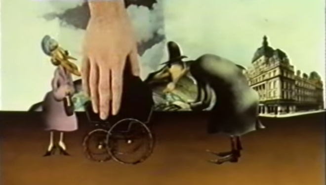
Watch director and animator Terry Gilliam describe his cut-out animation process.
Is Gilliam an influence on you generally? It seems unavoidable in terms of British culture...
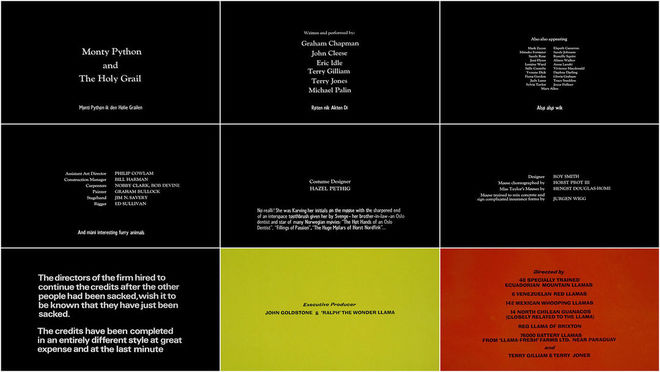
Alex: For me, yes, particularly Holy Grail. I think there is something about the playfulness that resonated with the tone of Good Omens.
Monty Python and the Holy Grail (1975) main titles
Peter: I’m not sure it’s possible to create anything without the memory of seeing something else, but we tried our best to gain inspiration from everything. Bauhaus costumes and plays have always influenced me. Another influence came from Douglas. He had just seen a projected installation in South Africa of a cut-out silhouette protest and said there was something about its darkness and scale that was very dramatic. They reminded me that the relationship story was also very important. I remember thinking this is a puzzle of two scales, two stories that needed fitting together.
What elements or materials did you get from the production relating to characters, environments, etc?
Alex: At the beginning of the job we had very little to visually work with.
Red: We read and dissected the scripts and were sent over material in dribs and drabs so it looked more and more like the show as the project went on.
Peter: We used most of the costumes from the show, a handful of props and a couple of CGI show elements like the bookshop and Crowley’s car made by [visual effects company] Milk.
Red: Milk supplied elements such as the motorcycle, the Kraken, the Bentley and one or two characters.

Still from the title sequence featuring a giant cherub, a Bentley, and a bookstore
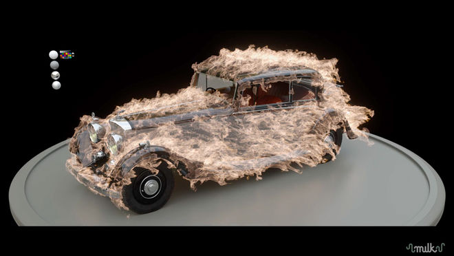
Check out a reel of Milk's VFX work for Good Omens here.
Peter: Everything else we built in 3D, 2D, drew or filmed. It’s a concoction of illustration, physical props, character animation, 3D and live action.
Alex: All of the landscapes were made by us.
Red: The live-action element of the titles, which is about half of the characters, was filmed by us on a green screen at Brunel University. The studio team dressed up in costumes from the show and filmed themselves walking on a travelator. The other half of the characters were illustrated and animated. We created a lot of the elements in 3D such as the cherub, spaceship, trees, the burning bookshop.
VIDEO: The making of the Good Omens title sequence, by Peter Anderson Studio
Alex: All of the 3D work was done in Cinema 4D. Comping, grading and character animation was done using After Effects and the Red Giant Magic Bullet suite. Characters and illustrations were edited using Photoshop.
Peter: The music came later. It is of course massively important and adds to the mood of the sequence. It also dictated the pace.
What kind of mood did you want to evoke?
Red: We wanted it to feel like a British, bonkers epic, a fantastical journey with elements of both humour and poignancy. We achieved epic through our environments, bonkers and fantastical through the unusual juxtaposition of techniques and colour and then humour and poignancy through the small layered details. We also thought it important to show that this is an ambitious and modern show. I think we achieved this through being aspirational and daring with what we produced.
Peter: We wanted an audience to keep finding new things every time they watched the sequence. A title sequence is the one part of a drama that’s watched over and over again, so, ambitiously, we wanted viewers to enjoy that again and again.
What are some of your personal favourite title sequences, whether classic or contemporary?
Peter: I very recently had the honour of having dinner with Dan Perri who told me how he hand-set the text on cardboard and then filmed the Star Wars intro sequence. Incredible!
The Good Life (1975) main titles, with design by Oliver Elmes, animation by Janet Pimlott and music by Burt Rhodes
An early favourite British television sequence is The Good Life because it takes me as a viewer into their world in seconds. It’s impossible to watch it without smiling.
Peter: More recent favourites include Carnivàle and The Man in the High Castle.
Alex: My favourites tend to be about world-building and scene-setting. The map mechanic from Game of Thrones, the audio/visual tone of the Stranger Things title sting or the minute graphic detail in the opening titles to Se7en, which gives us specific insight into the mind of the unknown killer.
Looking at it now, what elements of the Good Omens sequence are you most happy with?
Alex: For me the bit I really love and that gives me so much joy is the micro level of detail we managed create within these grand landscapes.
Red: I am very happy by all the tiny yet significant interactions between Crowley and Aziraphale. For example, when Crowley sets the spacecraft on a destructive course towards earth and Aziraphale intercepts to save the day by turning it into fish.
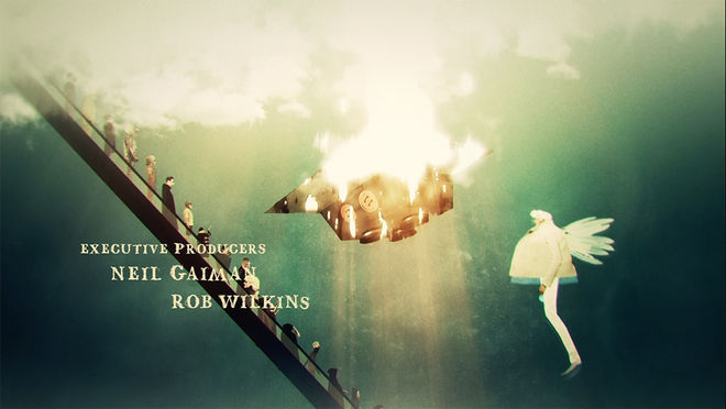
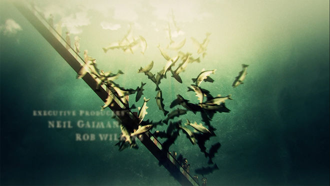
Red: There is a little man that I added who is always running the opposite way, like on the escalator and approaching the cliff edge, as he tries to escape his fate….
One of the band members has such little legs he keeps getting left behind. I wish we had had more time for these layers!
Peter: I am also very proud of my hand-drawn type! From an early stage I knew I wanted to mix many techniques so I am super happy all these different elements and styles fitted together so well. We managed to make something that feels a little bit bonkers.
