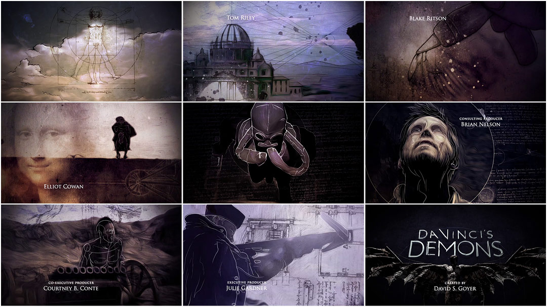
After centuries of reflection, the oft studied character of Leonardo da Vinci continues to reign as the genius and archetypal Renaissance Man that we've always known him to be. Yet as familiar as the man may seem, the opening to Da Vinci's Demons illuminates new facets of his feverishly inventive and enigmatic mind. Beginning with Bear McCreary's driving score, the sequence descends from painterly clouds and a Florentine horizon to reveal reams of hand sketched notes – a collection soon recognized as masterworks from da Vinci’s own hand. Paul McDonnell manipulates the hand-drawn illustrations to remind us of da Vinci’s ambidextrously rendered triumphs and musings while suggesting that there's more to the prolific artist and polymath than even he may have known. Da Vinci's demons seem to lurk behind each drop of ink, in each scratch upon the scroll. Amongst birds in flight and the fantastic contraptions that they inspired, Mona Lisa's dispassionate smirk taunts the viewer with a secret she'll never tell: "What did Leonardo da Vinci know that we don't?"
In this, our latest examination of the anatomy of title sequences, Huge Designs assembles a golden ratio of iconic da Vinci sketches and flights of fantasy, brought to real life in a way that only modern day machinations could.
Primetime Emmy Award for Outstanding Main Title Design
A discussion with Creative Director PAUL MCDONNELL of Huge Designs.
Give us a little background on yourself and Huge.
We are a small design studio based in London, consisting of three directors-slash-designers: Hugo Moss, Tamsin McGee, and myself. I joined a little over two years ago, but the company itself has been around for just over 20 years, primarily designing broadcast titles.
And as for Da Vinci's Demons: what was the first meeting like?
We initially had a Skype meeting with the creator of the series, David Goyer, and one of the producers, Lee Morris, who we had worked with on Any Human Heart. They were in the early stages of filming in Swansea at the time. My prior knowledge of David was through his work on the Blade trilogy and The Dark Knight trilogy and I have been super geeked out over The Man of Steel trailers so I was really looking forward to meeting him even if we didn't get the job. We had received the Da Vinci's Demon's scripts and an early trailer so we knew the series was going to be exciting and different. It was a very encouraging meeting. David is very open and straight out of the gate it was apparent he was a design enthusiast.

Title sequence pitch v1, 09/27/12
What were your original concepts for the sequence and how did they develop?
In the initial brief David mentioned The Johnny Cash project. If you're unfamiliar with it, it's a music video created by visitors to the site. You have the option of creating a frame to be placed into the animation and the result is a crazy jumble of styles and flash frames. It doesn't sound like it should work but the result is amazing. I used that piece as our inspiration. I wanted the sequence to look as if you are flicking through Da Vinci's notebooks while on acid! It is essentially a sequence of clips that have been drawn onto rotoscopically... is that a word? I began with a test shot, and worked on that over and over until I got the desired effect. Once I had got to that point I rolled it out over the rest of the edited sequence.
How did you collect the various elements like Da Vinci’s artwork, the live action footage, etc?
At our studio, we have a complete history of Da Vinci's work in a book that is about the size of a small Volkswagen which we used extensively for reference. I collected hundreds of illustrations, sketches, and schematics to use as a textural layer which were then graded and animated. The live action component came from filmed sequences from the drama, which I then manipulated. We also shot a library of seeping and splashing ink to be used as transitionary devices and for added grunge.
Storyboard Animatic
Illustration Overlay Test
How did you decide to use hand-drawn elements to tie the sources together?
The idea came from the man himself! Da Vinci, probably more than any other artist, is as well known for his drawings and his notebooks than he is for his paintings. I think there are supposed to be about 13,000 drawings in museums around the world. He would study and dissect his subject matters and record his discoveries through the medium of drawing and writing. The 'cartoons' he made for his paintings are a direct influence to the textural multi-layering that I wanted to achieve in the titles.
How did you develop the subtle color palette?
I wanted to steer clear of the old parchment and browns that are so often linked with Da Vinci. David kept stressing that he wanted it to feel very contemporary and to avoid the pitfall of having it look like you are watching The History Channel. So in order to avoid that I literally inverted one of his sketches and that gave me my blues and whites!

Title sequence pitch v2, 09/27/12
Tell us about the typography – the shattered text of the main title and combining the names with backwards handwriting.
The shattered logo idea actually came to us after hearing the music track for the first time. Da Vinci's notebooks were all written in mirror and, in response to this, Bear McCreary created a piece of music that is the same if played backwards! I didn't believe it until I tried it myself but it's true.
The Da Vinci's Demons title sequence played backwards, featuring Bear McCreary's palindromic theme
This sparked the idea of hiding segments of the logo throughout the animation and then playing our sequence backwards at its culmination to pull out the hidden shards. It is very subtle but Da Vinci's work was often subtly symbolic, with hidden meanings and references and so it was great to be able to reflect this. Apparently, he was left handed which made quills difficult to use and so it was easier for him to write backwards.
Which tools and software did you use to put it all together?
I worked at 12 frames per second, printed out each frame, sketched over it with pencil, then scanned the sketches – so I spent many hours staring into the hypnotic lights of a scanner. The illustrations, created by our head illustrator Nathan Mckenna, were created on a Cintiq so he supplied me with a bunch of .psds at the end of each day. Far simpler! Every frame was composited individually in Photoshop and then finally imported into After Effects for finishing. I created the winged statue at the end using Z-brush and then imported it into 3D Studio Max. We also created a few of Da Vinci's inventions in 3D.
Pitch Animation
How long did it take to put the sequence together? How many people?
From pitch to delivery the sequence took roughly four months. Our team was relatively small. I directed and oversaw the job with help from Hugo and Tamsin. Nathan Mckenna was an invaluable asset on the job. He has a fantastic illustration style which reminded me of Da Vinci's work and he worked really quickly. We also had Maria Arnal working on the way the text animated on and off.
Was there anything that took you by surprise when working on this sequence?
Just how much work was involved! I tend to charge into designing a sequence with all guns blazing and worry about the technical implementation later, so as not to restrict the creative flow. I knew it was going to be labour intensive but I thought the process would get faster as we progressed and the method would streamline itself... but the last frame I completed pretty much took as much time as the first!
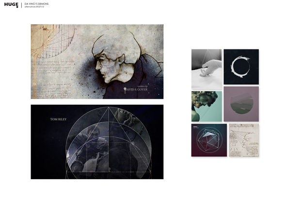
Design Alternatives
What element(s) of this sequence are you most happy with?
My favourite part of the sequence is the close up of the hawk’s head. That was one of the first scenes that I created and up to that point I still had a few doubts about whether or not the execution was going to work. I had a horrible feeling that the test we created for the pitch may have been a bit of a fluke but once I got about 12 frames in I started to feel a lot more comfortable about the entire process.
Do you think there should be a Best Title Design category at the Oscars?
The recognition as a craft at that level would be nice. Titles, at their finest, are stand-alone films in their own right, and therefore should receive accolades of the same calibre as the films they are introducing. I think SXSW is doing it right. SXSW is also miles cooler so who needs the stuffy Oscars anyway! However, saying that, I have perfected my Anne Hathaway victory sob just in case that day ever comes.
Style and Pace Test
What are some of your personal favorite title sequences, either classic or contemporary?
My personal favourite title sequence is for The Fall. Also, from a completely nostalgic point of view I'm really into The NeverEnding Story titles. Please don't make fun of me.
What excites you outside of design?
I tend to procreate quite a lot! I also work around the corner from the best coffee shop in London. So, coffee and procreation – in that order!

