


"Soapdish," says Cyril, running a finger along the hollow of Cécile's porcelain collarbone. It's one of the first words of Durga Chew-Bose's leisurely and luxurious debut Bonjour Tristesse and it captures the film's carefully sculpted quality.
Cécile (Lily McInerny) is slight, pale, headstrong, and eighteen years old. She’s spending the summer floating about the French seaside with her charismatic father Raymond (Claes Bang) and his companion du jour Elsa (Naïlia Harzoune) when the arrival of her late mother’s friend pitches their world into chaos. Anne (Chloë Sevigny) is an artist, ensconced in her work as a fashion designer and buttoned up to the chin. Her gaze is quiet and her demeanor distant, a hard glaze over a soft center. But she breathes fire into the coterie of characters as she rekindles a buried romance with Raymond and sees Elsa discarded like a suit worn too long, inspiring the tragic events to come.
Bonjour Tristesse is Canadian writer-turned-filmmaker Durga Chew-Bose’s first feature. It’s a gorgeous, minimalistic, and meticulously curated spin on Françoise Sagan's best-selling novel of the same name, originally brought to the screen in 1958 by Otto Preminger. Whereas Preminger’s adaptation is loaded with tension, flashbacks, and an impish Jean Seberg — and headed by a memorable Saul Bass opener — Chew-Bose’s is understated, almost muted, and entranced by endless small beauties.

The cover of Durga Chew-Bose's essay collection Too Much and Not the Mood features photography by Sara Cwynar
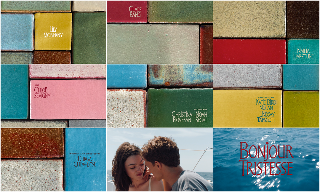
The opening tile sequence is a ceramic and typographic affair created by title designer Teddy Blanks and ceramicist Shane Gabier. It features lanky all-caps typography that retains its I and J tittles, a squat sans-serif, and earthy, saturated tiles in hues of crimson, azure, olive, coral, and sand. Paired with the lulling voice of Cyril (Aliocha Schneider), Cécile’s holiday fling, performing a cover of Irving Berlin’s “Blue Skies”, the sequence softly ushers viewers into this dreamy Riviera rendezvous. It’s only after the first scenes of sun-dappled skin, gleaming waves, and sailboat kisses that the title appears over the water in blood red, a subtle hint of what’s to come. It’s all just enough and very much the mood.
A discussion with Bonjour Tristesse Director DURGA CHEW-BOSE and Title Designer TEDDY BLANKS.
Thank you so much for joining me to chat Bonjour Tristesse. I'm so appreciative of your time.
Durga Chew-Bose: Thank you for taking an interest in our movie.
I love the classic curtains-being-drawn spectacle of a title sequence that says, Welcome to our world. Let's escape together.
It was a pleasure to watch, knowing your work as a writer and editor. I’m always so fascinated when I see artists turning to embrace other media.
DCB: Oh, thank you. I know you relate to this because of what you write and your interest but I love every aspect of movies being made. Every element – all the jobs that go into a single film – and titles have always been so fascinating to me. I also knew that if I ever made a movie one day I'd work with Teddy. So this feels very full circle.
Teddy, you and Durga have known each other for a while before this film, right?
Teddy Blanks: Durga has been a close friend for many years.
DCB: I want to say 15 years... A good timestamp would be Lena Dunham's Tiny Furniture, because that's where we met as extras in a gallery scene. We met through Lena and then our friendship took off.
TB: When Durga lived in New York, we went to the movies a lot. I've always known she would direct a feature someday.
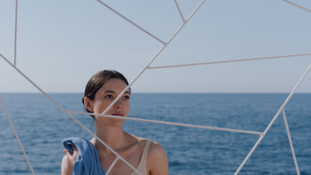
Still from Bonjour Tristesse featuring Lily McInerny as Cécile

Bonjour Tristesse (2025) main title card
DCB: We used to do double features together, go to those big cineplexes in Times Square and go to two movies, not paying for the second one, sneaking in. A true double feature. It feels like a completely different time in the world but also in one's personhood. It was just the beginning and there was something so pure… our friendship was completely based on going to movies, talking about movies, listening to music — playing, almost, you know?
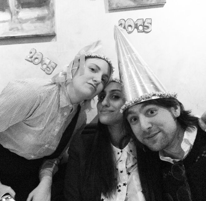
Lena Dunham, Durga Chew-Bose, and Teddy Blanks in 2015
TB: I always loved our post-theater conversations. She would pick out the most specific and particular details – the color of a shoe, the way a character brushed back her hair – things I hadn't even noticed. Bonjour Tristesse is a movie composed entirely of Durga Details, infused with her specific way of thinking and speaking. It's a beautiful thing. I was so moved watching the film.
So having that rapport but also having developed your own vision, wanting to make a splash that’s very Durga Chew-Bose, how did you approach the opening for Bonjour Tristesse?
DCB: Obviously it's my first film and my first real screenplay, for what it's worth to call it that, but I wrote it in such an unorthodox way that the first line of the screenplay is literally what I imagined the titles to be like. And it was so far from what Teddy and I ended up doing. My idea for the titles in the script was totally stolen from my favorite movie titles of all time, John Cassavettes’ Gloria. But then, as we scouted our villa, we shot in Cassis in the south of France, I edited the film... I was sitting with this film for so long, always knowing I would work with Teddy for the titles.
TB: We were in touch during the production because I designed some fake book covers that she used as props in the film. And we started talking about titles seriously after she sent me the rough cut.
Still from Bonjour Tristesse showing Lily McInerny (center) holding the fake book Claudia, Claudia
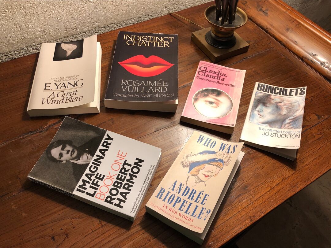
Some of the books featuring fake covers developed for Bonjour Tristesse by Teddy Blanks and Molly Young

Still from Bonjour Tristesse showing Nailia Harzoune (left) and Claes Bang (right) holding the fake book Imaginary Life
Tell me about the book covers you designed for the film, too. Those aren't real books, right? They make me think of your work on Listen Up Philip.
TB: That's right — all the books are fake, but a few of them are loose parodies of real books. For instance, Imaginary Life is a riff on Knausgård's My Struggle. My wife, Molly Young, who writes for The New York Times, came up with a few of the titles. My favorite is Bunchlets.
DCB: I wrote him an email from France and I was like, I don't want anyone watching the film being like, “Oh, is Cecile reading this? This explains her character!” I kind of hate what the internet has done to books on screen. So I made up a bunch of book titles for Teddy and they have easter eggs in them, like one of them is written by E. Yang, because Edward Yang's films were a big influence for me and my DP. And one of the books is called Claudia, Claudia. Both the title and the writer are, like, Monica Vitti characters from different films. Teddy and Molly wrote all the back copy and then my props team printed it and found the books on set.
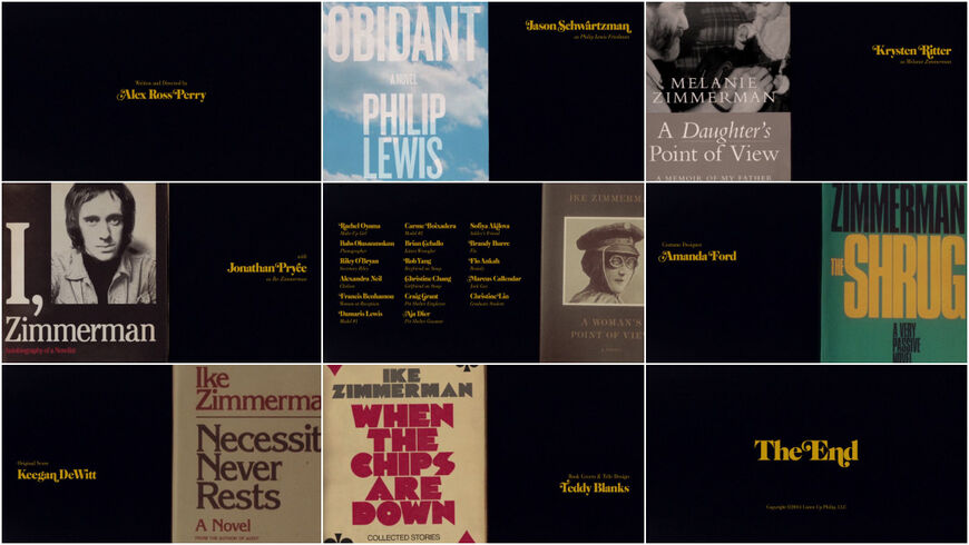
Listen Up Philip (2014) main-on-end titles, designed by Teddy Blanks
DCB: I really needed to be focused on other things but I was so scared of having people focus on book covers in the film that I was like, If I don't prioritize this, we're going to end up with Cecile reading like a Sally Rooney book or something insane. And I was like, This cannot happen.
It's an interesting choice to forego choosing books that would match your characters in terms of being clues to their personalities and just sidestepping that altogether with your own versions of that.
DCB: We wanted to create a sense of familiarity that was disorienting. He designed these two volumes of books for Raymond that kind of look like Knausgård. There was a sense of the cerebral. Who would be a writer that Raymond would read? I gave him the title and everything but picked a design that was inspired by Knausgård. What I also loved about the covers is they weren't all retro or cool or looked like ’70s paperbacks. Some of them are just generic-looking 2023 novels. He's not precious about design, where every element has to be retro-cool. Like, Anne has her books. Cecile has her book that she can barely finish in summer. She's never really reading.
I love when things like titles or any design element, let's say, is not a literal reflection of what you're about to experience but is in the same orbit. I kept thinking about the tile work in this villa – it had these flares of color. And my friend Shane Gabier, during the pandemic, started working with ceramics. I had bought from him these ceramic bookends which I love.
So much of this film has been about working with friends and my points of inspiration. And I learned, especially in post, it's just so much more pleasurable to work with your friends because you have the shorthand but, most importantly, you have the artistic trust. You know you're going to get something that surprises you but is also quite reliable.

Credit for Lily McInerny

Credit for Claes Bang
When you've known people for so long, you've gone on a creative journey together and when that big project comes through and you get to bring them along, it's almost an act of gratitude.
DCB: My God, yes. This film feels like a big thank you to every single person who's ever watched a movie with me or believed in me. I get emotional because, like, Teddy is really someone who roots for his friends. We've been through hard times together and it's really nice to have this moment where my film opens with his touch. He was kind because I was very clear about exactly what I wanted. I wasn't like, Go to town.
TB: The title sequence is entirely Durga's vision. She had the idea to use close-up photos of Shane's gorgeous tile compositions and set them to that song. By the time I started working on it, she had already been in touch with Shane, who sent me a folder of snapshots to work with.

Credit for Naïlia Harzoune

Credit for Costume Designer Miyako Bellizzi
How were the tiles photographed?
DCB: Those photos are actually taken in natural daylight on Shane’s iPhone. But he burned those ceramic tiles specifically for the titles. Like, I told him the colors I want and he made the tiles. They weren't tiles that already existed. I was very against orange. I felt an orange tile would be too mid-century but I knew I wanted pink when it was Chloë's card. Just for the color that's a bit outside the other colors, you know.

Credit for Chloë Sevigny
DCB: So he cooked those tiles for us, and then he took a ton of photos with the sort of light one would have in the south of France and he sent them to Teddy.
TB: I cropped and cut them together, adding grain and gate weave to make the digital photos look a little more analog.
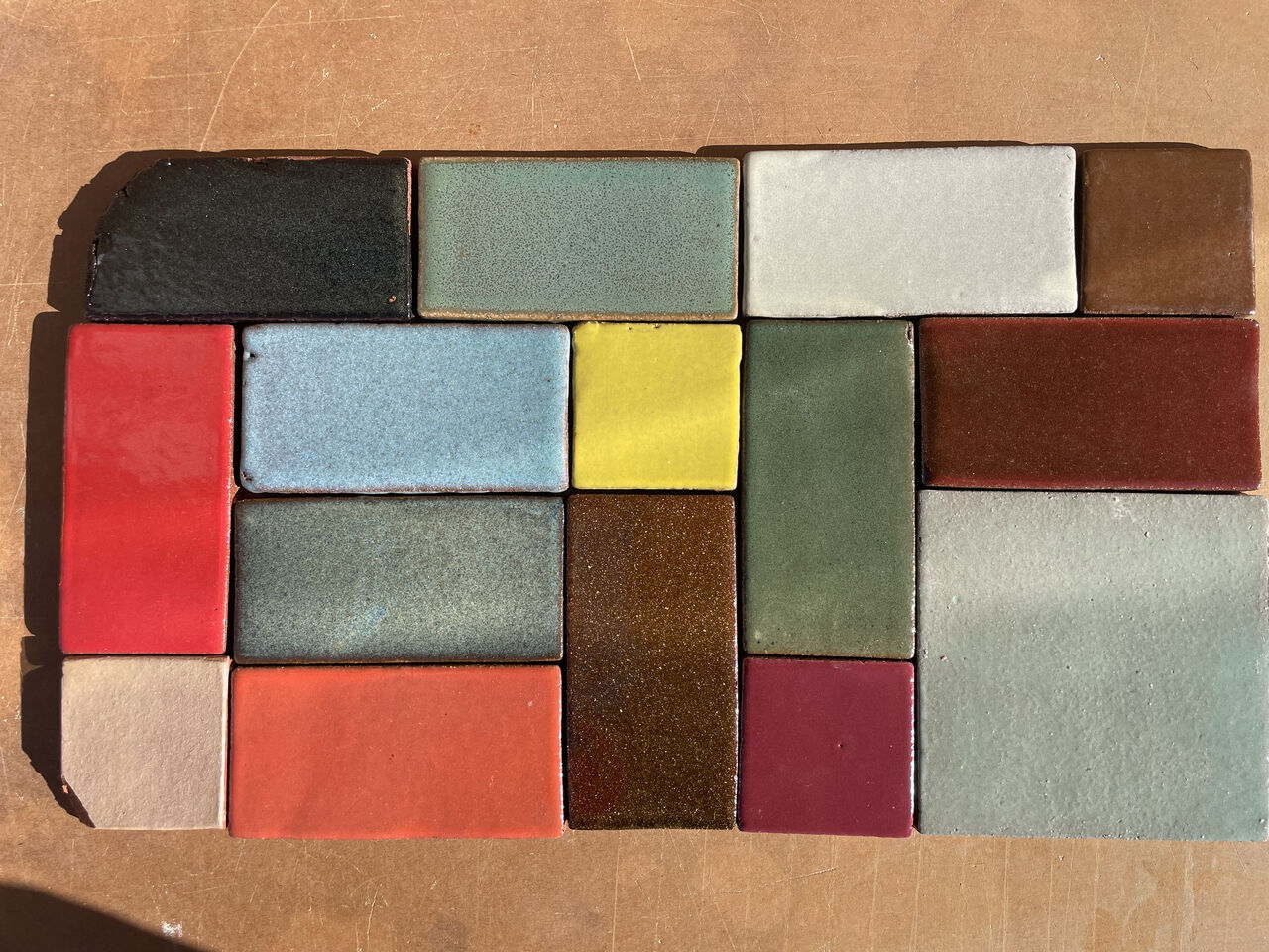
Tiles made by Shane Gabier
TB: Durga had strong instincts about which colors belonged in the sequence and which didn't, so the revision process was mostly one of switching out one composition for another, changing the crop, or slightly adjusting the hue of certain tiles. But from the first draft, I think we all realized it was going to work.
DCB: We found this font on this very early edition of Françoise Sagan’s book and I asked, "Is there a way you can mimic its spindly shape?" I had a strong direction.
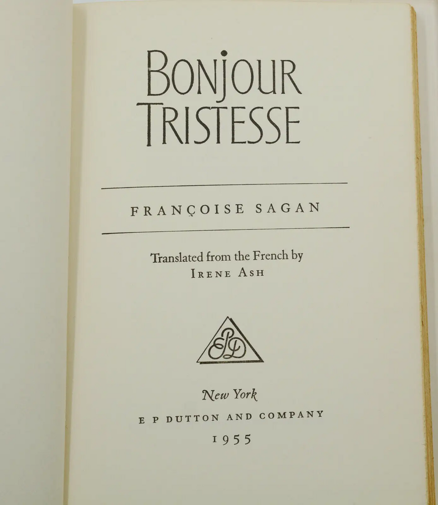
Title page from the 1955 edition of Françoise Sagan's novel Bonjour Tristesse
Was that an existing typeface, the main credits font? How did you decide on the pairing?
TB: In her rough cut Durga had slotted in the temp title from the title page of the first edition of Bonjour Tristesse, the novel. I thought it was great but it was either custom lettering or a font that I was never able to identify, so I ended up just creating an alphabet inspired by it, which we used for the names. The job titles are set in a slightly stretched Antique Olive, the classic 1960s French font by Roger Excoffon.
I especially love the tittles of the lanky serif typeface, the dots over the Is and such. They're very playful.
TB: I must say, it surprised me. I never dot an uppercase "I" because I associate this move with Godard's film titles and any time someone else does it, I think, "Oh, they're ripping off Godard." I thought he invented it! But I was wrong. So, I apologize to anyone whose work I denigrated for this reason. Dotting an uppercase "I" is fair game.
What software did you use to create the alphabet and then to lay out the credits?
TB: I drew the alphabet in Illustrator and turned it into a font using an Illustrator plugin called FontSelf. Then, I edited the font in Glyphs and typeset each individual title in Illustrator. I pasted the type into Photoshop, where I did the layouts for each title card using Shane's photos. Finally, I imported the Photoshop files into After Effects as compositions, where I added film grain, crossfades, and gate weave, and timed it all out to the song.
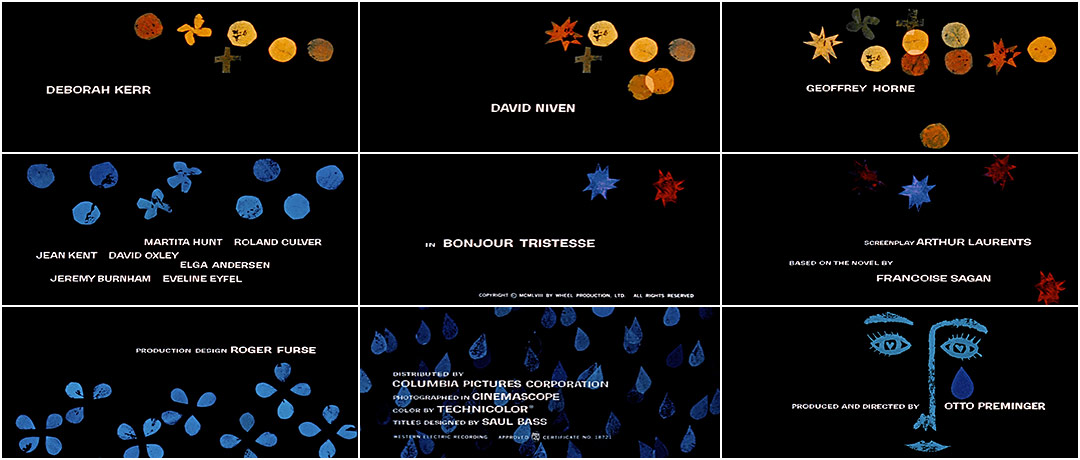
Bonjour Tristesse (1958) main titles, designed by Saul Bass
Durga, you'd obviously seen the Saul Bass titles for the 1958 Otto Preminger film. Was that at all a touchpoint or did you want to diverge entirely?
DCB: I always knew I wanted a title sequence, so that originates from him. Saul Bass is always there when you think of a sequence. I had written it in the script that the titles were going to be their own thing. I told my producers I want titles that have a lot of information in the beginning. I love the classic curtains-being-drawn spectacle of a title sequence that says, Welcome to our world. Let's escape together. And I’d always known we would have some kind of version of “Blue Skies” playing. It was also written into my script. A lot of my credit goes to my producers because they really tried to say yes before they said no. They always tried to meet me as near to my vision as possible.

Credit for Nathalie Richard and Aliocha Schneider
I find so much of the film is about setting this very languorous, locked-out-of-time mood, and so it seems very curated. It had to be very much of the mood, pardon the reference to your book.
DCB: Exactly – I'm happy you bring it up. Sometimes I worry that people are critical of my work because maybe I'm too reliant on a style or a mood or an aesthetic. But it's very hard to create a world, especially when you're working with collaborators. It's not like you have control of all the gears. You're saying, I want to work with you so I trust how you're going to interpret my notes or my vision or my idea, my half-baked idea. There's something that happens in that in-between space between you and your collaborator.
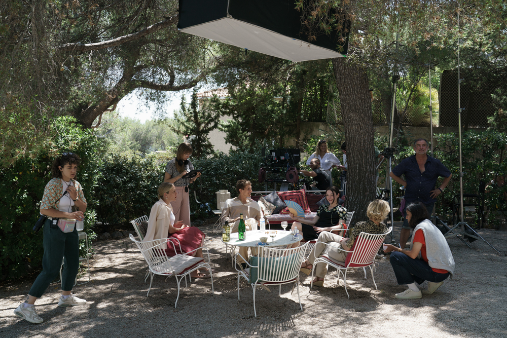
Director Durga Chew-Bose (bottom right) directs actors on the set of Bonjour Tristesse (2025)
What you really build together is a sense of trust because they have to bake it the rest of the way.
DCB: Yeah. And they have to do things that are so technical. I always wanted the world of our Bonjour Tristesse to feel familiar but disorienting. Just when you think Oh, I know what world we're in, there's an off quality or the dialogue is a bit mannered or the costume seems like it’s from another time. Just an unsteady, hermetically sealed-off world.
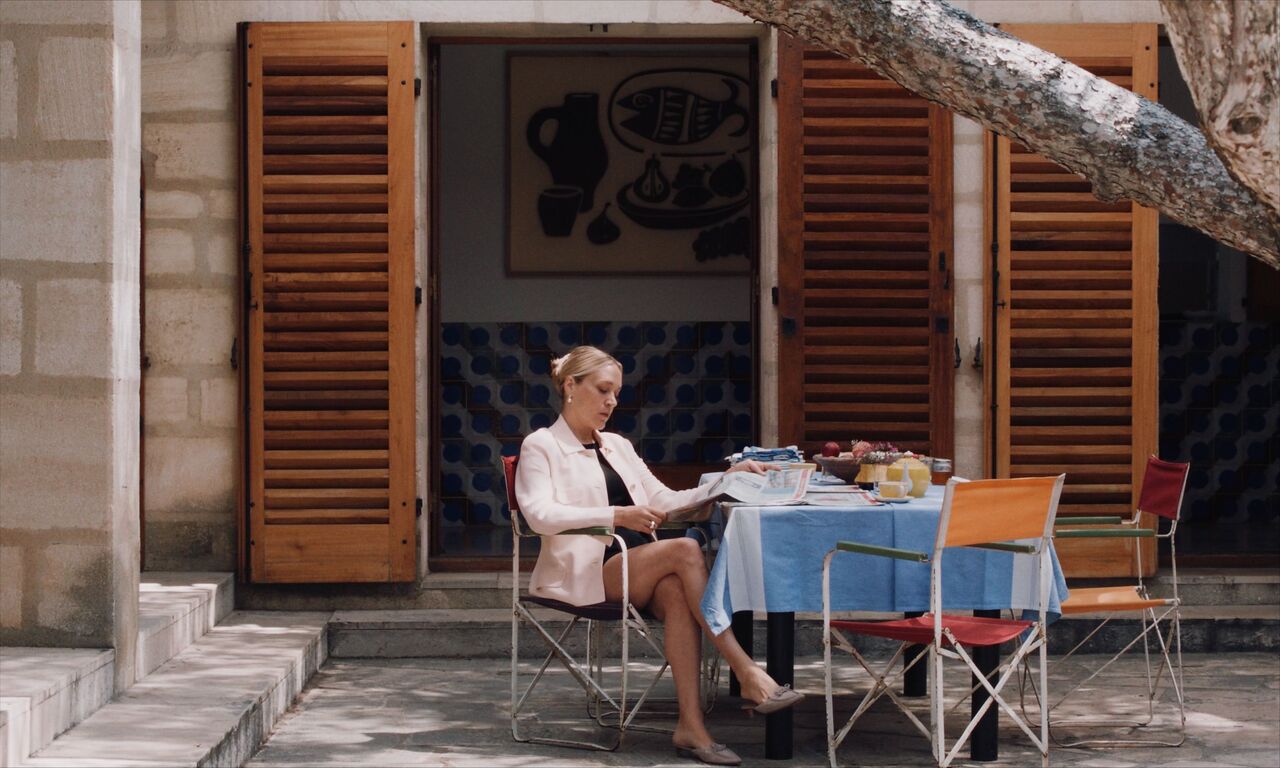
Still from Bonjour Tristesse in which Anne (Chloë Sevigny) reads the newspaper
I was struck by Chloë Sevigny’s Anne; what we know about her past, how she relates to others, how deliberate her clothing is, her movements, the way she speaks... It feels like there’s a throughline from the tiles to her. They're fired through this intense heat process and when they come out they're beautiful but glossy and hard.
DCB: I love that. Maybe this meets you where you're thinking – I really loved the idea of opening with the human touch, a handmade feel to the titles, not just because I knew I wanted to work with Teddy, but because of Anne herself. There's a scene with her sketchbook – she is a fashion designer – but I really believe that she's an artist. That's why there's that scene where she's talking to Cécile and she's trying to explain her process but it's just so hard to put into words. It's her way of potentially connecting with Cécile in that moment. Originally I had watercolors in my mind and I think it was because I thought [the titles] were going to be maybe similar to Anne, like her sketchbook.
So your instinct is actually really funny because it's part of the backstory without really knowing it! I always wanted the titles to put you in a place of thinking that someone made this which I think we get with Shane's work. His tiles don't look like they're made in a factory.
Where are the tiles now?
DCB: I don't know! I really should ask Shane for a couple of them. I would even just frame them like a keepsake.

The credit for "Written and Directed by Durga Chew-Bose"
Support Art of the TItle
Related
-

Bonjour Tristesse
summary
-
Cleo from 5 to 7
summary
-
An Education
interview
-

Listen Up Philip
title only
-
A Woman Is a Woman
title only
-
Lilith
summary