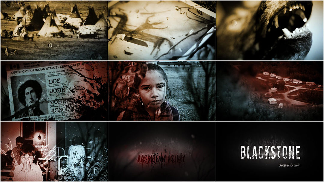


Steve Seeley and Studio Dialog paint a gritty picture of heritage and struggle with their opening for Blackstone, Showcase Channel's gripping Aboriginal drama. In the sequence, mounds of dusty earth blow across archive photos and snapshots of modern-day tribe life as the First Nation children branch out from their ancestors' shadows.
Creative Director STEVE SEELEY at Studio Dialog details the creation of the title sequence for us.
SS: Blackstone is an unmuted exploration of First Nations’ power and politics. This raw, intense, and authentic drama tells the story of the fictional Blackstone First Nation, suffering disintegration by its own hand – the result of the corruption of its chief and council. From within the community, a new generation of leaders rise up and fight to create lasting and substantial change.
Ron E. Scott, the creator of Blackstone came to us looking for an opener that matched the raw grit of the show. We wanted to create something that would have enough detail in it so that something new would reveal itself each time you watched it.

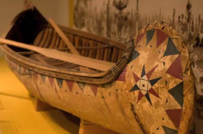
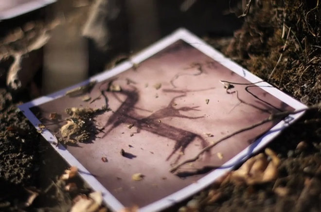
Glenbow Museum research images
The first thing we did was photograph assets from the Glenbow Museum, which has an excellent collection of artifacts, photographs, and art from the First Nations people of Alberta. Starting with these pieces in place really helped give it an authentic feel. We toyed with the idea of stop motion vs. actual video for a while and we actually did some tests with video, but ultimately we felt that stop motion really conveyed the grittiness that we were looking for. It also had a bit of a hand-done feel which we preferred over the slickness that video might have.
Glenbow Museum research video
The sequences were shot on Canon 40D, 5D, and 60D DSLRs as straightforward JPEG sequences. The 40D and 60D have a fairly fast burst rate and they gave us high-res files that allowed for a bit of panning and cropping. We’ve used video in the past and just stepped down the frame rate to about 12 fps to simulate the stop motion look, but in my opinion, taking actual stills is usually the most effective.
We then took those photographs and brought them to an outdoor location, similar to the reserve on which the show takes place to film. We wanted a really organic look, so we used stop motion animation and materials like dirt, leaves, and water to lend that dirtied, natural look to the animation.
Location video footage
The client provided the video materials. They had shot some B-roll footage of an actual native reserve to use in the titles and throughout the show. There was a bit of helicopter footage and some shots of children playing, as well as some redneck-style burnouts in old trucks. We incorporated this footage during once we had all the other pieces created. We layered on some green screen footage of dirt and leaves to tie it in with the rest of the assets we were using.
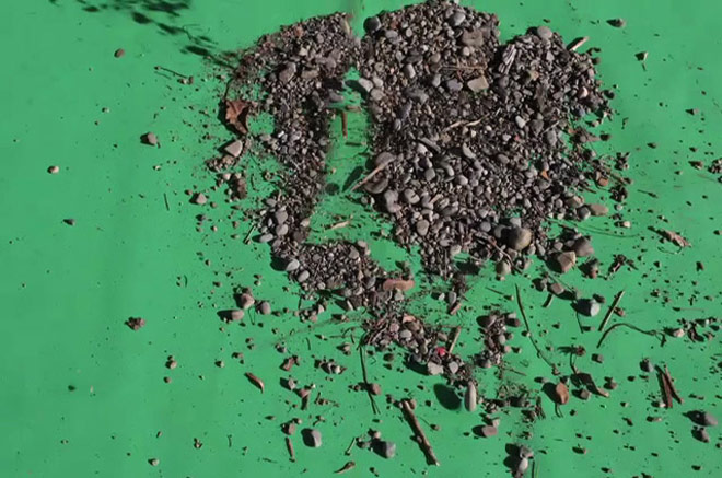
Greenscreen dirt and leaves footage
For the logo animation, we created a couple of different treatments. Both began with the Cree spelling of “Blackstone” and transformed into the final logo. The chosen direction used the Cree text as metaphorical roots, which grow upwards, forming the Blackstone logo, again reinforcing the organic theme.
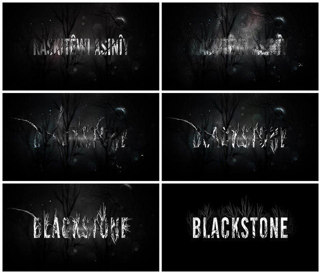
Logo animation concepts
Once all those parts were created, everything was composited together and colour treated to give the piece a dark and foreboding atmosphere. Music was the final component, which really gave it a somber, and somewhat controversial, final twist.
LIKE THIS ARTICLE?

HELP US KEEP SHOWCASING GREAT TITLE DESIGN. BECOME A PATRON TODAY.
Related
-
Hard Rock Medical
interview
-
Les Bleus de Ramville
interview
-
Durham County
summary
-
My Winnipeg
title only
-
The Changeling
summary