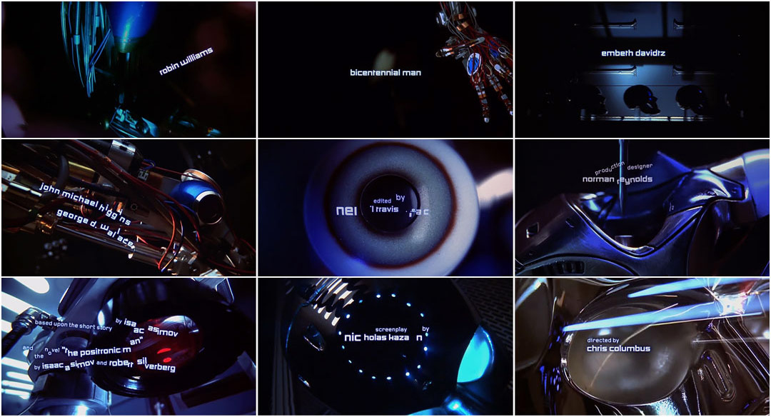


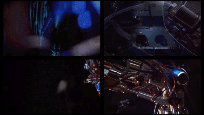
In the not too distant future (2005 to be exact), inside the factory of NorthAM Robotics, a man is manufactured — a positronic man. Hands, arms, legs, eyes — all the things that make us human — some assembly required. Our mechanical protagonist NDR (or Andrew Martin as he will later become known) is just one of thousands of anonymous automatons conveyed piece-by-piece down the factory line, constructed like any other industrial good, bound for lonely lives of servitude. Or maybe something more.
In a decade dominated by grim, future-wary science fiction, Imaginary Forces' title sequence for Bicentennial Man presents a friendly, domesticated vision of what the new millennium had to offer. The sequence essentially operates as a cheeky counterpart to the iconic Terminator 2: Judgment Day teaser trailer. Instead of the construction of a sinister cyborg with a strangely Austrian accent, the viewer is treated with the fabrication of a servile robot played by the late Robin Williams. Paired with mechanical and ever-evolving modernist type — mimicking Andrew’s metamorphosis from machine to man — and James Horner’s industrious score, the sequence rises to near-whimsical heights.
Part of what makes the opening of Bicentennial Man especially endearing is the fact that almost everything on screen is a genuine physical object. Although computer-generated visual effects hit new heights in 1999 thanks to movies like The Matrix and The Phantom Menace, the film’s prologue proved that practical effects were very much alive and well. Conceptualized by illustrators Carlos Huante and Constantine Sekeris and built by special effects wizard Steve Johnson and his crew at XFX, the assembly line and the android parts carried upon it might not add up to a real live robot, but all those bits and bobs inarguably have a life to them that most modern visual effects still can’t match.
This overly sentimental sci-fi flop doesn’t have much going for it, but the opening sequence is a definite highlight.
A discussion with Art Director MIKON VAN GASTEL of Sibling Rivalry Studio (formerly of Imaginary Forces during the sequence's production).
Give us a little background on yourself and your experience at production studio Imaginary Forces.

Covers of Ray Gun, the American alternative rock-and-roll magazine, in print from 1992 to 2000
I was in Holland studying graphic design when Post Modernism took the design world by storm. Ray Gun Magazine, Cranbrook Academy of Art, The Royal College – there was work being produced that was completely foreign to us as students in Holland at the time. So I fled to the USA to apply to Cranbrook – I have an MFA without a BFA!
After Cranbrook I moved to LA and was hired by Kyle Cooper at Imaginary Forces. I got there right after they did Se7en. It was the perfect time because there was too much work and they needed people to run their own projects. I worked on my fair share of titles sequences and commercials, and then started the Experience Design division. After we won a big Times Square signage project that demanded a local presence, I launched the New York City office in 2001.
So, let’s talk about Bicentennial Man. How did you start on this project?
This was a classic “type over scene” title sequence [at first]. We were handed raw footage and crafted the story from there. The immediate goal for both Matt Checkowski, the designer on my team, and I was to make the typography act like an actor on a stage. Give it a personality, have it play off the movement in the footage and create a visual language for it that could sustain itself over two minutes. This is a theme in both Sphere and Bicentennial Man.
Sphere (1998) title sequence, art directed by Mikon van Gastel and Kurt Mattila
A lot of sequences use a single “trick" or technique for the typography, over and over again, rather than think about a visual language that could unfold over time. It’s a big a pet peeve of mine. So we wanted each title to be unique and did not want the sequence to become repetitive. Much like a character in a film… it should change, evolve and transform.
At what stage of production did you guys come in? Did you watch the movie beforehand?
We saw a rough cut of the film first. But it was pretty late in the game. When the assignment is “type over scene” you’re basically forced to use existing footage and base it around the typography of the credits. You take the footage and come up with various treatments, both visually or editorially. We played around with ideas of using robotic blueprints. But in this specific case the footage was so great that there really was no need to alter it.
How did you choose the typeface?
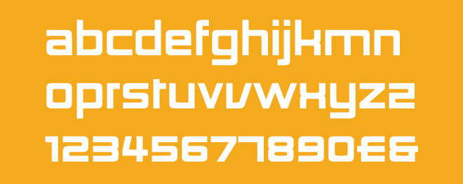
Well, the film was about how a robot becomes more human and fights for his place in society over the span of 200 years. So the production design feels both nostalgic and futuristic at the same time. We looked for a pair of typefaces that felt both nostalgic and futuristic. A combination of something man-made and machine-made, geometric and monoline that we could take apart, animate and pivot, as if they were parts of a robot being constructed on a conveyor belt.
Architype Ballmer and Architype Gridnik typefaces
We chose the Architype Konstrukt Collection of fonts since the ideology behind it played beautifully to the concept of the film. It’s a collection of avant garde typefaces derived from the work of artists and designers in the period between the First and Second World Wars whose ideals of clean, simple and functional form have helped shape the design philosophies of the modernist movement in Europe.
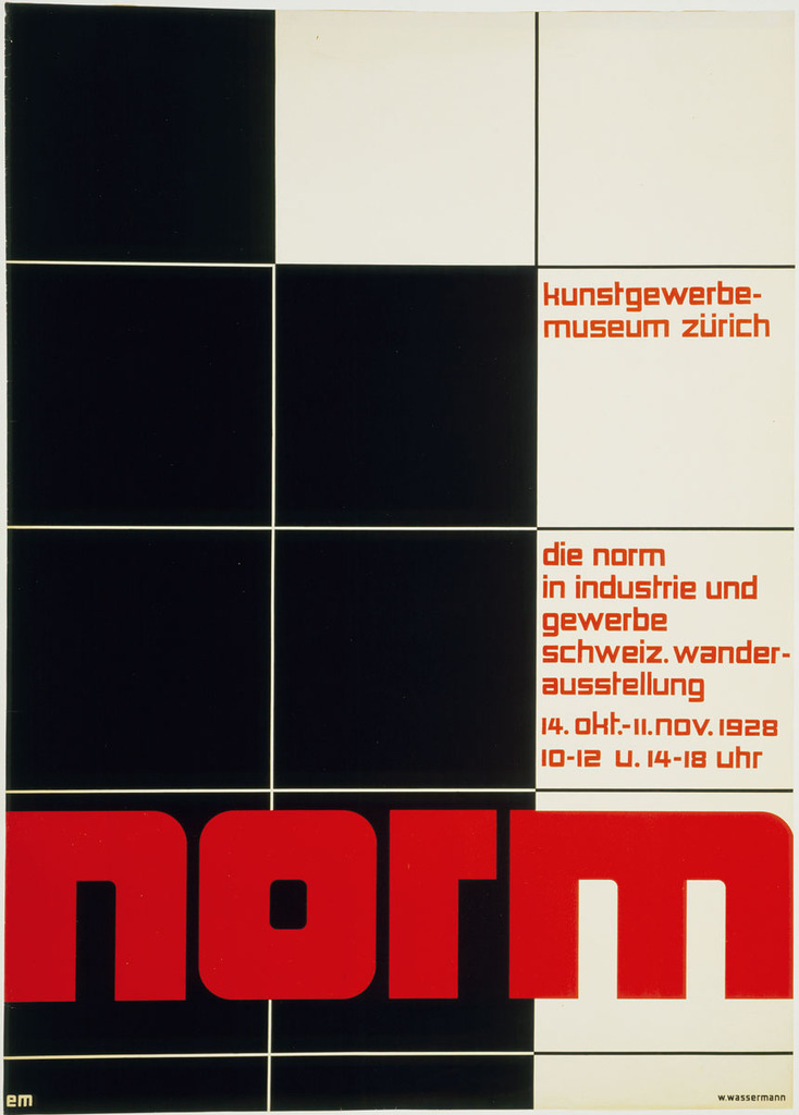
Theo Ballmer's poster for a traveling exhibition of industrial standards (1928)
Architype Ballmer is the main font, which is inspired by Swiss designer Theo Ballmer’s 1928 posters for an exhibition on Industrial Standards. Architype Gridnik is the secondary font, designed by Foundry but based on a Modernist typeface commissioned by Olivetti to Dutch designer Wim Crouwel for Olivetti’s new electric typewriters.
How did you integrate the credits typography into the shots?
Since the footage was visually so luscious we wanted to treat the type with a certain amount of restraint and mechanical intelligence. It would have been quite obvious to track the type to the movement in the backplate, make it situational or move on multiple axes robotically but we opted to keep it much simpler and 2D.
The type is inspired by the mechanical motion of the conveyor belt without literally tracking to it or living inside it. The type feels integrated from a choreographic perspective, they all share a common aesthetic, but each credit still feels like it has its own personality.
There’s also a definitive arc to the cadence and complexity of the animation as it builds over time. It starts with simple 1-axis movements, letters pivoting, dots in the “I” blinking, and evolves to entire lines transforming and pivoting!
Animated type examples
How did you work with the music? When did that come in?
As so often happens, it got post-scored – in this case by James Horner. The piece is called “The Machine Age." I believe he later re-used it, without the sound effects, for A Beautiful Mind and called it "A Kaleidoscope of Mathematics” and won an Oscar for it! Hah.
Who did you work with on this title sequence and what tools did you use?
It was a small dedicated team which I think played to its success. I was the creative director, Matt Checkowski was the designer and animator, and Jason Webb was the editor. We used Photoshop, Illustrator, After Effects, and Avid.
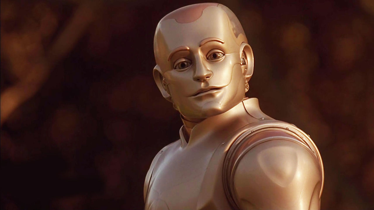
Andrew (Robin Williams), the titular Bicentennial Man.
What are some of your favorite film and television title sequences, whether classic or contemporary?
I think you’ve covered them all! Your site is very impressive. But I mostly enjoy the ones that have a smart, unexpected angle and play with the format. Some of the most creative these days are for design and tech conferences it seems! The ones that have to tell a story are the most fun to work on.
Looking back, how do you feel about this sequence?
We wanted it to feel simple, playful, intelligent and harmonious. There was something endearing about Andrew, the robot, and we tried to give the credits a similar quality. I think it still holds up! The footage is incredibly well-shot. Norman Reynold’s production design is very intricate. The typography is timeless and the animation avoids many techniques that would have become clichéd today.
Support for Art of the Title comes from
NEW YORK FILM ACADEMY LOS ANGELES
Study under award-winning photographers and master the art of photography.
Related
-

The Inner Workings
feature
-

Ghost in the Shell
summary
-
Chasseurs De Dragons
summary
-

I'm a Cyborg, but That's OK
summary
-

I, Robot
summary
-

Deus Ex: Human Revolution
interview