


Editor’s Note: This article has been marked “Not Safe For Work” due to elements that contain nudity.
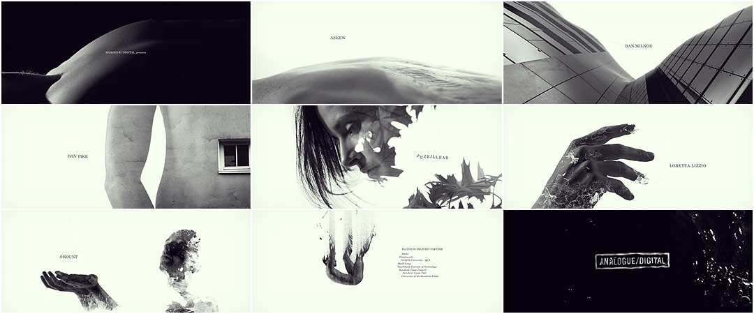
The fluid curvature of skin, so elusive in the briefest of glances, opens this exquisite title sequence for the 2013 Analogue/Digital conference in Brisbane. Juxtaposing the hard and the soft, natural and constructed elements are placed among the angles of the human body, supple, stretching in some unspoken desire. The typography floats just beside these surfaces, trembling in its proximity. Figures fall through space, disintegrating, communicating with the adjacent credits to create a symmetry in the void.
And though the sequence runs a touch too long, a certain sense of wonder lingers as the title ripples into view.
A discussion with Creative Lead JOYCE HO of Breeder.
Give us a little background on yourself and Breeder.
Breeder is a design-led motion studio. We’re a tight-knit team of five and we’re based in Brisbane, Australia. I’m on the creative side so I get to spend my days with a super fine and talented crew, where I do a range of things from designing boards and animating, to editing.
How did you develop the concept for the sequence?
Just like the titles we created for Analogue/Digital in 2012, we were given another mastered track written by Alabaster. We were also inspired by the program design that the A/D team sent across. Their design featured two speaker headshots overlaid on top of each other – one vertically and one horizontally – so you had to physically rotate the program to read their biographies, which we thought was pretty cool. We were intrigued by this idea of looking at things from different perspectives.
A/D program design
We listened to Alabaster’s track non-stop for about a day as we tossed ideas around the theme of ‘binary.’ It resonated with us and we felt it suited the conference. We got the crazy idea to combine the concept from the program design, where images were overlaid, and the theme of binary.
We took his song and broke it down into sections of a narrative. This made sure our visuals fit the vibe and pacing of the song, and into a greater story arc. Through this process, we constructed a timing animatic that acted both as a shot list and storyboard.
What are some concepts you ultimately did not go ahead with?
Another idea we bounced around, again taking inspiration from the program design, was a red and blue stereoscopic vision. We envisioned everyone at the conference wearing 3D glasses with our studio logo printed on them. But in the end, we decided against it because we wanted the titles to reach a wider audience and to be viewable outside the conference.
Where did merging the human form and natural textures come from?
We played around with the idea of double exposing man-made objects with nature, as a different take on “Analogue/Digital,” but we concluded that was too literal. It lacked a central protagonist to drive the titles for the whole four minutes. So we focused on a man and woman and juxtaposed them with a set of binaries: the urban sprawl and nature, black and white, flight and fall, unification and disintegration.

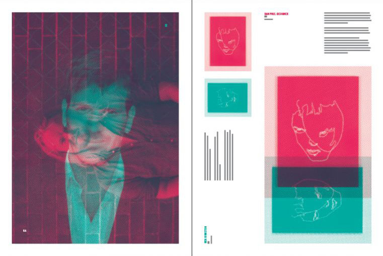
Concept board
What kind of discussions did you have about the nudity?
We briefly discussed whether it was necessary and whether we could get away with the talent wearing plain white clothes. Ultimately, we wanted to capture the beauty of the nude form and thought the movements of the dancers were best captured and rotoscoped without clothing. We also felt the juxtaposition between organic and urban was much stronger if the talent were nude – as if to say, they had nothing to hide and nothing to separate them from the elements – reinforcing a sense of freedom.
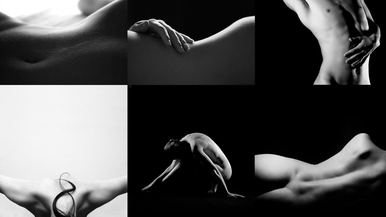
Image reference
What techniques did you use to map the images to the bodies? Was this a process developed especially for this sequence?
*Mocha is a powerful motion tracking and roto utility that allows for advanced tracking and matte creation for Adobe After Effects.
We primarily used Mocha* to track the film plates. We’d always intended the film shoot to be really organic, so we decided against the use of markers on the bodies since we weren’t sure how they would move. Mocha was easy to integrate into our After Effects workflow as we could copy and paste tracking information directly into AE. Most of the time, Mocha would return good data but if there were gaps, we filled those in with expressions.

After Effects and Mocha screenshots
Detail your workflow for us.
At the height of production, there were five motion designers working simultaneously on different shots and stages of production. Unlike the disintegrating particles, we hadn’t explored this double-exposure aesthetic before, so our workflow was completely new but it made the project all the more exciting.
When we finished filming, we did a rough edit to choose the shots we wanted. It was important to do this first, so we had the exact duration of each shot, and wouldn’t waste time later. While this was happening, boards were designed and assets assembled for each shot. We imported these exact film plates into Mocha, where we used the most prominent body parts to track. Although some limbs were tricky and we took extra time tracking, in the end we still finished them faster than if we’d decided to use markers on the dancers.
Next, we took the data from Mocha and applied it to nulls that we parented to a Puppet Tool rig on each texture layer. We decided to use the Puppet Tool as it gave us extra freedom to really tweak the motion of each layer. The textures were finally screened on top of the graded film footage.
Process breakdown of the opening titles
We then got stuck into animating names and lines. This was simply keyframing the letters as if they were being affected by the movement of the dancers. For each and every line, we tracked nulls onto the comped shots in AE and parented Beams on each end. We had a very specific idea for where to put these lines – to make sure they suited the overall composition. It was easier to do this manually rather than use something like Plexus. Last and definitely not least, a colour grade was added.
How long did it take to put it all together? What tools did you use?
The whole project, from concept to post-production, took us around 400 hours to complete. We used Photoshop for the design, After Effects for motion, and Mocha for tracking.
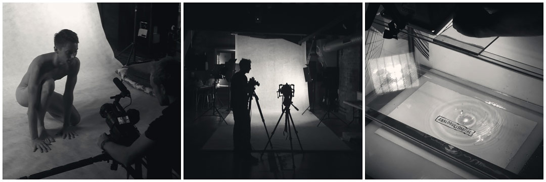
Live-action shoot
What was the live shoot with the actors or models like?
The live shoot was very organic. We set up a white space in our studio and invited two dancers to star in the titles. On a large TV screen, we had our timing animatic on loop while we gave the dancers some broad direction on specific parts of the narrative we wanted to capture. This included the more measured introduction with rim light and how we wanted them to “fall” for the climax. Since none of us are educated in dance, we wanted to give them as much freedom to freestyle as possible and urged them to do what they felt from listening to the music. What resulted was a lot of great movement and body forms that we didn’t plan on getting.
How did you do the disintegrating particles at the end?
For the particles at the end we used Shatter, one of AE’s oldest and probably most neglected plugins. Shatter, who knew?!

Hand particle breakdown
Download Breeder's “Hand Particle” After Effects project*.
*After Effects CS6 or CC, and Trapcode Particular required.
Firstly, we cleaned up the film plates of the dancers by rotoscoping their arms and hiding some of the bits that we didn’t want showing. We also Twixtor’d the plates so they would fall even slower. The first map was simply a fractal and then the rather finicky Shatter Gradient map was created to give the debris the correct speed and look. This same formula was used on a few layers in Z to sell the depth. Sandwiched between those layers were some Particular emitters, using turbulence field to add some chaos. Finally, the edge pixels of the dancers film plate were used as layer emitters for some more Particular chaos.
We feel really happy to be able to share this process and give people greater insight to this piece. Hopefully, it encourages people to get in and explore this stuff for themselves.
The tension between the text and the characters was a very interesting element – how did you develop that?
From the very beginning, with the first concept board, we had a vague idea of animating the text in a slightly delayed fashion, as if the visuals set off a wave of motion and the text needs to catch up. We thought it would add a great layer of interest instead of the text just sitting in space or simply being tracked on. The lines were added as a catalyst for the text’s animation. It also helped subtly break up some of the white space, which was sometimes too stark.

Early styleframe
Was there anything that took you by surprise when working on this sequence?
Making water drip from the end of someone’s nose on cue was actually really hard! It would either be too many drips or it wouldn’t be enough water to slide down his nose. Took about 10 takes to get it right!
What are some of your personal favorite title sequences, whether classic or contemporary?
I love the amazingly surreal opener to The Twilight Zone and I also have a certain soft spot for the quirky style of titles like Napoleon Dynamite and Gentlemen Broncos, where graphic design or set design plays heavily. Another favourite is Zombieland – I really dig how it starts with Columbus’s rules, leading onto the titles but then his rules are continued throughout the movie. Also, titles with Jesse Eisenberg, zombies in slow motion, all set to the sound of Metallica? What’s not the love?

The titles on display at the Analogue/Digital BNE 2013 conference. Photo: Luke Middleton
Support Art of the TItle
Related
-
True Detective
summary
-
Semi-Permanent Sydney 2018
interview
-
OFFF 2013 Cincinnati
interview
-
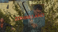
Zombieland
summary
-
The Expanse
title only
-
Likeminds 2017
title only