


Beginning with Stop, a short film Richard Greenberg made in university in the late ’60s, the thread that would run most clearly throughout much of the title design of R/Greenberg Associates is a particular application of typography. Their first title sequence, for 1978's Superman, involved the innovation of a slit-scan technology that would allow the title to "swoop" through space. Next came Ridley Scott's Alien featuring strangely dismembered bits of type, lending the opening a definitively ominous tone.
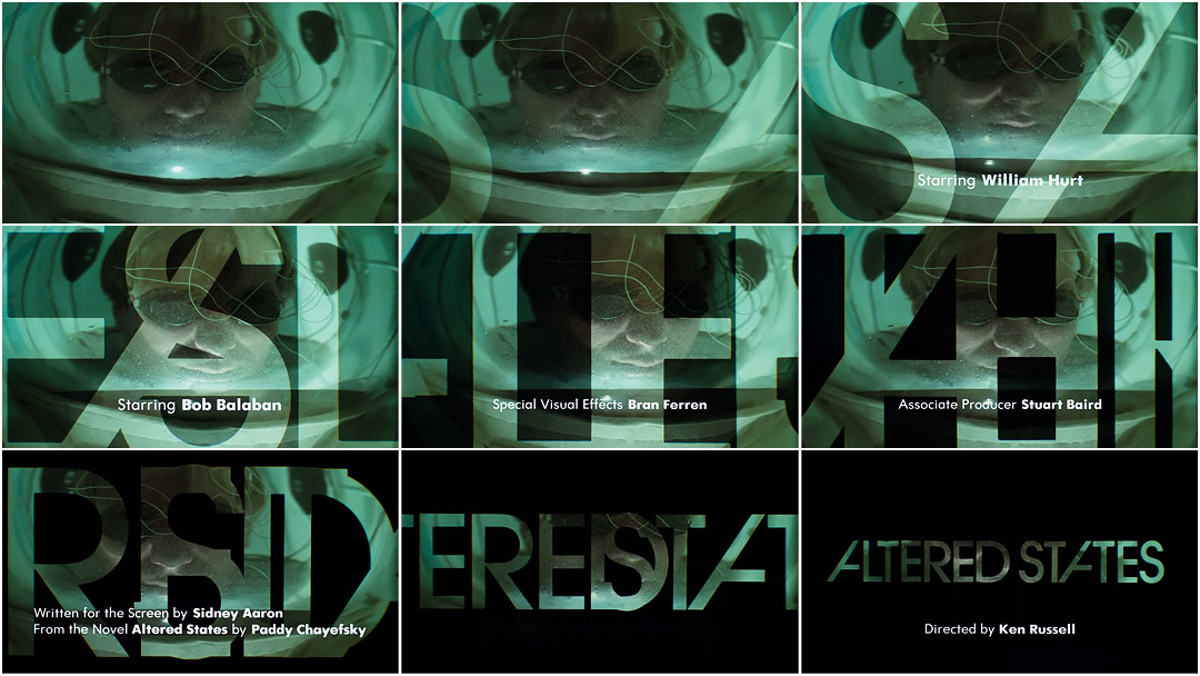
Altered States, from 1980, uses a geometric sans-serif typeface, a slightly modified ITC Avant Garde Gothic. The letters invade, becoming a lens for the scene and conveying a sense of encroachment. They shuffle themselves disorientingly, the man within eventually lost to text. This technique and the use of type as a lens can be seen again in the titles to The Dead Zone. This usage of type as structure and as obstruction is a motif to which Richard would return again and again.
Title Designer RICHARD GREENBERG and RGA CEO ROBERT GREENBERG speak about their work on Altered States in this excerpt from our feature article R/Greenberg Associates: A Film Title Retrospective.
So what was after Alien? Was it Altered States?
Richard: Altered States was in there. Usually when you’re developing ideas you try to present a couple of storyboards that you at least believe in but I had the notion that we could set up the film by putting type against type. I thought I could set up a metaphor of the first trip because that’s what the movie’s about, so I made a little piece of film instead.
That seems to be a clear thread connecting much of your work, actually. There’s a clear progression with the use of type.
Richard: I really liked that way of teasing of the audience. Bass would do stuff like that — using a motif and then transforming it, like an eye. I believe a classic title sequence could be a tease, like Altered States was, where you didn’t really know what you were looking at and then there was the “A-ha!” moment.
Robert: Richard really came out of the world’s best program, which happened to be at the University of Illinois. David Colley was his teacher, and my brother came out with, essentially, a masters education in typography. Most other people don’t. Kyle Cooper did. Richard was way ahead of me in that regard — he had all the right influences. He met or knew a lot of the type designers when we used to hire.
So, you wanted to use type as a tease in Altered States?
Richard: Right, so we just shot type going against type on color film. I went out to California on a Saturday night and I showed it to Stuart Baird who was the editor, and Ken the director. Ken just recently passed away, actually.
Yeah, Ken Russell.
Richard: Yeah, Ken Russell and Danny Melnick, the producer, were there. I remember sitting far away from them in the screening room. I was so nervous and I thought to myself, “What if they don’t like this? I don’t have another idea.” But they loved it and we produced it and it all fell into place.
Related
-
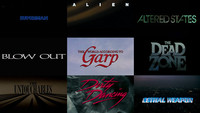
R/Greenberg Associates: A Film Title Retrospective
feature interview
-
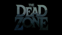
The Dead Zone
summary
-
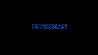
Superman
summary
-
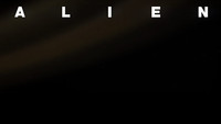
Alien
summary
-

The World According to Garp
summary
-
Blow Out
summary