The Very Best Title Sequences of 2016, as chosen by Art of the Title
For our third annual list of the year’s top 10 title sequences, Art of the Title’s editors chose from among work created for film, television, video games, exhibitions, and conferences. The Top 10 of 2016 were chosen based on criteria including originality and innovation, impact, atmosphere, relevance to the larger work, and technique.
Starting in late 2015, we began formally cataloguing title sequences for the year and by the end of December 2016 we had assembled a huge long list for consideration. Paring the long list down from 107 to just 10 was a difficult task, but it was a process we relished. These title sequences were painstakingly crafted, acted, shot, animated, composited, typeset, modeled, frozen, blown up, and hand-drawn by teams large and small all around the world, with budgets modest and mighty, in state-of-the-art facilities and in home studios. So sit back, relax, and enjoy some of the most interesting and innovative work to hit screens this year. These sequences represent the cream of the crop – be sure to hit the full screen buttons for the best viewing experience!
Art of the Title's Top 10 Title Sequences of 2016
10. DOOM
CATEGORY: GAME
Created by id Software
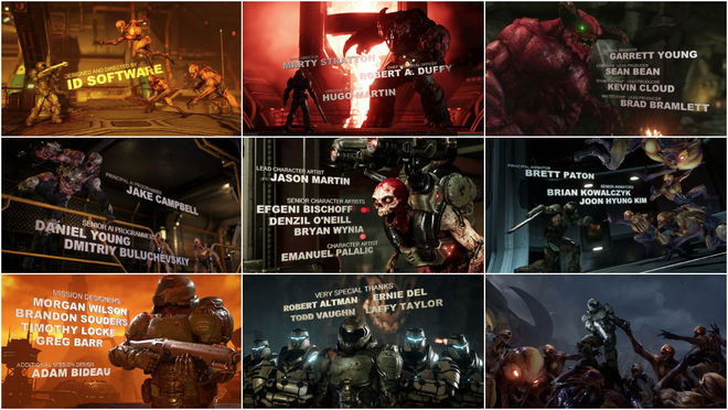
Mars has gone to Hell. Literally. An evil corporation has tapped the unlimited powers of the underworld with predictable results. Demonic forces have overrun the red planet and it’s up to a lone space marine to stop them in id Software’s bloody, brilliant reimagining of DOOM — the granddaddy of the modern first-person shooter. Channelling the heavy metal album covers and pulpy sci-fi that inspired the original game, 2016’s DOOM is finely tuned to capture the essence of what made those earlier games such a blast to play. It’s all refreshingly retro, an ultraviolent power fantasy with a dash of Verhoevian satire for good measure.
DOOM’s end credits are the perfect coda for that kind of gameplay experience. A four-minute reprise of the player’s gib-filled journey, the title sequence is a shotgun-blasting, demon-dismembering battle across Mars and into Hell itself. It’s rare for game developers to get their due in anything but a lengthy end crawl, but here each department is given their due with a thematically appropriate tableau; a terrifying hellscape for the environment artists, a map room for the mission designers, an arrayed arsenal for the weapon modelers, and so on. It’s precisely what a good end title sequence should do: bookend the experience in an entertaining way while celebrating the people who made it all possible.
Read our in-depth discussion with Principal Animator Brett Paton of id Software.
9. Vinyl
CATEGORY: TV
Created by Imaginary Forces
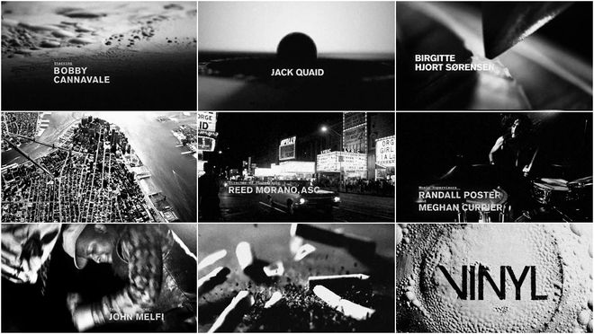
Do you remember the best concert you ever went to? You know, the one where your favourite band brought down the house and you partied harder than you ever have before or since? If you’ve ever had an experience like that then you will most certainly recognize the vein being tapped into by the raw and rollicking opening to HBO’s Vinyl.
The short lived series shined light on one of the most exciting eras in music history: the early 1970s in New York City. It was a time ruled by rock stars and record men, a place where proto-punk and primordial hip hop were birthed within earshot of psychedelic soul and stadium glam rock. For the show’s opening, Imaginary Forces channels Richie’s depraved essence and capture the zeitgeist of ’70s NYC. A team working in both New York and Los Angeles brought together numerous concepts – including high-speed and macro photography – to create a minute and a half of blisteringly intense, hard rockin’ title design. From the moment the stylus needle first tears into the LP’s groove to rocker Sturgill Simpson’s final venue-demolishing scream, the Vinyl sequence is turned up to eleven throughout, still reverberating in your chest as the show begins.
8. Pride and Prejudice and Zombies
CATEGORY: FILM
Created by Mill+
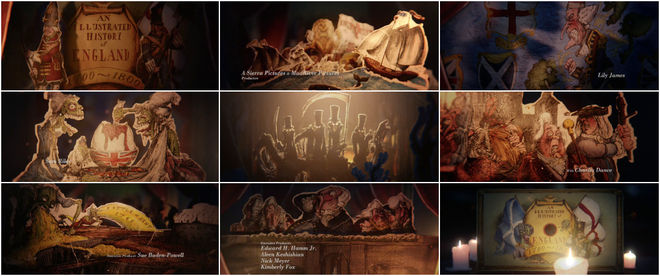
What if instead of the Napoleonic Wars pushing 18th century Europe into conflict, it was actually a supernatural threat – a zombie pandemic – that plunged the continent into war? That brain-eating alternate history is the central conceit of Pride and Prejudice and Zombies, director Burr Steers’ nearly straight-faced adaptation of author Seth Grahame-Smith’s novel of the same name. The genre-bending parody transforms Jane Austen’s Regency era novel of manners into a zombie-slaying tale of love, classism, and kung fu.
The film’s opening sequence does the necessary worldbuilding a mashup like this requires. Creative Director Ben Smith and the team at The Mill were tasked with developing a prologue that would ground the utterly insane concept in some semblance of reality, and, at the same time, explain the differences between this zombie-filled history and our own. To encapsulate this turbulent time, the team employed the talents of renowned political cartoonist Martin Rowson to illustrate the sequence in the style of 18th century caricaturist James Gillray. The finished sequence takes the form of a bedtime story being told by Mr. Bennet (Charles Dance) in between the hushed whispers of young Elizabeth and her sisters. Bolstered by beautifully timed animation and Rowson’s irreverent illustrations, the prologue plays out not as some fairy tale dreamt up to scare children, but as practical, life-saving advice being passed from one generation to the next – from a well-meaning father to his well-mannered and very well-armed daughters.
7. St-Nickel
CATEGORY: TV
Created by Jay Bond, Garry Tutte
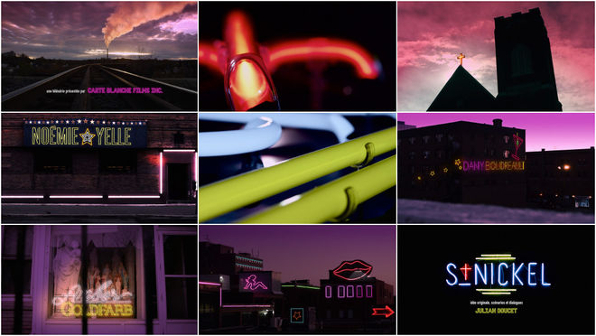
The opening of St-Nickel exposes a Sudbury, Ontario that most have never seen. As the sun goes down a different kind of city wakes up. It’s the time of day when baristas and business people co-exist with barflies and bikers for the briefest of moments, when the red lights of the local peeler bar and the rusty hues of the northern sky become one and the same. Neon signs enlighten the city about its new state of being, leading many into temptation and other kinds of worship with that ceaseless, ever-present buzz.
Described by its creator as Parks and Recreation by way of Shameless with a distinctly Ontarois spin, St-Nickel is a TV dramedy about an exotic dancer and a famous virgin trying to get by in a French-speaking corner of Sudbury. The series puts the city’s significant Franco-Ontarian population centre stage, focusing on the families caught in the middle of the clash between the city’s rough-and-tumble past and its uncertain but promising future. With a wink and a kick in the ass, St-Nickel reveals that there’s far more to this old mining town than just the almighty five-cent coin.
Read our in-depth discussion with directors Jay Bond and Garry Tutte.
6. El Rey Tuerto
CATEGORY: FILM
Created by Pablo Sánchez
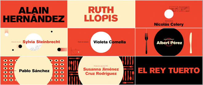
In the land of the blind, the one-eyed man is king. In Marc Crehuet’s 2016 dark comedy El Rey Tuerto (also known as El rei borni), a demonstrator loses his eye to a rubber bullet shot during a rally. Soon thereafter he finds himself a guest in the home of the police officer who shot it. Face to face at a couples’ dinner, the men must confront each other and their convictions, trapped in the context of a cordial social gathering.
Designer Pablo Sánchez’s opening title sequence to the film takes this conflict and its explosive catalyst – the rubber ball – and focuses on it with unwavering style. The colours flash on and off, a minimalist palette of red, white, beige, and black echo blood and skin and rubber and change in time with the pounding beat. The circle at the centre starts small but grows steadily, larger with each drumbeat, a pinprick, a ball, an eye, a hole, a sun. The drawings of police vehicles and cutlery drop away as the dark circle swallows the whole and the stage is set for a bold confrontation.
Watch the El Rey Tuertotitle sequence on Art of the Title.
5. The Jungle Book
CATEGORY: FILM
Created by WETA, Moving Picture Company, yU+Co
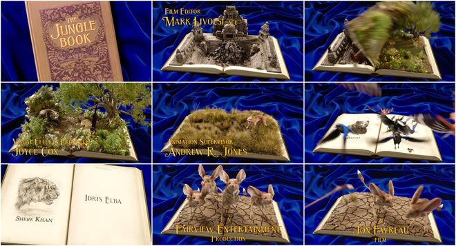
The third Disney adaptation of the adventures of feral child Mowgli penned by Rudyard Kipling, 2016’s The Jungle Book takes its cues from the classics, combining techniques from the previous two Disney versions while charting its own path.
The end title sequence of Jon Favreau’s The Jungle Book is a gorgeous postscript and one that can only be properly understood through its lineage. As with his previous family-friendly film Elf, Favreau pays loving homage to the source material.
The opening of the 1967 The Jungle Book features a worn hardcover book laying atop a blue velvet background that opens to reveal black-and-white illustrations and the names of the film’s key players. Notably, the film has no closing sequence featuring the book, a simple “The End” card doing the job. Here, Favreau takes that book and recreates it exactly, using it to open the film but also adding an end sequence to bring the story to a close with stunning vitality and depth.
Watch The Jungle Book's closing sequence on Art of the Title.
4. David Blaine: Beyond Magic
CATEGORY: TV
Created by Buck
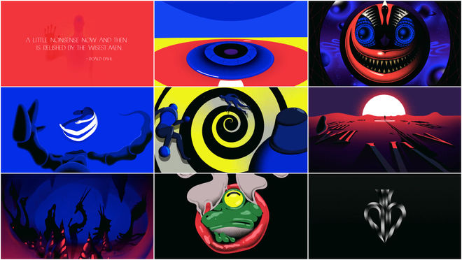
David Blaine is undoubtedly the biggest name in magic today, and his new ABC special Beyond Magic follows the illusionist on another of his escapades performing for public figures.
The 42-minute special begins with an apt contradiction: a light quote from British writer Roald Dahl and the first inklings of an ominous score by audio studio Antfood. From there, the richly animated opening produced by Buck takes a plunge down the rabbit hole into voids of blue and black and red, into shapeshifting and body horror, into unanswerable questions and Dalí-esque landscapes – the heart of the ineffable.
“He wants to thrill us. He wants to get our attention,” says the voice of actor Christopher Walken, his stilted and strange cadence tying together Cheshire Cat grins and bubbling eyeballs. A figure is slammed through spirals and space, maneuvering that crazy edge between the real and the supernatural. This sequence bears its own magic, a wily and adroit skill that borrows from the past but uses the technology of today, hiding its tricks for the sake of the impression. At its end, and the picture’s start, there is nothing to ground us, no title card – just an image of a spade, the stylized “db” of David Blaine.
Read Motionographer's in-depth discussion with Buck Creative Directors Orion Tait and Thomas Schmid.
3. Divines
CATEGORY: FILM
Created by Anaïs Mak
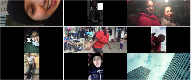
To visitors, Paris is the city of love and lights. But there is one Paris that tourists rarely see: La Ville-Immigrée – The Immigrant City, an impoverished periphery where opportunities are few and far between, and those that appear must be seized or stolen. Glimpses of that Paris can be seen in the opening moments of Divines, Director Houda Benyamina’s timely, heart-wrenching drama about two young women coming of age in the outskirts of the French capital. The film opens with a montage of Dounia (Oulaya Amamra) and Maimouna (Déborah Lukumuena) goofing off. Shot vertically on a mobile phone, the pair record themselves smiling and laughing, dancing and mugging for the camera, aping their idols and broadcasting it to the world. These “snaps”, shared through the video messaging app Snapchat, are as much for them as anyone else – fun and fleeting projections that belie the poverty and violence that surrounds them, revealing a deep bond between the two.
Director Benyamina and Editor Loic Lallemand assembled the opening sequence from footage shot by stars Amamra and Lukumuena along with Cinematographer Julien Poupard. Title Designer Anaïs Mak then designed the credits to appear as on-screen captions in line with the app’s signature style. The selfie aesthetic helps to ground Divines in a level of realism that’s impossible to shake. When paired with Vivaldi’s haunting Nisi Dominus, the girls’ playful antics begin to take on a foreboding dimension. Closing with Dounia’s defiant declaration that she’s “queen of the world” and a sky high title card, it’s hard not to wonder what the future holds for these two friends.
Read our in-depth discussion with Title Designer Anaïs Mak and Editor Loïc Lallemand.
2. Stranger Things
CATEGORY: TV
Created by Imaginary Forces
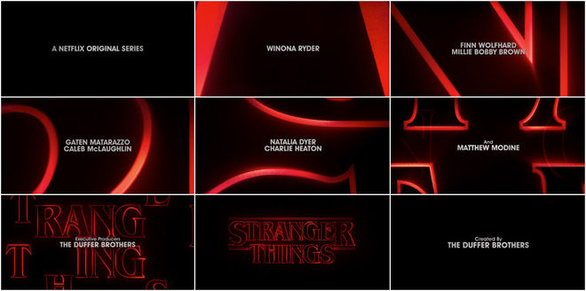
Netflix’s Stranger Things is a series loaded with subtle nods and not-so-subtle homages to some of the most beloved films of the 1980s. Showrunners Matt and Ross Duffer channel Steven Spielberg, John Carpenter, David Cronenberg, John Hughes, and everyone in between, delivering a shot of pure nostalgia, a dose of something both familiar to viewers and altogether distinct. Think Tarantino by way of Amblin Entertainment!
Similarly, the show’s main titles function as a tribute to some of the era’s most iconic book covers and title sequences, a pastiche of first impressions. Paired with a synthy title track straight out of a Carpenter flick, the Stranger Things sequence echoes the openings of genre classics like Altered States and The Dead Zone both in form and tone. Large, hollow type drifts through a void, slowly assembling, its glowing red edges cutting through the darkness as smaller credits fade in and out. The primary typeface is Benguiat, carefully chosen for its deep associations with early ’80s Stephen King paperbacks, the Choose Your Own Adventure series, and other dusty, musty touchstones.
The Stranger Things opening is not only a fitting successor to a revered title design tradition, but a testament to the power of type in motion and the enormous potency of nostalgia.
Read our in-depth discussion with Creative Director Michelle Dougherty of Imaginary Forces.
1. Deadpool
CATEGORY: FILM
Created by Blur Studio
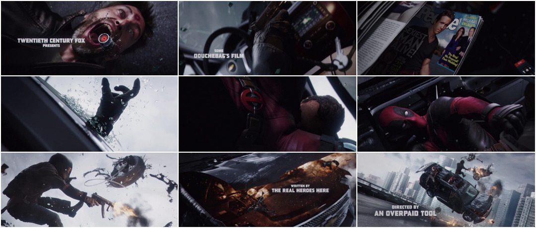
The opening notes of Juice Newton’s adult contemporary classic “Angel of the Morning” drown out what are sure to be the final screams of some extremely unlucky hired goons. Here, frozen in time, in the back seat of an exploding Cadillac Escalade, a hyper-violent tableau takes shape. In what can only be described as some unholy marriage of the Three Stooges and a Michael Bay movie, battered bodies fly in all directions, engulfed in a shower of spit, blood, and broken glass. Guns are fired. Eyes are gouged. Tea is bagged. This is Deadpool… or rather it’s our introduction to Deadpool, the masked mutant in the middle of all that death and debris — the guy deftly executing the wedgie to end all wedgies.
Blur Studio’s opening to Deadpool acknowledges the fact that it is a title sequence in a movie. Full of sly (and not-so-sly) nods to comic book fans and self-reflexive title cards that say what we’re all really thinking, there is no way to come away from the opening sequence without knowing full well what you’re about to get into.
Honourable Mention
With the arrival of consumer virtual reality devices like the Oculus Rift and PlayStation VR in 2016, title design has begun to make some interesting forays into the VR space. Special mention must be made of the fantastic opening to I Expect You to Die, Schell Games’ spy-themed VR puzzle game which kicks off the experience by putting players into a James Bond-inspired opening title sequence.

Read our in-depth discussion with the Schell Games design team.
—
...and that's a wrap!
There are so many amazing title sequences we weren’t able to include in this top 10, but a number of this year’s most notable sequences can be viewed by looking at our 2016 titles list.
Love our choices? Disagree with our picks? Did your favourite title sequence not make the cut? What were your favourites? Be sure to tweet us at @ArtoftheTitle and have your say.
Thanks for joining us for another incredible year in title design.
Here’s to an exciting 2017!
—Art of the Title