Pioneers. Iconoclasts. Ad Men. Brothers. Whatever you call them, Robert and Richard Greenberg are responsible for founding R/Greenberg Associates (now R/GA) and for bringing about incredible innovations in the worlds of advertising and film. What began in 1977 as two brothers designing film titles and advertising out of a remarkably tiny brownstone where they slept in bookcases has evolved into a full-service international agency responsible for some of the most iconic commercial and film work of the last 35 years.
After stints working unsatisfying jobs – Robert for a cola company, Richard under Director Pablo Ferro – the brothers struck out on their own. Robert handled the business side of the operation, ensuring they had the means and the equipment, while Richard handled the creative. Born of a tradition that included Saul Bass, who designed the titles for films like North by Northwest, Psycho, and West Side Story, and Stephen Frankfurt, designer of the classic opening sequence for To Kill a Mockingbird, the title design of R/Greenberg Associates took motion and titles a step further. As is evident throughout their oeuvre, the Greenbergs ascribed to a philosophy of formal simplicity while endeavoring to innovate and intrigue at every turn.
Beginning with Stop, a short film Richard made in university, the thread that runs most clearly throughout his style is a particular application of typography. Stop is as much a political response to the tumultuous events of the 1968 Democratic National Convention as it is an exploration of type and film as media. In Stop, the letters are simultaneously message and medium, a lens through which images are both displayed and distorted, the repetition of forms echoing the song’s lyrics and outlining the message in no uncertain terms. This usage of type as structure and as obstruction is a motif to which Richard would return again and again.
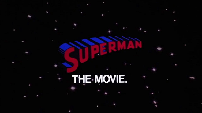
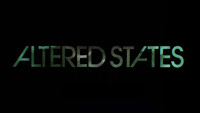
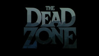
The Greenbergs’ first major film project as a company, the teaser and opening title sequence to 1978’s Superman, gave them a start, but their second established them as a creative voice. In the opening sequence for Ridley Scott’s Alien, a disjointed version of the Futura typeface is used to instill a sense of foreboding, the letters broken into pieces, the space between them unsettling. Altered States, from 1980, uses another geometric sans-serif typeface, a slightly modified ITC Avant Garde Gothic. The letters invade, becoming a lens for the scene and conveying a sense of encroachment. They shuffle themselves disorientingly, the man within eventually lost to text. This technique and the use of type as a lens can be seen again in the titles to The Dead Zone.

Alien, Altered States, and The Dead Zone title stills
These three title sequences, as well as the ones for Richard Donner’s Ladyhawke and Brian de Palma’s Blow Out and The Untouchables, combine type and sound in a way that is symbiotic, the type heightening the effect of the music, the music adding layers to the type. In 1982, their work hit a distinctly lighter note with The World According to Garp, where type as a device took the backseat to an adorable, floating baby, allowing R/Greenberg Associates to demonstrate their range.
Throughout each of these projects and many others, they developed specialized technologies which would become industry standards during the optical era and beyond, speeding along the evolution of the medium as a whole. For Superman, they developed a slit-scan technology; for Garp, they developed a white matte screen process to float the baby. They perfected motion control, used rostrum cameras to animate, and made great strides in the use of computers for visual effects. Marrying cutting-edge technology with an acuity of ideas is the foundation on which R/GA was built and their title designs stand as monuments to their achievements, defining movies not just through consistent branding and memorable imagery, but through their presentation of abstractions of plot and narrative undercurrents.
In this in-depth interview, we speak with the Greenberg brothers about their philosophies and the iconic title design work that inspired a generation of moviegoers.
A discussion with Designer RICHARD GREENBERG and current R/GA Chairman and CEO ROBERT GREENBERG.
What made you want to go into design?
Richard: Well, I grew up in Chicago and I went to Chicago Public School. In first grade, my teachers wondered if I should go to the Art Institute since I was always so visual. So I went to these classes and it opened up my eyes. I grew up in a fundamentally middle class Jewish neighbourhood and all of a sudden I was involved with kids from all different parts of the city, from different ethnic and cultural backgrounds. The idea of being a painter or a sculptor was too far-fetched for my father, who wanted something more practical, so I thought about design. I was actually an architect in school for the first couple of years and then I switched over to graphic and product design.
So how did you move over to motion work?
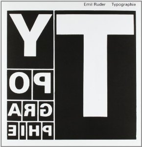
Typographie:
A Manual of Design
by Emil Ruder
Richard: When I was studying at University of Illinois, I moved within different disciplines with a lot of missteps and false starts. I worked for the motion picture unit and someone let me work on an Arriflex camera. I had of course seen the Saul Bass opening sequences for Hitchcock and Preminger and I got it into my head that someday I would try to do work like that. I saw Bass’s film Why Man Creates in design school, which was really graphic – he literally hand-wrote things out on the screen, very well produced – and I was really fascinated with it. I also went to a screening of underground filmmaker Kenneth Anger’s films Fireworks and Scorpio Rising. He dealt with subject matter that you really couldn't deal with at the time; there was a lot of overt homosexuality and they were heavily metaphoric.
Then, in a class I had as a senior at University of Illinois we did typographic things very much like Emil Ruder and his typography book. We had an assignment to imply a third dimension using type of various sizes on a two-dimensional page. I thought, "Ok, I'll take that and animate it to create a portrait with real emotion."
And that was your first short film Stop?
Richard: Yes. I went home that summer and I thought it would be very interesting to create a fourth dimension – motion – so I bought a Bolex. It wasn't even a reflex Bolex! It was a real cheap Bolex camera with, you know, 16mm film. So I started animating using pictures from the 1968 Democratic National Convention where people got gassed and whatnot. I used Buffalo Springfield’s song, [sings] There’s something happening here, what it is ain’t exactly clear...
Bolex is a Swiss company that manufactures motion picture cameras and lenses, the most notable products of which are in the 16mm and Super 16mm formats. Bolex cameras were particularly important for early television news, nature films, documentaries, and the avant garde, and are still favored by many animators today. The 16mm spring-wound Bolex is a popular introductory camera in film schools.
Stop student film by Richard Greenberg
Oh – “For What It's Worth.”
Richard: Yeah. And when I went back to school in the fall, one of my classmates showed me the typical student film where he's, like, walking with his girlfriend in the woods. He was sending it to the New York Film Festival, which I didn't even know about. So I xeroxed a form and sent in what I had made and it changed my life! I was a senior in college and it won. The prize was $3,000 – a lot back then – and the judges were avant garde filmmakers no one had heard of like Brian De Palma and an instructor at the NYU film school named Martin Scorsese. It gave me a lot of confidence.
What happened when you graduated?
Morton Goldsholl Associates, run by Morton & Millie Goldsholl, was one of Chicago's leading design studios in the '50s. They were known for their animations, experimental films, progressive hiring practices, and the development of corporate branding packages for various companies.
See their collection at the Chicago Film Archives.
Richard: Well, I got a BA in industrial design and an MFA in graphic design. But I couldn’t design a poster if my life depended on it; I had no print experience! I thought I would be an academic and after I finished graduate school I taught at the Institute of Design at IIT (Illinois Institute of Technology) and the University of Illinois, both in Chicago. I was also working for a local design place called Morton Goldsholl Associates. Mort Goldsholl was kind of a contemporary of Saul Bass but he was in the suburbs of Chicago as opposed to the entertainment industry in Los Angeles.
Robert: Mort was a real byproduct of IIT and the Bauhaus movement.
Richard: I liked Goldsholl; I liked doing the work. I was 27 years old and the dean said that they'd give me tenure if I came back in September. I realized I didn't want to teach. Instead I went to New York and worked for Pablo Ferro.
Robert: Richard had a choice between Eames, Saul Bass, and the Ferro brothers. So he took a job with José and Pablo.
—Richard GreenbergI'm very passive, but I just said, “Fuck you,” and walked out!
Richard: Pablo had made a splash with his bold work for Kubrick’s Dr. Strangelove. I was at the bottom of the totem pole so I had to load the camera and fetch coffee. I went from a world of comfort and privilege to being a PA! I mean, Pablo would have me bring the film to the lab when we were finished at night and the lab was on 9th Avenue and 43rd or something. I would walk. It was a creative city, but your shoes would crunch from walking over all the hypodermic needles. That was New York then!
Robert: I think every Friday Richard would have to run to the bank to try and cash his check before anyone else because they never had enough cash flow!
Richard: Yeah, and one day Pablo and José asked me to bring them coffee and I just... I don't know where it came from because I'm very passive, but I just said, “Fuck you,” and walked out!
But they were doing graphic commercials for clients like GM and other big companies, so I got to see how it worked. It gave me the experience to realize that I could do this if I had somebody to handle the business part. I sensed that graphic design in motion was nowhere near as advanced as it was in print because print had this Swiss–German influence and all the motion stuff was just a carnival. It was really a circus. I thought we could take that print discipline and apply it to film graphics. That’s where my brother Bobby came in. He had been in Canada working for my uncle and he came down and was absolutely brilliant at it. So I would do all of the creative and he would manage everything and then we brought in others.
And that's how R/Greenberg started?
Robert: R/Greenberg Associates began as just the two of us – I was the producer and Richard was the creative. We saw an opening in the market for a company who could take great print design and put it into motion. That’s how simple it was, our core mission.
I had been trained, or rather mentored, by my uncle while running a company in Canada. It was a subsidiary of Royal Crown Cola and we made different things – picture frames, mirrors, accessory items. It was a very big plant – 107,000 square feet – and I had three shifts. After working with my uncle for almost seven years, I decided to move to New York. I was pretty young; I was 29 and Richard was 30.

Oxberry Animation Stand (a type of rostrum animation camera stand)
Richard: Right, I think we started in 1977 and like any design-based production team just starting out, we took any project available. We started it out of – I mean, it's hard to imagine we were both living there, but – this tiny, tiny place in the top two floors of a brownstone on 38th Street. It was so small that no one knew we actually lived there! I had a bed that came out of a bookcase and so did Bobby on the other floor.
Robert: It was a whorehouse originally! The ceiling was replaced on an angle which left just enough space for a rostrum animation camera to fit. I was used to a lot of creature comforts and here I was sleeping on the floor!
Richard: I remember our first really big job was something for IBM and all the bigwigs came over. They looked at me and one said, "Boy, you must be really happy when you can go home." I said, "Well, this is home." So, we really scrambled and it wasn't that easy.
Robert: I was thrilled when I could get off of the camera – I was also the cameraman – and turn it over to Kenny Stytzer who joined us as our first employee.
A Moviola is a device that allows a film editor to view film while editing. It was the first machine for motion picture editing when it was invented by Iwan Serrurier in 1924.
Kenny turned out to be one of the very best animation cameramen ever, but we didn't know that at the time. We started adding other people and that small space got pretty crowded. We had a Moviola in our kitchen. Then we added more people and there were probably ten of us by the time we moved to 240 Madison, just down the block, a couple of years later.
Richard: We would get all these wonderful graduates from Cooper Union or Yale – really talented people who didn’t want to move to California.
Then the industry began to change and we started doing title sequences. We did a movie called Roseland that took place in the Roseland Ballroom in New York. We did something for a Farrah Fawcett movie which gave me a sense of how to do a title sequence.
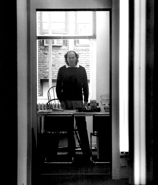
Robert Greenberg at the 240 Madison Ave. office, mid-1980s
Did you get interested in title sequences while working with Pablo Ferro or was there something else that led you that way?
Richard: Well, I had always been very interested in the history of graphics, especially motion graphics which people didn’t realize even existed at that point. There were avant garde filmmakers who were working in it, though. There was a guy at USC – no, UCLA – by the name of Harry Marks, who had done a lot of work. And I believe Bob Abel was just starting out. There was the Canadian film board (NFB) and all the Len Lye films that were done during World War II, some of which were very graphic. I knew the work that Pablo had done for Kubrick. But it was beginning to happen all over and in many ways I was part of it because I was aware of it.
So, how did you progress to handling bigger movie titles?
Robert: We got a call from Steve Frankfurt who was president of Young & Rubicam Advertising at the time. He opened a division in feature promotion and gave us the opportunity to work on Superman.
Had you known each other previously?
Robert: No, he had heard of us and called for our reel, but he didn’t know us.
Richard: With him, we worked up an idea for a graphic trailer which is very similar to what became the titles. Dick [Richard] Donner, the director of the movie, was a contemporary of Steve’s, and became a very successful movie director. His first big movie was The Omen, which is pretty incredible, and then he got Superman. They brought me over to London and we talked. R/GA presented the idea of these streaking titles to Warner Bros. and I told them I knew how to do it.
And did you?
Richard: No, we had no idea how to do it! For about two weeks we kept trying to figure it out. Then we realized we had to let the Oxberry run and put a black card in front of it to end the streak. The streak was created by putting a negative and positive Kodalith together with a blue gel in between. The blue gel allowed enough light through to create that streak.
Superman teaser trailer, designed by R/Greenberg Assoicates
Superman was the first comic book movie with [Grade] A actors in it like Marlon Brando. So the idea was to announce their participation in a fabulous way. We thought it would cheapen the tease if any real footage was shown. So that's what we did, and it was developed for the advertising materials and then refined for the title. Dick was working with a high-end London optical house at the time and if they had been able to do the streaking they would've gotten the job. But they didn't really want to come to New York or fly me back there, so it worked out because nobody but us could do it! Then we bought an Elicon early in the '80s. It was a very crude version of a motion control system.
How did that work?
Richard: Hah, it didn't quite work. It sort of worked. Those titles were created by re-working the idea of what the animation stand was; you would literally move the camera on the rostrum stand and cap it at particular points to create a kind of three-dimensional motion. Everything we did until the mid-'80s was pre-computer – Superman is all pre-digital. It is more beautiful, in a way, than digital work could have been. There will be a point in the near future when – and we’re almost there now – films won’t be shot on film anymore. We came in as everything was only beginning to change over throughout the industry.
—Richard GreenbergEverybody in New York wants to be a movie director. When they say they don’t, that’s bullshit.
It seems like for many of your projects – like Superman with that streaking effect – you came up with the idea but didn’t know how to execute it. You had to invent a way to produce the effect.
Robert: That was part of our creative process. We would sell ideas to clients based on 35mm film frames. We’d make storyboards that were created on the animation camera, printed out as a half transparency, and put into frames, and then we’d bring a light box with us and show the client the progression – as frames. And so for the Superman titles, when Steve Frankfurt said, “We’ve got to go ahead and make this thing,” we were clueless about how to do it. We had to invent what they called “slit-scan.” Later, we found that Bob Abel, as a competitor, had really invented slit-scan before us for 2001: A Space Odyssey. But we didn’t know that! We had to figure it out.
To describe it in more technical terms, the way it happened was that there was a motorized capping shutter on the camera. That allowed us to leave the lens open to do the storyboard still frames for the teaser, and then we had to buy equipment and design it to be able to do motion. We had to do it later in CinemaScope for the opening titles, which are anamorphic. That was really, really difficult because it had never been done.
Then, when the titles were inserted, they had an outline, which was a problem. The whole thing became a nightmare optical shoot that took something like 14 to 16 hours. Every time we’d do it, there’d be something screwed up, and it got down to the wire. Stuart Baird, who was the editor, was there and we only had one more shot at it. Harvey stayed up all night, we all did, and it came out the next morning with a hitch in it, but nobody saw it. We covered it over with a music cue! And then it made it, you know? Stewie took the Concord and got it there just in time. Our career was made on something that made it just by a hair. I think a lot of things work that way.
Then we went to the opening. Richard Donner had congratulated us before we got there, so they had seen an earlier version. Seeing it put together with the movie and not to mention the great music – it was pretty awesome.
Superman (1978) opening titles
So the Superman titles got a great response and gave you a confidence boost?
Richard: People loved it! I had never been at a screening before and we were at the Ziegfeld in New York City, which is a giant theater, with all of the high rollers in New York, and people applauded after the title sequence! I've never seen that happen. And Dick Donner was there and so was John Williams, who had done the score. It was a really big thing. I'm very shy, but never after that did I have to explain who I was.
Since the teaser trailer for Superman won the Clio that year, it gave us something that's very, very important in New York advertising: a tie to the entertainment business, which – I don’t care what New Yorkers say – is very fascinating to them. Everybody in New York wants to be a movie director. When they say they don't, that's bullshit.
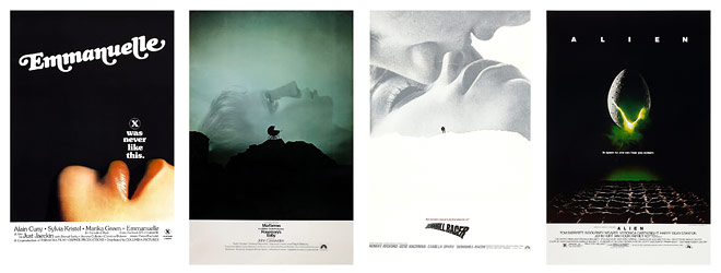
Frankfurt Gips Balkind film poster designs
So what came next?
Robert: Well, Steve Frankfurt got to know us through Superman, and that led to us doing all of his film work. Then there was another company, Frankfurt Gips Balkind, that did all the print work, so we were Steve’s right-hand production facilities for feature promotion, print or logo type design, teaser trailers, trailers, commercials, and so forth – and of course, opening titles.
Richard: Then Ridley [Scott] was doing this movie called Alien that was going to be a B-movie for Fox – he didn't know how big it would be. Ridley had come out of British advertising and his work looked beautiful but he'd had no success with it.
How did you go about designing those titles?
Richard: The titles came from the idea of something “unsettling.” It's disturbing to people to see those little bits of type coming on. I think Steve once said to me that sound is 50% of a film and I agree with that. So we abstracted the idea of the off-putting sound but in a typographic way. We wanted to set up tension and as these little bits come in, they seem very mechanical. We wanted to break the type apart using that letter-spaced sans serif, which really hadn't been done in film before. When the bits finally resolve into a word, I think people weren’t prepared to read it as a title because of the spacing.
Alien (1979) opening titles
It looks sort of like Futura. Was it a custom typeface?
Richard: It's probably a slight variation on Futura, but it wasn't custom. It was incredibly simple, but it struck a chord. Maybe because it was attached to one of the most frightening movies ever made!
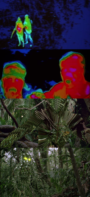
Predator (1987) VFX work
Alien really put Ridley on the map. It made a lot of money for 20th Century Fox, way more than they expected, and that led to other things, like R/GA designing the effects for Predator and our Academy Award nomination. We didn't win because Spielberg had made a movie that year, and effects weren't on anybody's radar. It was the first award they would present at the Academy Awards just to get it out of the way. That’s all changed now.
So similar to Superman, the Alien titles grew out of the marketing for the film.
Richard: Yes. Steve and I created a teaser trailer that was just the egg and those letters and it really worked. It created a sense of foreboding. The teaser trailer was the creative touchpoint for the titles. Phil Gips was the art director. The trailer for Alien, just like Superman, had no voice-over. At the end it just had that copy line which is then repeated a million times: “In space no one can hear you scream.” That was written by the art director's wife, Barbara Gips.
And similar to the teaser, the opening titles use the motif of the pan across –
Richard: Across the planet, correct. That grew out of the advertising, too. In that particular period of American filmmaking, from the late ’70s into the early ’80s, there were some attempts by studios to have the graphic nature of the advertising and the titles feel cohesive. That really dissipated later. Marketing has grown to the point where there are separate departments for everything and the process is more complicated. We tried to use techniques that were experimental for the time.
Alien trailer
So what was after Alien? Was it Altered States?
Richard: Altered States was in there. Usually when you're developing ideas you try to present a couple of storyboards that you at least believe in but I had the notion that we could set up the film by putting type against type. I thought I could set up a metaphor of the first trip because that's what the movie's about, so I made a little piece of film instead.
That seems to be a clear thread connecting much of your work, actually. There’s a clear progression with the use of type.
Richard: I really liked that way of teasing of the audience. Bass would do stuff like that – using a motif and then transforming it, like an eye. I believe a classic title sequence could be a tease, like Altered States was, where you didn't really know what you were looking at and then there was the “A-ha!” moment.
Altered States (1980) opening titles
Robert: Richard really came out of the world’s best program, which happened to be at the University of Illinois. David Colley was his teacher, and my brother came out with, essentially, a masters education in typography. Most other people don’t. Kyle Cooper did. Richard was way ahead of me in that regard – he had all the right influences. He met or knew a lot of the type designers when we used to hire.
So, you wanted to use type as a tease in Altered States?
Richard: Right, so we just shot type going against type on color film. I went out to California on a Saturday night and I showed it to Stuart Baird who was the editor, and Ken the director. Ken just recently passed away, actually.
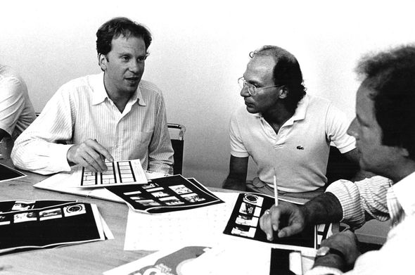
Richard and Robert Greenberg in a client meeting, circa 1980s
Yeah, Ken Russell.
Richard: Yeah, Ken Russell and Danny Melnick, the producer, were there. I remember sitting far away from them in the screening room. I was so nervous and I thought to myself, “What if they don’t like this? I don’t have another idea.” But they loved it and we produced it and it all fell into place.
I remember another time I was flying out – we were doing something incredibly simple for Hair, for Miloš Forman – and the flight was very rocky and we kept losing altitude. I remember saying a little prayer that I didn’t mind dying, but not for Hair! [laughs] It’s on the resumé now but it was just a straight title that faded up and faded down. We didn’t always get to execute our ideas.
So, Altered States was another example of a project that started out as a teaser trailer and then moved into a feature film title?
Robert: That’s correct. It started with Superman and then with Alien and Altered States and so many others. We worked on a few fun projects with Steve; he was the world’s best creative director. He would put together writers and artists and others as part of a team, and we would do the motion and Gips Balkind would do the print.
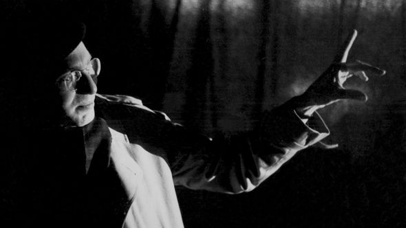
Robert on the set of Resurrection (1980)
When we were in the initial process of something, Steve would say, “Well, which one do you guys really like?” And if he was in an agreement, which was almost always, we’d all agree that this was the best idea, but that they’d never buy it. So Steve would sell it to the client. That made a huge difference because it doesn’t matter how good you are if you can’t sell an idea. And Steve was a master at that because he had done it for so many years at Young & Rubicam. He started with Rosemary’s Baby, which he did with his own company, Frankfurt Communications. And then he brought in Paula Silver from Warner Brothers, who became my brother’s wife. She worked on Steve’s side, overseeing the projects.
So that was 1980, Altered States. What about Blow Out, from 1981? That movie is very connected with the idea of sound and visuals because of Travolta's character.
Richard: That was an interesting one. I had presented lots of stuff to Brian De Palma who was cutting the movie somewhere near our studio. But he didn't like it and I didn't really like it; we weren’t sold on any of the ideas. It suddenly occurred to me that this movie is about sound, so why not go straight at it and do a graphic version of the VU meter? I sent Brian something like a straight line with a frame and called him up to explain the idea. He simply said, “Good!” and that's what it became. That's an example of an idea that was very, very hard to find.
Blow Out (1981) opening titles
Let's talk a little about The World According to Garp. Was that opening scene with the baby already in place, or did you have to conceptualize and experiment?
Richard: That scene was already there. Glenn Close catches a baby. Now, the baby that she catches was not the same one we used, because by the time they decided to do a sequence, that baby would have been a year old. So we had to make it work back to that. The movie is Hollywood-style entertainment but it has a kind of down ending, which they wanted to mitigate somewhat with the idea of rebirth, which informed the opening titles.
We had the idea of a baby floating in space and Warner Bros. had bought that wonderful Beatles song, “When I'm Sixty-Four.” We hadn’t developed the technology that would allow the audience to believe this baby was actually floating and of course we couldn’t throw the baby up in the air! So we used a luna crane and we laid the baby down.
The World According to Garp (1982) opening titles
He was on milk glass – just glass that’s white with a light underneath. Then we created the match – and this was new at the time – from the difference between the color of the baby’s skin and true white. If you look closely at the white of his eye, you can see the clouds moving. It was impossible to get two takes of the baby being happy, so we panned off the baby and let it re-enter the frame. The final takes might have been like the third and the thirty-fifth because in between the baby would cry or fidget, and because we had this real baby boy on his back, that was the first time I realized that when a baby urinates they urinate straight up! [laughs]
So it was a little dangerous. We had a very heavy camera on a boom high above this little child, and I'm not sure they would let you do that anymore. But we managed to create a sequence of a kind of exultant baby. And the way he’s holding his legs is just very cute.
And The Untouchables?
Richard: That movie was beautifully shot in color. I thought it would be great to do something that was black and white, some very film noir titles to contrast it. I had an art director that I was working with and we kept looking at shadows. I got the idea that the shadows should be actually cast by the word. And the art director kept saying, "It's boring." Finally I just looked at him and said, "It's supposed to be boring." I wanted it to take its time. That's how I thought about this stuff; I didn’t want it to be rushed. I guess it was in reaction to what was so prevalent at the time: news graphics and stuff that was all so rushed. And it's only gotten worse.
The Untouchables (1987) opening titles
With R/GA you were building an impressive resumé of titles and becoming quite successful. Did the studios come to you or did you seek out work?
Richard: At one point directors with big movies would come to us and it was a wonderful situation to be in. When I was in New York, if they wanted to talk to me, they had to fly me out and because I’m part of the Directors Guild, it had to be business class or first class and they had to put me up at a hotel. So if they bothered to do that, I knew I had a good chance at the project. I never had to go into meetings where we were one of eight companies they’d talked to. That just didn’t happen. It was a very good position to be in.
Robert: These were the days when Richard was really focused on title design. I think Richard was the person that Saul Bass respected the most, and that was one thing that I knew. He led the creation of the title work but we all had a lot to do with parts and pieces. I would add a part or two creatively at times because it was such a collaborative process, but producing was my job. Richard led our work, and oversaw it, and had the meetings with the heads of studios, the directors, the editors, and so forth.
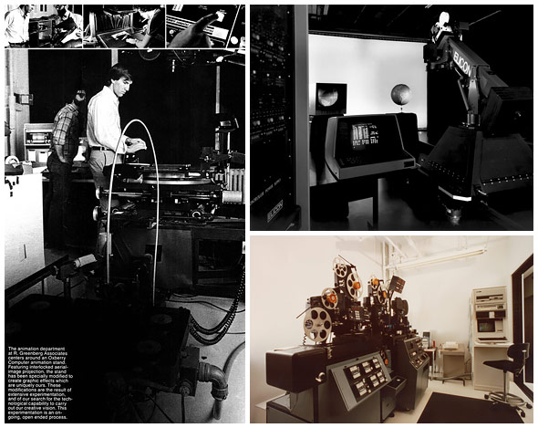
Various equipment systems implemented at R/Greenberg Assoicates
Robert, how involved were you with the technology side of things? It seems like R/Greenberg was on the forefront of tech and having the latest equipment to push technique forward.
Robert: Yeah, that was me. I am not a good operator, but I am a very good person to develop software and technology and integrate it. I still do that here, but I have an older kind of ability. I am not particularly good on computers like many of the people that work here but I understand how they work and all. Like other people that lead organizations, I was very good at hiring people that were a whole lot better than me. That’s how you do it.
We hired some of the best. We invented a lot of the technology. We also had major relationships with like, Nikkor, which made printing lenses, or Kodak. We designed a number of film stocks, and on and on.
Who were some of your collaborators – other members of the team you had then?
Robert: Larry Plastrick, our editor, was critical to a lot of our success. He had a company of his own called Cinemetrix and he was just critical to the opening title. He invented the quick cut. He edited everything – all our trailers, even the Alien opening. His brother Harvey was one of the best optical people in the world then, too.
There wasn’t that much competition back then and we started a lot of the very best people in the business, ones that are still doing this type of work, like Garson Yu or Kyle Cooper or Jakob Trollback. You could see implied motion in Kyle’s work and then you could see conceptual things in his portfolio. That’s what we were looking for then – those two things. So almost everybody passed through our shop and we became fairly big.
Then, my brother left and there was a whole series of things that happened after that. That was R/Greenberg Associates, part two. There’s also a part three, which is where we’re at now, where everyone has their own companies.
The Dead Zone (1983) opening titles
Richard, what year was that – when you left New York?
Richard: I think it was ’91.
What happened was, my then-wife, Paula Silver, had been the producer for a lot of the advertising-based stuff and she eventually became head of marketing at Columbia before they were Sony. I did a film on a cathedral for the Metropolitan, for which Saul Bass was on the board. It had a budget of $100,000, all in, and it was a nice little film for the Program for Film on Art.
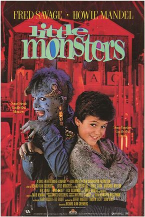
Then, Vestron offered me a little movie to do and I took it because I was kind of tired of titles already. That was Little Monsters, which I had a lot of fun doing. It was eventually bought by MGM and kids still watch it.
Then I didn't know what to do. The company was becoming less creatively driven, so I decided to move out to California and pursue the feature thing. I had no idea how hard it would be! I started a company, Greenberg/Schluter, with Bruce Schluter and we did things like Dracula, which was actually made separate from R/Greenberg Associates.
Were you also connected to the west coast division of R/Greenberg Associates?
Richard: Well, what happened was... Robert decided that he needed a Hollywood presence so we started a company called R/GA LA (R/Greenberg Associates West, Inc.). I headed it and we did more title sequences. It was probably around ’93 that R/GA LA was started and by that point we were entering the digital world. Even in the artwork for The Untouchables, the shadows were created digitally, and of course True Lies is completely digital. Something like that wouldn’t be possible without a computer because you have all those points to change "True" to "Lies" and there’s just no way you could do that otherwise.
True Lies (1994) opening titles
I don’t like decoration for decoration’s sake – I think that an idea has to be pared down to its essentials to really come alive. That’s a philosophy that I hold to in every part of my life. We came in as everything was beginning to change over.
Who made the trip from New York to Los Angeles?
Richard: Kyle [Cooper] came out with R/GA from New York and we worked together for a couple of years. Se7en, from 1995, was done with R/GA. You know, there's certain directors that you work with – and David Fincher is one of them – where the ideas are very strong, very graphic, and they’re willing to accept a departure from what came before. The nervous type in Se7en’s sequence and the idea of getting inside the head of a psychopath – it's a wonderful piece of work. It certainly took title sequences in a very interesting direction.
Right. So, during this part two, R/Greenberg Associates in both New York and LA was one of the few companies actually producing or known for title design and specific things like that. Did you move more into visual effects because of the technology that you were using and creating?
Robert: Post Richard’s involvement, I had to take over the creative side, and then we evolved into a different type of company, considerably bigger, doing more commercial work. The work became much more complicated as we started doing more special effects and things like that. We grew to be close to 200 people, still doing title designs. We moved from just doing animation into a fuller digital studio with all sorts of equipment to do whatever was needed – optically or with aerial image projection and motion control – and then computer graphics came in. We also did print work, and interactive in its utmost early stages in terms of CD-I/CD-ROMs, stuff like that.
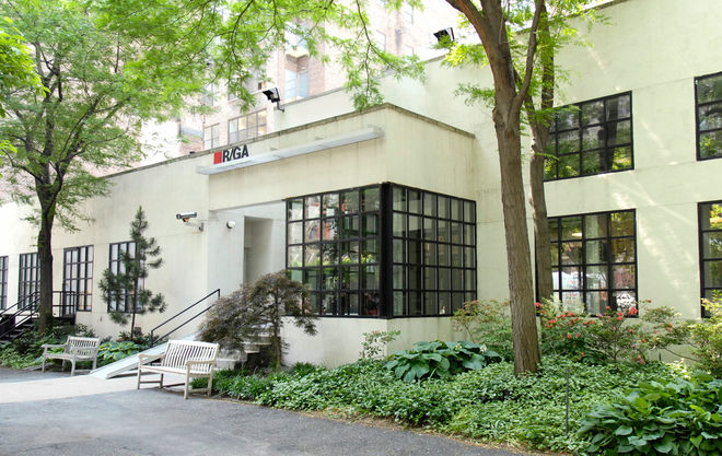
R/GA's current New York office at 350 W 39th Street
I started representing directors, so we had an offshoot company called Savoy. We started to develop feature products, get more into feature development. We went into a movie with Wesley Snipes – Blade. R/Greenberg Associates grew in two different directions. We opened the office in LA in the mid-’90s and like Richard mentioned, he joined us for a couple of years as head of that office.
Richard: The way we were set up, though, we weren’t making very much money. Then Kyle went off to create Imaginary Forces with Peter Frankfurt and Chip Houghton. Imaginary Forces basically took over the office space that we were in and created a lot of wonderful work for a while.
Robert: I transferred the overall company and dove into building an agency. We changed the name to R/GA and we’re almost 1400 people now. So we just called that office R/GA, LA.
This is the third period – us moving into an agency, coming out of the R/Greenberg background.
Right. So what prompted this move towards being an agency and away from the LA division?
Robert: What prompted it was seeing the Internet, the web, and then past that, mobile and social media. I saw computer graphics very early on in 1982.
R/GA "Our History"
Right. A lot of things were changing. There was a huge jump in movie technology and title design. Now it seems like it's everywhere. Do you think the quality of motion design in film is suffering?
Richard: Well, it used to be that the studios would make very little money on something like Superman. And when a picture was important, the studios would spend some money and time on the titles. Now it's really changed because everything, theoretically, can be done on a Mac.
When I was in design school we were asked, “Should formica look like wood just because it can?” and it's a difficult, philosophical question. Now all type has moving shadows and three dimensions and sometimes that adds real value and sometimes it doesn’t. It seems like studios don’t really do the middleground films anymore; they're really only interested in big event movies where they can make a tremendous amount of money. Good work always comes through and the world changes. It never ends – or at least I hope it doesn't.
Did directors and studios view your titles work as an investment in the film?
Richard: Somewhat. You know, very few title sequences actually affect the commercial potential of a film. But, for example, I’d worked on this little film called Dirty Dancing which ended up being a gigantic hit. I came up with the idea to throw away the whole opening and take it to the sexy part where the ‘help’ are dancing together. We did that.
Dirty Dancing (1987) opening titles
Of course, the technology always changes and titles change with it. Bobby always kept Greenberg Associates at the razor's edge. It was expensive but it's what kept us so vital. It was a wonderful combination and New York was very different than it is now.
And now? Are you still doing titles work?
Richard: If it comes up! When you’re dealing with movies now, it’s so much about the size, budget, and the pre-contractual stuff. I feel like there’s less creativity actually involved, but that could be me. A lot of the really good work is being done for television. I love the opening to Mad Men. I love that guy falling through space. It's a wonderful metaphor for advertising. You never know where you are.
Robert: Richard had a great career. He often thinks of going back, but then he’d have to deal with the crap of it all.
Right. Over three decades later, a lot has changed.
Robert: Yeah. But I do watch for what we call the R/GA Alumni, and I really am so thrilled when I see something great that they’re doing.
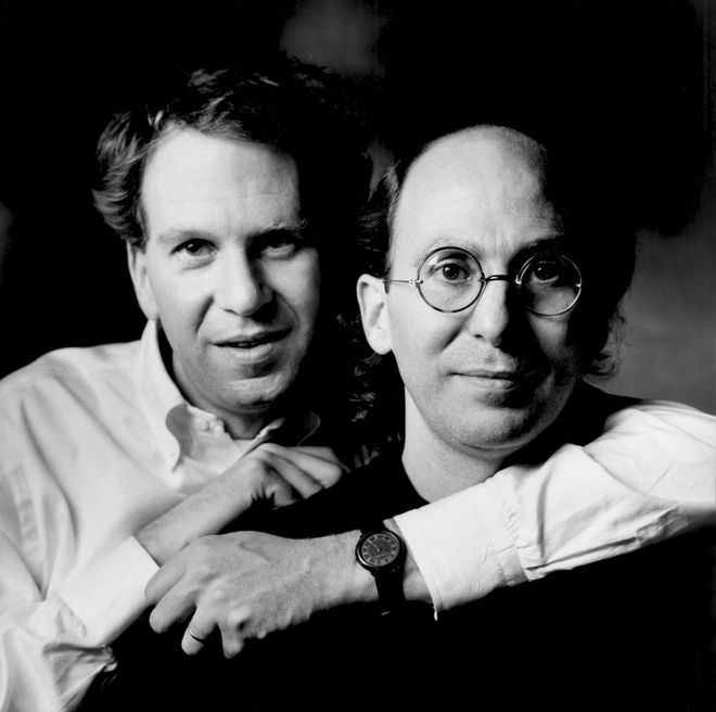
Richard and Robert Greenberg portrait, 1986
LIKE THIS FEATURE?


