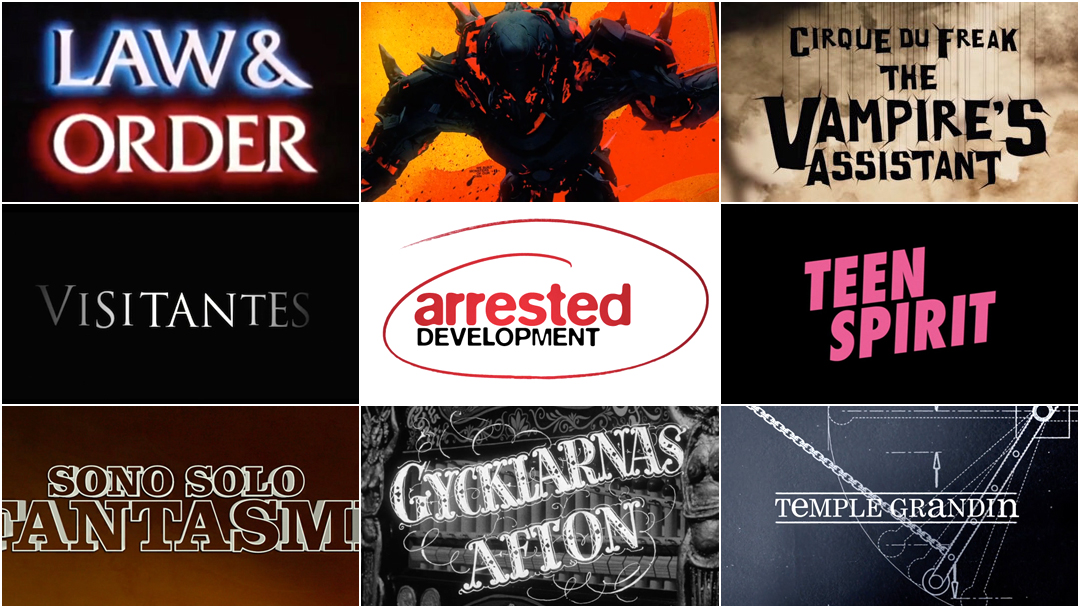
We are ecstatic to present part six of our annual 10 Women of Title Design feature, bringing the number of women showcased to 60!
In March of 2015, we published our first article in celebration of International Women’s Day entitled 10 Women of Title Design. Every year since, we've returned with a new group of 10 women in the title design industry to celebrate. When we first conceptualized this feature, we never imagined we would be able to showcase this many women. We are humbled and overjoyed to know and share the diverse talents of this artform.
This year, the list includes creative directors, lettering artists, animators, motion designers, and 3D artists, spanning several decades and genres across both TV and film. Join us as we celebrate another International Women's Day and shine a light on the often unsung women in this great field.
10 Women of Title Design That You Should Know – Part Six
Benedetta Cappelloni
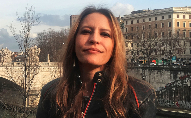
Title Designer Benedetta Cappelloni
Benedetta Cappelloni is a digital artist and title designer based in Rome, Italy.
Working primarily in the Italian film industry, Cappelloni has created dozens of title sequences for films including Baaria (2009), The Best Offer (2013), La corrispondenza (2016), The Leisure Seeker (2017), Made in Italy (2018), The Traitor (2019), Tutto il mio Folle Amore (Volare) (2019), Sono solo fantasmi (2019), and Brave ragazze (2019).
Her clients include Fandango, Indiana Production, Paco Cinematografica, Groenlandia, Lumiere & Co, Eagle Pictures, Kavac Film, and Warner Bros Italy.
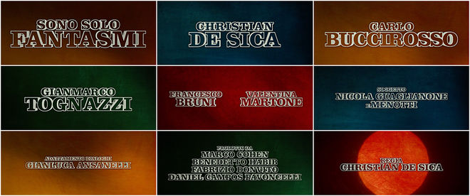
Sono Solo Fantasmi (2019)
CATEGORY: Film
Sono Solo Fantasmi (2019) main titles – designed by Benedetta Cappelloni
In the opening scene of Italian horror-comedy film Sono solo fantasmi (2019), a woman is viciously attacked by a terrifying creature. As she screams, her arms outstretched in self-protection, the camera pulls back to show her flailing in the empty air. The title pounds on screen, Italian for "They’re just ghosts," undercutting the previous unsettling action. Dauntless white letters sit atop flashing colours, shadows playing in the background across fields of bright blues, golden yellows, and rusty reds. The music is pulsing, a strong electronic beat that pumps life into every corner.
Created by designer Benedetta Cappelloni, the bold, energetic sequence sets the stage for this modern, tongue-in-cheek story of three brothers wading into the business of ghost-busting. The simple combination of catchy, driving beat and giant typography, landing at just the right moment, is a solid recipe for success – punchline and invitation in one.
Betty Green

Title Designer Betty Green
Betty Green is an Emmy Award-winning title designer and artist. She has created title sequences for TV series Murder, She Wrote (1984–1996), Stingray (1985), Rags to Riches (1987), Mission: Impossible (1988), Quantum Leap (1989–1993), Law & Order (1990), and the films Soylent Green (1973) and There Are No Children Here (1993), among others.
Based in Santa Monica, California, Green's work often incorporates techniques in which photographic stills, artwork and special effects are shot under an animation camera. In 1985, she received a Primetime Emmy Award for Outstanding Main Title Design for her work on Stingray. She has also been awarded an International Clio for The Eastman Kodak Story and a Certificate of Tribute, City of Los Angeles for accomplishment in the Arts.
Originally from New York, she studied fine arts at Cornell University and UCLA. Currently Green works as a fine artist, creating mixed media paintings in her Santa Monica studio. Her work has been exhibited in Los Angeles as well as galleries and museums across the United States.
Law & Order (1990)
CATEGORY: TV
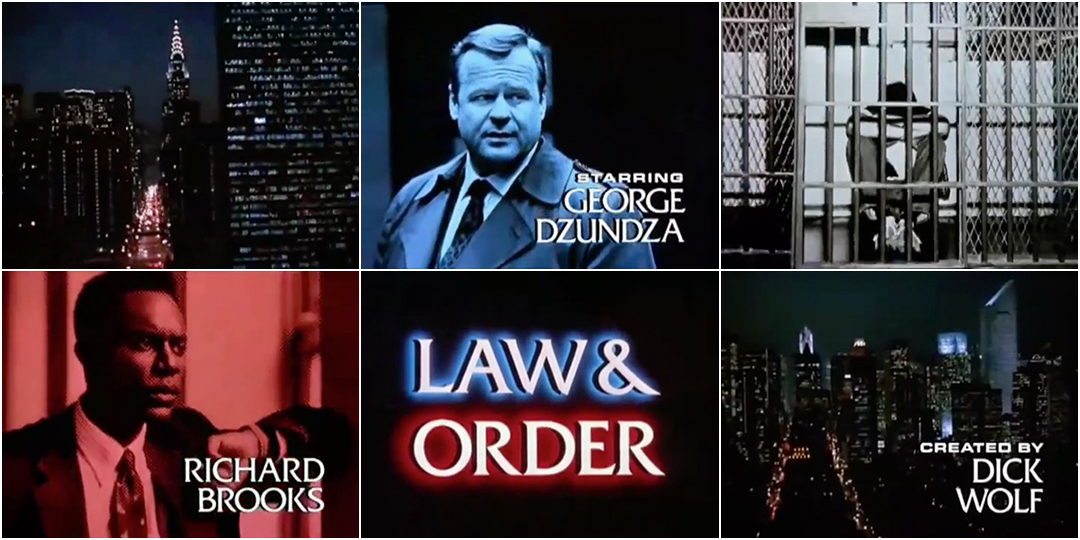
Law & Order (1990) main titles – designed by Betty Green
There are few TV brands as well known as that of Law & Order. With its ripped-from-the-headlines stories, its rotating cast of gruff and compassionate characters, its array of captivating guest stars, and its commanding title sequence, the show became a massive hit, running from 1990 to 2010 on NBC and spinning off into six other series, five videogames, four adaptations, and one TV movie.
Behind Law & Order's sound is composer Mike Post. That bluesy electric synth theme and that distinctive clang – dun-dun – have been featured in several articles and documentaries over the years. Less well-known but equally crucial is the series’ title designer Betty Green. Before lending her considerable talents to Law & Order, Green had already established herself in TV with openings for Murder, She Wrote, Stingray, Mission: Impossible and Quantum Leap. For Law & Order she created the moody montage of night-time city shots, the high-contrast graphics and halftone cast portraits, the giant text glowing red, white, and blue, and wrapped it all together into a gritty, memorable package.
Green worked with visual effects house Howard Anderson Company to capture the restless energy of New York City, the quick cuts and image zooms reminiscent of her work with Chuck Braverman for Soylent Green. The typeface Friz Quadrata, which looks like it’s about to be carved into stone, was used for the credits and locator lines, lending the show gravity and authority. It’s a testament to the power and ubiquity of the series that 30 years later one glimpse of that typeface and two bits of sound can immediately transport audiences back to a world of perilous but soothing procedure, where process and justice are the only things worth a damn.
Krystal Sojourner
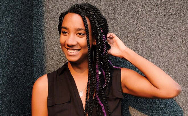
Title Designer Krystal Sojourner
Krystal Sojourner is a motion designer and animator based in Los Angeles, California. Originally from Philadelphia, Sojourner earned a BA in Advertising and Public Relations from Pennsylvania State University and an MFA in Motion Media Design from Savannah College of Art Design. In 2018, she moved to the west coast to work with studios such as Elastic, Buck, Paramount Pictures, Laundry, and BOND.
She has contributed to title sequences for TV series including Making a Murderer (2015), The Leftovers (Season 2) (2015), and Coisa Mais Linda (2019), and the film Teen Spirit (2019). She has also created graphics for the 87th Academy Awards, designing the imagery projected behind artists John Legend and Common and the graphics for categories Best Documentary Feature and Best Live Action Short, as well as for the Golden Globe Awards, designing the graphics for Oprah Winfrey’s Cecil B. DeMille award video. In 2017, her work on stop-motion short film Child Labor won the International Creative Muse Award (Platinum) and the Atlanta Addy Award (Gold).
Teen Spirit (2019)
CATEGORY: Film
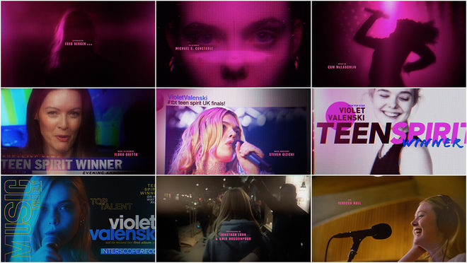
Teen Spirit (2019) main-on-end titles – designed by BOND
In Max Minghella’s 2019 directorial debut Teen Spirit, Elle Fanning is Violet Valenski, a shy girl on a mission to neon pop stardom. She’s got the voice, she’s got the look, and by the end of the film, she’s got the dream. Developed by studio BOND, the main-on-end sequence is an effervescent fuschia fantasia. Led by creative directors Bernard Crosland and Ben Andron with Krystal Sojourner on design and animation duties, the team manipulated stills and footage from the film and created original magazine covers to illustrate Violet’s meteoric rise to fame.
And if that heavenly melody pumping throughout seems familiar, perhaps it’s because it was prominently featured in another title sequence: the opening to Hackers (1995). English electronic duo Orbital’s celestial house track “Halcyon + on + on” was remixed for the film and features new vocals by – who else? – Violet Valenski.
Olga Midlenko
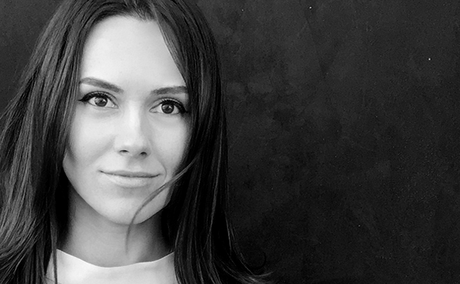
Title Designer Olga Midlenko
Olga Midlenko is a creative director and designer based in Los Angeles, California.
Originally from Russia, Midlenko studied interior and graphic design, working as a graphic designer and creative director for 10 years before joining studio Prologue in 2013. She has worked on projects in film, TV, and video games, creating title sequences, branding, integrated content, and broadcast packages. In 2018, she joined studio Elastic.
In title design, she has contributed to and directed sequences and motion graphics for films Teenage Mutant Ninja Turtles (2014), Ouija (2014), Exodus: Gods and Kings (2014), Black Mass (2015), Our Brand is Crisis (2015), The Nice Guys (2016), Zoolander 2 (2016), Voyage of Time: Life’s Journey (2016), Sand Castle (2017), Kong: Skull Island (2017), Suburbicon (2017), Hostiles (2017), mother! (2017), Fahrenheit 451 (2018), and Pacific Rim: Uprising (2018), as well as TV series Salem (2014), Limitless (2015), Battle Creek (2015), The Making of the Mob (2015), Good Behavior (2016), The Putin Interviews (2017), American Horror Story: Cult (2017), and Lodge 49 (2018).
Pacific Rim: Uprising (2018)
CATEGORY: Film
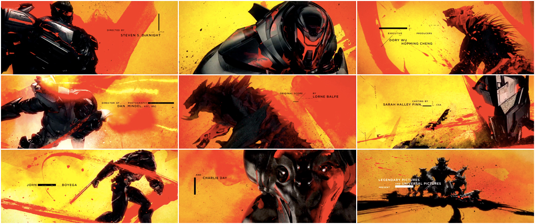
Pacific Rim: Uprising (2018) main-on-end titles – designed by Prologue Films
In 2013, Pacific Rim’s kaiju rose from the depths and were smashed back by the towering Jaegers, massive machine suits controlled by human pilots. Director Guillermo del Toro’s rock ‘em-sock ‘em robot-versus-monster war was a delight for the ages and the box office, guaranteeing a sequel almost immediately. That film’s finale takes the form of what’s now become a standard closer for a certain type of high-budget action film. You’ve seen it by now: the serious, sensuous pan across equipment and characters, the elements frozen, the music epic and grand. It’s a slow, luxurious look at the physical curves and features of figures normally seen only in motion, racing across the screen.
For the 2018 sequel, Uprising, creative directors Kyle Cooper (Se7en, Dawn of the Dead) and Olga Midlenko and the team at studio Prologue took the end sequence in a different direction. Blending 2D with 3D, the team created a piece full of motion and drama, splashes of paint and oodles of colour. The resultant piece is heavier, bolder, more tactile and fundamentally alive, a celebration of the film rather than a solemn reminiscence.
Maribel Martínez Galindo
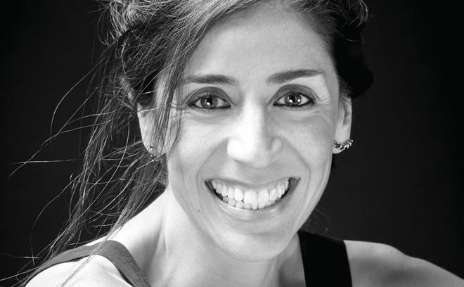
Title Designer Maribel Martínez Galindo
Maribel Martínez Galindo is a creative director and producer based in Mexico City, Mexico.
After being educated at Universidad Iberoamericana, School of Visual Arts, and at Casa Lamm, Martínez Galindo worked with Televisa Mexico and with directors including Manolo Caro, Demián Bichir, Gullermo Arriaga, Carlos Carrera, and others. She has created title sequences for Viaje Redondo (2009), Visitantes (2014), Words with Gods (2014), On the Milky Road (2016), and La Casa de las Flores (2018).
Her work has won awards and nominations from the New York TV and Film Festival, SXSW, Promax World, Broadcast Design Association, and Animacor in Spain. She was Director at Televisa until 2012. She is the founder of 19+36, a studio focused on title sequence design for film and TV.
Visitantes (2014)
CATEGORY: Film
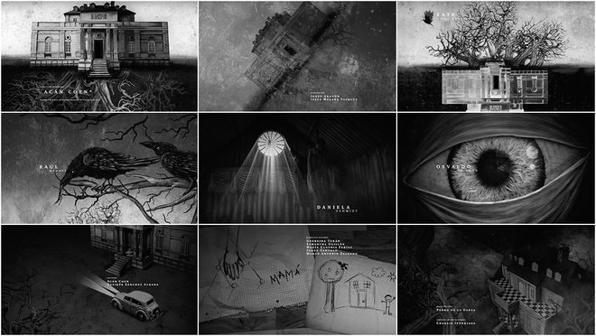
Visitantes (2014) main-on-end titles – designed by Diecinueve36
For the end of Mexican horror film Visitantes (2014), creative director Maribel Martínez Galindo and her studio 19+36 create a set of bleak storybook-inspired moving illustrations that encapsulate the experience of the Moreno family. The main-on-end sequence moves from outside the bright family home into a world of deep roots, menacing crows, terrors and traumas, finally settling on a birds-eye view of the home, as off-putting as a dollhouse in the dark.
Alva Lundin
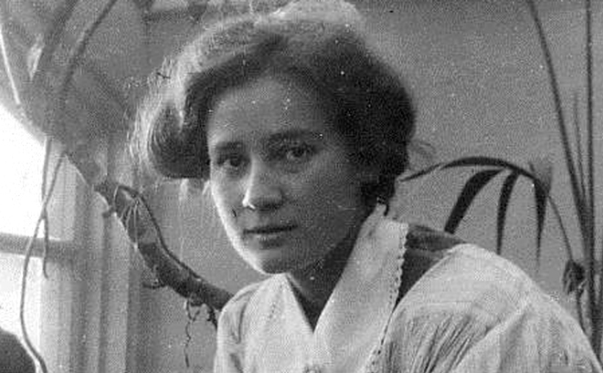
Title card and credit designer Alva Lundin
Alva Lundin (1889 – 1972) was a Swedish title card and credit designer and artist. Over the course of her 40-year career, Lundin contributed to nearly 500 films. She was regarded as a leader in title card design.
Lundin began her career writing title cards when the artform first came to Sweden from Hollywood in 1919. She worked with virtually all the directors who were active in the area and was engaged by most of the studios operating at the time, including Nordisk Tonefilm, Sandrews, and Terrafilm. From 1916 to 1960, she created title sequences and inter-titles for nearly 500 feature films as well as several information and documentary films, including such Swedish classics as Gustaf Molander’s En Stilla Flirt (A Little Flirt, 1934) and Intermezzo (1936), Hasse Ekman’s Fram för lilla Märta (Put Little Märta First, 1945) and Flicka och hyacinter (Girl with Hyacinths, 1950), and Ingmar Bergman's Thirst (1949) and Sawdust and Tinsel (1953).
Lundin created her last title sequence in 1960 with the short film Nybyggarna i Faxälven (The Settlers in Faxälven), a documentary about the beaver population of northern Sweden.
Sawdust and Tinsel (1953)
CATEGORY: Film
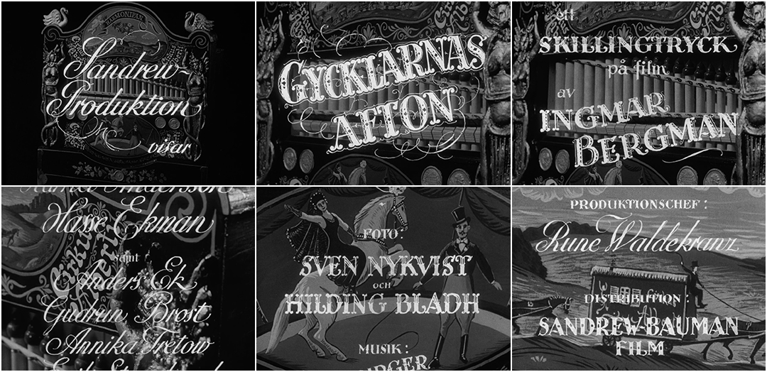
Sawdust and Tinsel (1953) main titles – designed by Alva Lundin
Director Ingmar Bergman, speaking about his 1953 film Sawdust and Tinsel in his autobiography Images: My Life in Film, said “One could insist that the film is a pandemonium – but a well-organized pandemonium.”
Its opening sequence, featuring ornate lettering by designer Alva Lundin over images of an illustration-festooned street organ, captures this notion beautifully. The barrel organ, or harmonipan, is a mechanical instrument that, when its crank is turned, plays musical tones and sounds. This one clearly belongs to Cirkus Alberti and its surface features swans, cherubs, flowers, vines, and an oval painting of a woman on a horse and a ringmaster, a nod to a pivotal, tense scene in the film. Lundin’s stunning calligraphy runs overtop of these images, creating a captivating chaos. First an elegant cursive, then a thick all-caps carnival lettering with hairline flourishes, and then a hodgepodge of circus-style lettering, thick and ornate, with dots and lines through the stems and jaunty crossbars. As the music ominously crescendos, a final background illustration appears, also likely by Lundin, which isn’t on the organ: a caravan of wagons pulled by dark horses which fades into the film's opening shot. As an amalgam of illustration and various lettering styles, the sequence is a prime example of Lundin’s versatility as a designer and artist and, luckily, just the tip of a very large iceberg.
Penelope Nederlander
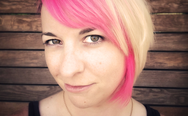
Title Designer Penelope Nederlander
Penelope Nederlander is an Emmy Award nominated motion and VFX artist working in TV, film, commercial, and web.
She has contributed to title sequences for films Kung Fu Panda (2008) and Kung Fu Panda 2 (2011), Temple Grandin (2010), Too Big to Fail (2011), Pitch Perfect (2012), and Birds of Prey: And the Fantabulous Emancipation of One Harley Quinn (2020) and has been a compositor on films The Aviator (2004), Superman Returns (2006), and Iron Man (2008). In 2012, she worked on the stereoscopic version of the MGM Lion logo.
She has been nominated for an Emmy Award for Outstanding Main Title Design for her work on HBO’s Temple Grandin.
Originally from Detroit, Michigan, Nederlander attended Rochester Institute of Technology, where she studied graphic design, and Savannah College of Art and Design, where she studied computer art and motion graphics. Her clients include Sony, IBM, MGM, Nissan, Doritos, NFL, Nickelodeon, and others. She is based in Austin, Texas.
Temple Grandin (2010)
CATEGORY: TV Movie
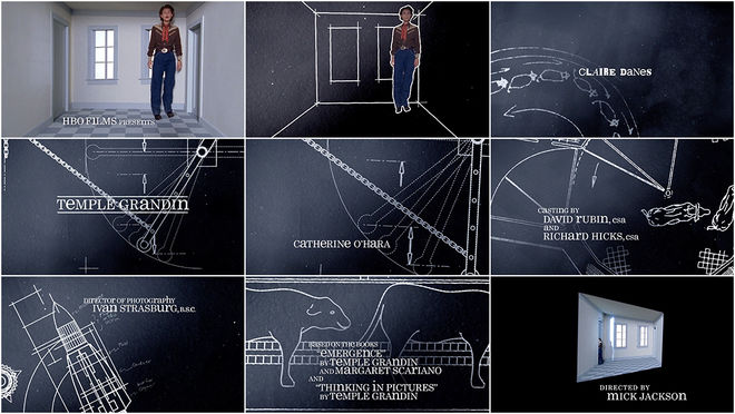
Temple Grandin (2010) main titles – designed by Shine
Temple Grandin thinks in pictures. As she says, played by Claire Danes in the 2010 biopic directed by Mick Jackson, she’s not like everybody else. The scientist, inventor, author, livestock facility designer, and autism rights activist can recall events and devise plans in acute visual detail, like a movie playing in her head.
In the foreword to Grandin’s autobiography Thinking in Pictures, first published in 1995, neurologist Oliver Sacks described the book as offering “a bridge between our world and hers” which “allows us to glimpse into a quite other sort of mind." We're given a similar bridge in the diagrammatic, letter-flipping opening sequence to the film created by studio Shine. The sequence attempts to visualize aspects of Grandin’s singular point of view. In just under two minutes, Shine's creative director Michael Riley, lead animator Penelope Nederlander, animator Dru Nget and editor Justine Gerenstein, with support from producer Bob Swensen and coordinator Lindsey Gerber introduce audiences to Grandin and what would become a multiple award-winning performance for Danes. These diagrammatic graphics carry over into several sequences in the film and the typographic treatment is maintained for the end credits, creating a cohesive whole brimming with a personality that’s brilliant, interesting, and unusual.
Ellen Kahn and Lynda Kahn

Title Designers Ellen Kahn and Lynda Kahn
Ellen Kahn and Lynda Kahn are identical twin sisters and Emmy Award-winning title designers. They are co-founders of the studio TWINART and together they have created title sequences for Two Guys, A Girl and a Pizza Place (1998-2000), Dharma and Greg (1998-2002), Ellen: The Ellen Degeneres Show (2003), Arrested Development (2003-2006), The Talk (2010), and Netflix’s A Series of Unfortunate Events (2017). In 2006, the Kahns’ work for Ellen: The Ellen Degeneres Show earned an Emmy Award for Outstanding Achievement in Main Title Design.
Ellen’s credits also include main titles for The Reporters (1988-1990), Stand-Up Spotlight (1988), and Band Aid (2017), as well as graphics for the magic screens of Pee-wee’s Playhouse (1986). In 1988, her work on the title sequence for FOX news show The Reporters (1988-1990) was nominated for a News & Documentary Emmy Award. She has been a governor for the Emmys’ Motion and Title Design Peer Group and now serves on the Executive Committee.
Lynda’s title sequence credits include Beakman’s World (1992), Sister, Sister (1994), Conde Nast and ABC’s Fashion Rocks (2005 and 2006) and others. Lynda is also a recipient of the National Endowment of the Arts fellowship grant in Visual Media and she has served as a governor for the Academy of Television Arts & Sciences from 2008 to 2011 and from 2013 to 2017. She also serves on the Executive Committee.
Arrested Development (2003)
CATEGORY: TV
Arrested Development (2003) main titles – designed by TWINART
Ellen Kahn and Lynda Kahn were born ten minutes apart. In 2003, they introduced the Bluth family in just 17 seconds. The opening title sequence for Arrested Development, designed under the sisters’ collaborative moniker TWINART, is a short and sweet burst of personality featuring hand-drawn arrows, newspaper clippings, goofy polaroids, and the now easily recognizable voice of narrator (and filmmaker) Ron Howard. The slap-dash scrapbook is a remarkably efficient amuse-bouche, combining a sort of loose, freeform aesthetic with a clean, minimal elegance. With its blocks of colour and strong grid lines, the sequence has echoes of mid-century graphic design but manages to sit comfortably in the slicked-back vibe of the early 2000s. Illusions, Michael!
Etsuko Uji
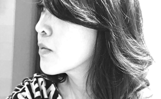
Title Designer Etsuko Uji
Etsuko Uji is an art director and motion designer working in film and television.
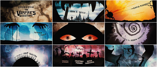
Born and raised in Tokyo, Japan, Uji studied economics and then relocated to the United States in 1999. While based in Los Angeles, she worked at studio yU+co creating motion and 3D graphics, title sequences, and commercial work for 15 years. She has contributed to title sequences for films including The Mothman Prophecies (2002), Bernard and Doris (2006), Cirque du Freak: The Vampire's Assistant (2009), Yogi Bear (2010), Life of Pi (2012), The Leftovers (2014), and The Jungle Book (2016).
In 2008, she was nominated for a Primetime Emmy Award for her work on the titles to Bernard and Doris. She is now based in Tokyo, Japan.
Cirque du Freak: The Vampire's Assistant (2009)
CATEGORY: Film
Cirque du Freak: The Vampire's Assistant (2009) – main titles by yU+co
It’s rare for a vampire film to have such vibrant, cut-out opening titles but Cirque du Freak: The Vampire’s Assistant plays by its own rules. Strands of DNA become a spider’s web catching coffins like cute cocoons. Lightning strikes a swarm of letters and the film’s title dangles in center frame, swaying on strings before bleeding into the crags of a face: John C. Reilly as former Vampire General Larten Crepsley. Spiders shoot names, teeth become stones, and trees grow red eyes like cursed fruit. Designed by studio yU+co with creative director Garson Yu and art director Etsuko Uji at the helm, the sequence takes its cues from lithographic circus banners, shadow puppetry, and German Expressionism. Leading viewers on a dark and twisty journey full of shadow and colour, the result is highly engaging, delightful and, above all, memorable.
—
To discover more fantastic title designers who happen to be women, take a look through our directory of designers. And if you know of any whose work we haven't yet featured on the site, let us know. We're dying to discover more exciting work and to keep these important conversations moving.
Art of the Title's mission is to champion the work of title designers and all those involved in the craft. The 10 Women of Title Design articles are one of the ways we strive towards more balanced representation, a priority that is vital to our mission and to ensure a thriving, diverse industry.
WANT MORE?
Check out the earlier articles:
10 Women of Title Design
10 More Women of Title Design
10 Women of Title Design — Part Three
10 Women of Title Design — Part Four
10 Women of Title Design — Part Five

