At Art of the Title we strive to represent content that is interesting, exciting, and varied. To us, that means content that is inclusive of many genres, genders, and geographies. We recognize that many industries are dominated by men, and we are determined to both acknowledge this bias and work towards more balanced representation.
To celebrate International Women’s Day, we’ve compiled a list of 10 women in title design that you should know about.
10 Women of Title Design That You Should Know
Nina Saxon

Title Designer Nina Saxon
Nina Saxon is an award-winning title designer and art director of feature film and television title sequences.
After graduating from UCLA’s Motion Picture and Television program in 1975, Saxon began her career as a commercial motion graphics artist and as a special effects animator in feature films, most notably on the original Star Wars trilogy.
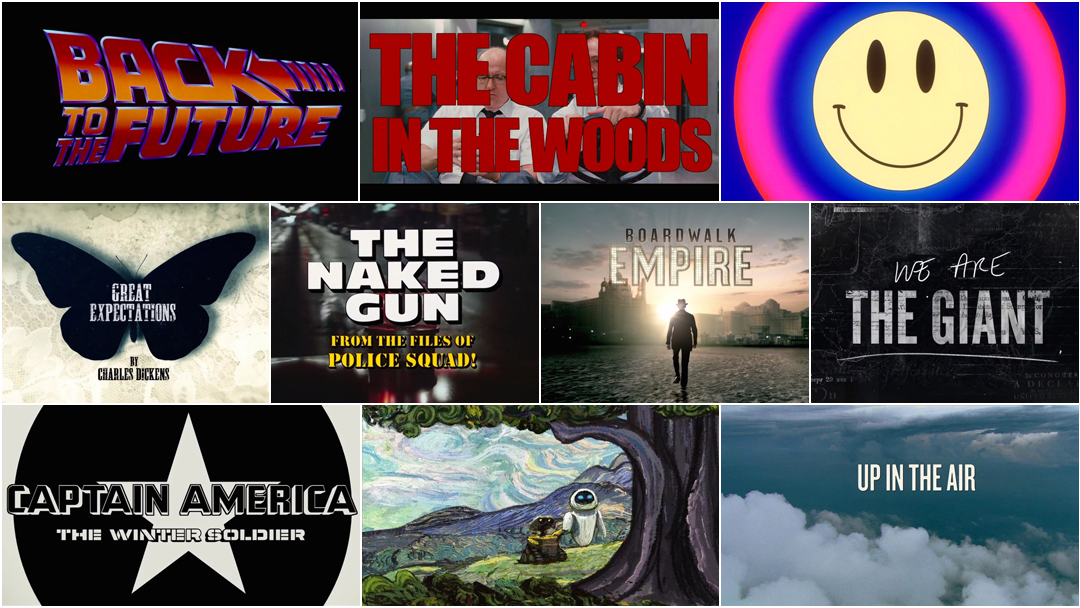
In 1981, Saxon founded Nina Saxon Design and over the next several decades produced title cards and sequences for some of Hollywood’s most successful and critically acclaimed films, including Romancing the Stone, Back to the Future, Beauty and the Beast, The Fugitive, Forrest Gump, The Craft, Contact, The Departed, and Salt. Saxon has also worked extensively on the small screen, including the title sequences for Picket Fences, Wings, Early Edition, and Gilmore Girls.
She has taught courses on title design at UCLA, Chapman University and the Otis College of Art and Design.
Read our deep dive into Saxon's work, Nina Saxon: A Career Retrospective – Part 1
Back to the Future (1985)
CATEGORY: FILM
Back to the Future (1985) — main titles by Nina Saxon
When people think of Back to the Future, they often think of a few key things: Deloreans, Huey Lewis and the News, and hoverboards. But few remember how quietly and thoughtfully this franchise begins. The opening title sequence combines two things: one of the most iconic movie logotypes of all time and a graceful type-over-scene. It is, in effect, a tour of time, a gallery of chronometric technology. As we glide past grandiose pendulum clocks, complex timekeepers, and kitsch cuckoos, we wonder: when are we? The radio chimes in and sets us firmly within the machinery of 1985. As Marty (Michael J. Fox) enters the scene and goes about his business, his bumbling, playful character gets a jump-start and we are thrown alongside into one of the most charming comedies of our age.
Pamela B. Green
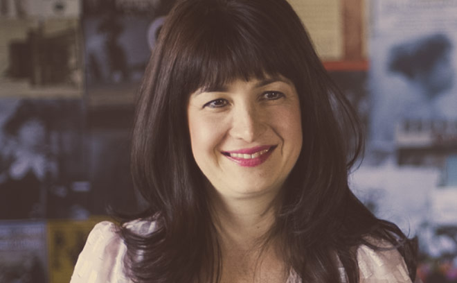
Title Designer Pamela B. Green
Pamela B. Green is a co-founder, producer, and creative director at PIC Agency. Originally from New York, Green co-founded PIC, an entertainment and motion design boutique based in Los Angeles in 2005. She has produced more than 100 feature film title sequences and marketing campaigns for films like The Kingdom, The Bourne Ultimatum, The Illusionist, Twilight, Fantastic Four, Sex and the City. She has creative directed and produced TV show packages, as well as on-screen sequences for the Academy Awards, Billboard Awards, Critics’ Choice Awards, and MTV awards. Green was also co-producer on the 2010 documentary Bhutto, which was nominated for an Emmy.
In 2012, Green began working on Be Natural: The Untold Story of Alice Guy-Blaché, a feature-length documentary about the first female film director.
The Cabin in the Woods (2012)
CATEGORY: FILM
The Cabin in the Woods (2012) — main titles by Pamela B. Green and Jarik Van Sluijs
PIC Agency's title sequence for Drew Goddard's 2012 horror film The Cabin in the Woods runs the gamut from practical effects involving delicious liquids, to CG, to a hard slam of typography. The scene begins with a recreation of millennia of human cruelty billowing out into a quiet void: torture, murder, ritual sacrifice, untold suffering, fresh coffee... Wait a minute. The images of savage protocol and hematic ceremony are jarringly replaced by an all too familiar scene: a hot cuppa joe and the morning commute of two government employees. The opening perfectly encapsulates the tone of the film: a crossroads between genuine scares and typical horror tropes, and that particular brand of tongue-in-cheek comedy for which co-writer Joss Whedon has come to be known. Read more.
Sally Cruikshank
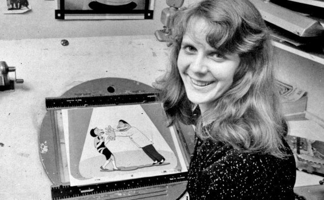
Title Designer and Animator Sally Cruikshank
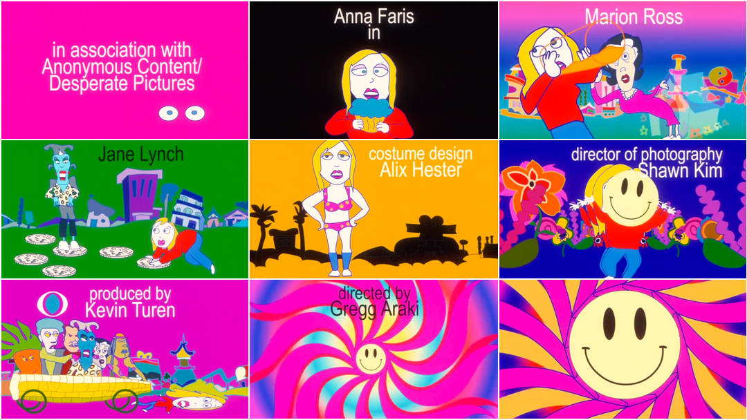
Sally Cruikshank is an American cartoonist and animator whose work includes the 1975 short film Quasi at the Quackadero, 1978’s Make Me Psychic, and 1987’s Face Like a Frog, featuring music by Danny Elfman. She has created the opening title sequences to films Ruthless People, Mannequin, Loverboy, Madhouse, and Smiley Face (below). From 1989 to 1999, she animated and produced animated segments and music videos for children’s television show Sesame Street.
In 2009, her film Quasi at the Quackadero was inducted into the United States National Film Registry, and in October 2012, several 35mm prints of Cruikshank's work were screened at the Museum of Modern Art in New York.
Read our feature article, Sally Cruikshank: A Career Retrospective
Smiley Face (2007)
CATEGORY: FILM
Smiley Face (2007) — main titles by Sally Cruikshank
Cruikshank's title sequence for Gregg Araki's stoner comedy Smiley Face is an opening like no other. The sequence is a no-holds-barred trip, a cannonball leap into psychedelia, vibrant and pulsing and a foreshadowing of the film's plot. The animated forms have a child-like energy, loose and endearing, and the backgrounds vibrate with colour, beaming the most saturated hues directly into your retinas. The Chemical Brothers' "Star Guitar" is the perfect accompaniment, steady and driving, a force of liberating rhythm. And in a stroke of genius, the film's title doesn't appear at all. Who needs words when a smiley will do?
Miki Kato
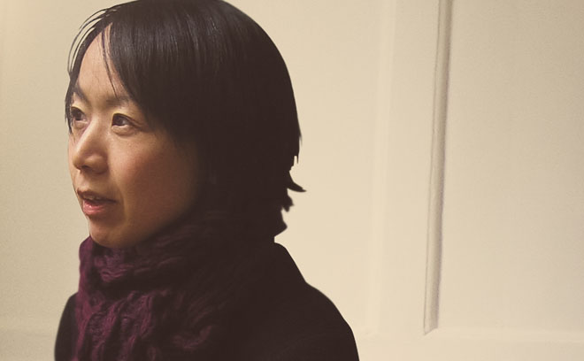
Title Designer Miki Kato
Miki Kato is a title designer and co-founder of design and live-action studio Momoco. Originally from Japan, Kato attended the California Institute of the Arts, where she earned an MFA in graphic design. After working for a few multimedia companies, she moved to London, England to set up her own studio called Momoco with Nic Benns in 1999. Since then, she has played a key role in art direction across commercials, interactive projects, and film sequences. She has directed title sequences for television shows including Misfits, Fresh Meat, and Wolfblood. Film titles she has worked on include Love Actually, One Day, Hard Candy, and Salmon Fishing in the Yemen.
In 2009, Kato was nominated for a BAFTA for her work on Misfits and, in 2012, she won a Primetime Emmy Award for Momoco's work on Great Expectations.
Great Expectations (2011)
CATEGORY: TV
Great Expectations (2011) — main titles by Miki Kato and Nic Benns
The Emmy-winning title sequence for BBC’s sumptuous adaptation of the Charles Dickens classic Great Expectations takes entomological allegory to new heights. A pulsating pupa cracks wide to birth an ever so delicate creature amidst utter decay. Soon the insect is completely overwhelmed by filigree, spasming under the weight of possibility, withering away until it becomes a mere spectre of its former self. In this opening sequence, the fluid hand of Momoco transforms the Victorian world of Charles Dickens into something decidedly more slick and modern. Read more.
Douy Swofford
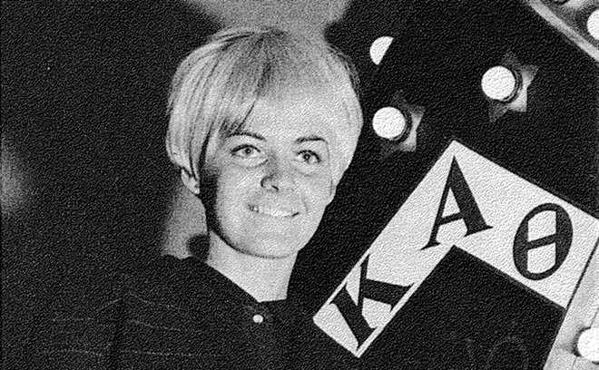
Title Designer Douy Swofford c. 1969
Douy Swofford is a film title designer, cartoonist, and writer based in Los Angeles.
She has designed title sequences for more than 25 feature films, including The Changeling, The Last of the Mohicans, The Naked Gun: From the Files of Police Squad!, The Philadelphia Experiment, New Jack City, and Tommy Boy. She is a contributor to the book National Lampoon Presents the Very Large Book of Comical Funnies, published in 1975.
She was also the special effects prop designer for the 1982 film Parasite.
The Naked Gun:
From the Files of Police Squad! (1988)
CATEGORY: FILM
The Naked Gun (1988) — main titles by Douy Swofford
Siren cam. A wailing police car takes a wild joyride, traversing the limits of both space and time and blaring its way through soggy streets and sidewalks, an upper class home, a woman's locker room, and even a quick car wash. The typefaces, Stencil (for the title) and Antique Olive (for the credits), are by now iconic, immediately recognizable. As the sequence finishes, the siren now a disembodied character in its own right, screaming its way down a rollercoaster, we know exactly what to expect: a hilarious ride of unreal proportions.
Karin Fong

Title Designer Karin Fong
Karin Fong is a director and designer based in New York and Los Angeles. She began her career with an art degree from Yale and a stint animating for Where in the World is Carmen San Diego? at WGBH Boston. She then joined the west coast studio of R/GA before becoming a founding member and partner at Imaginary Forces.
Fong has created numerous title sequences for film and television including Boardwalk Empire (below), Terminator: Salvation, Charlotte’s Web, and Rubicon. Her work has earned her five nominations and an Emmy for main title design. In the advertising world, she has helmed spots for Herman Miller, Target, and Honda. She has also created cinematics for the Sony PlayStation game God of War III and large-scale video installations for sites such as Lincoln Center, Las Vegas, and the LA Opera. Her work has appeared at the Cooper Hewitt National Design Museum, the Pasadena Museum of California Art, The Wexner Center, Artists Space, and the Walker Art Center.
Karin Fong is currently a partner at Wonderland Sound & Vision, the film and television production company founded by McG (Charlie’s Angels, The O.C.)
Boardwalk Empire (2010)
CATEGORY: TV
Boardwalk Empire (2010) — main titles by Karin Fong and Michelle Dougherty
For the title sequence to HBO's Prohibition-era epic Boardwalk Empire, creative directors Karin Fong and Michelle Dougherty of Imaginary Forces asked themselves, “What if the bottles literally are the storm?” In comes the roaring Atlantic City surf, breaking to the beat of an anachronistic slide guitar, rolling in and out to reveal names in the soaking sand. An immaculately dressed Enoch “Nucky” Thompson steps towards the shoreline, gazing out at the horizon. The future of this crooked town is carried on the tide, crashing in, submerging Nucky’s shoes in a wave of vice. Thousands of liquor bottles, like an armada of messages from so many drunken castaways, wash up before the boardwalk. The water recedes and his shoes remain dry. Read more.
Fong and Dougherty would team up again for the opening to television show Black Sails.
Erin Sarofsky

Title Designer Erin Sarofsky
Erin Sarofsky is the president, owner, and creative director of production studio Sarofsky Corp. After graduating from the Rochester Institute of Technology with both a BFA and an MFA, she spent six years with Digital Kitchen in Chicago, rising in rank from designer to creative director. In 2006, Erin was nominated for a Primetime Emmy for her work on the Ghost Whisperer main title sequence, and later that year, she was hired by Superfad as creative director at their New York office.
In January 2009, she established her own company, Sarofsky Corp., which has produced title sequences for Shameless, The Killing, Community, Happy Endings, and more, including...
Captain America: The Winter Soldier (2014)
CATEGORY: FILM
Captain America: The Winter Soldier (2014) — main-on-end titles by Sarofsky Corp.
Sarofsky’s minimalist main-on-end titles for Captain America: The Winter Soldier exemplify the newfound function of end credits. The title sequence, creative directed by Erin Sarofsky, perfectly distills the essence of the Russo brothers' action-packed potboiler. Stars and stripes, shields and skulls, gears and tentacles, a grand conspiracy unfolding as heroes and villains battle it out in silhouette. Part of an increasing trend of main-on-end titles in action films, the Winter Soldier title sequence is one of Marvel’s – and Erin Sarofsky's – boldest efforts to date. Read more.
Manija Emran
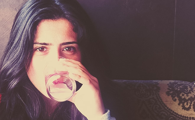
Title Designer Manija Emran
Manija Emran is a graphic and motion designer based in Los Angeles. Born in Kabul, Afghanistan and raised in Essen, Germany, Emran also studied and worked in Montreal, Canada before getting her start as a print designer. She did print design with Vince Frost and Thomas Manss in London, typography with Philippe Apeloig and poster design with Pascal Colrat in Paris, and branding at VSA Partners in New York. She then made the move to motion and title design with positions at Prologue and The Mill in Los Angeles.
In motion design, she has created work for Oscar-winning films as well as the Oscar ceremony itself. She has produced handmade type and designs for title sequences including Rango, Robin Hood, London Boulevard, Bad Teacher, The Help, Fright Night, Snow White and The Huntsman, The Lone Ranger, Manhunt: The Search for Bin Laden, and We Are The Giant.
We Are The Giant (2014)
CATEGORY: FILM
We Are The Giant (2014) — main titles by Manija Emran
The heart of every revolution is a human one, the signs written by hand. In We Are The Giant, director Greg Barker delivers a devastating account of the Arab Spring and its revolutionaries across Libya, Syria, and Bahrain, with an eye to the world.
The title sequence to the documentary, designed by Manija Emran while at The Mill, breathes fire into black and white photography, weaving parallels between disparate images of the human spirit in revolt. The sequence sets up a graphic language that acts as backbone for the film, a grounding element between chapters, that burns through the strata of time and place and insists upon uprising as universal language. No revolution is an island. Read more.
Susan Bradley
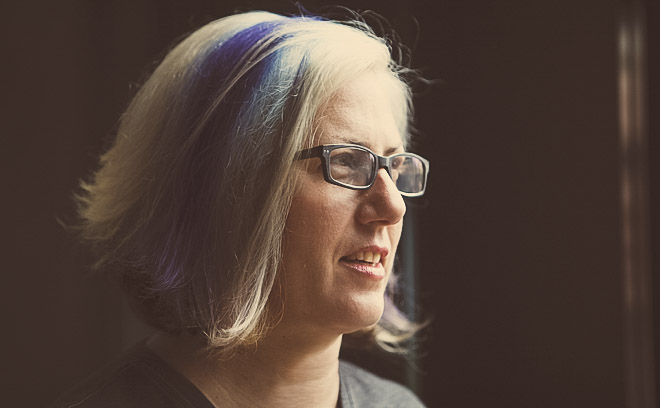
Title Designer Susan Bradley
Susan Bradley is a graphic designer, art director, and title designer. She was Design Lead and Manager of Walt Disney Studios’ Title Graphics Department for six years, producing title sequences and graphic design on films such as Quiz Show, The Lion King, Toy Story 1 and 2, A Bug’s Life, Murder in the First, Mulan, Romy & Michele’s High School Reunion, Monsters, Inc., and many more.
After leaving Disney, Bradley designed title sequences and graphics for live action films and documentaries including The Motorcycle Diaries, Dark Water, The Matador, and others. From 2005 to 2014, she designed title sequences for Pixar, beginning with Ratatouille (2007) and ending with Monsters University (2013).
She has been a proud member of the motion picture guild VES (Visual Effects Society) since 1997. Bradley is currently directing a documentary about title design and lettering legend Harold Adler.
WALL·E (2008)
CATEGORY: FILM
WALL·E (2008) – main-on-end titles by Susan Bradley
Something beautiful. Directed by Jim Capobianco and with title design by Susan Bradley, the end credits to Andrew Stanton's WALL·E are the actual ending of the film, a perfect and fantastically optimistic conclusion to a grand idea. Humanity’s past and future evolution are viewed through unspooling schools of art – and this is art, absolutely. Peter Gabriel and Thomas Newman’s song “Down to Earth” indulges with some thoughtful lyrics as the titles travel from the Stone Age to the Impressionists to wonderful 8-bit pixel sprites. In going beyond the more common functions of end titles – as a formality, as atmosphere and release, as a callback to jokes – this sequence outlines how important titles can be for narrative purposes. Read more.
Jenny Lee
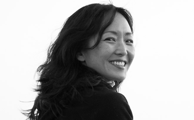
Title Designer Jenny Lee
Jenny Lee is a designer and director based in Los Angeles, California.
She studied fine art at Boston University and later earned a masters in design at the School of Visual Art in New York. In 2003, she collaborated on video projection designs with Shadowplay Studio on the hit Broadway musical Wicked. In 2005 she worked on her first title sequence when she co-designed the opening for Thank You For Smoking. An avid filmmaker, Jenny has filmed videos in South Korea, Tibet, and Tanzania.
In 2010, Jenny co-founded production studio Smith & Lee Design with husband Gareth Smith. They have produced the title sequences for films The Ward, Juno, Thank You For Smoking, Young Adult, Nick & Norah's Infinite Playlist, and...
Up In The Air (2009)
CATEGORY: FILM
Up in the Air (2009) — main titles by Jenny Lee and Gareth Smith
The opening title sequence for Jason Reitman's Up in the Air intoxicates with neat compositions of topology from a commuter's perspective. Designed by Jenny Lee and Gareth Smith of studio Smith & Lee Design, the sequence gives a sense of scale – the infinitesimal and the grand on an even keel. Warm and vivacious, the song by Sharon Jones & The Dap-Kings offsets the cold distance and stark lines, providing a common ground. The title sequence does exactly what it says on the tin and in this case, it's an excellent thing. Read more.
—
Keen readers will note that this list actually includes 11 women! Choosing among all of the women in our list of designers is tough. Do take a look through our directory of designers, and if you know of any whose work we haven't yet featured on the site, let us know. We're dying to discover more exciting work and to keep these important conversations moving.
WANT MORE?
Continue reading with 10 More Women of Title Design.
The entries for Cabin in the Woods, Great Expectations, Boardwalk Empire, and Captain America: The Winter Soldier feature notes from Will Perkins. The entries for WALL-E and Up In The Air feature notes from Alex Ulloa.
Support for Art of the Title comes from


