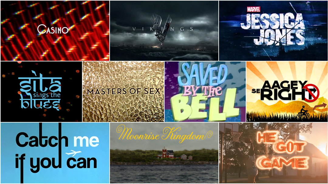
In 2015, we published our first feature article in celebration of International Women’s Day entitled 10 Women of Title Design, and this year we’re back with 10 more!
We recognize that many creative industries are dominated by men, and we are striving to both acknowledge this inequity and to work towards more balanced representation. How boring would film, television, games, and conferences be without various points of view driving them, without diverse experiences informing the process? We prefer to celebrate diversity and to represent content that is interesting, exciting, and varied.
With that in mind, we present a list of 10 more women in title design that you should know about. With hope, we’ll have another 10 to present next year!
10 More Women of Title Design That You Should Know
Michelle Dougherty
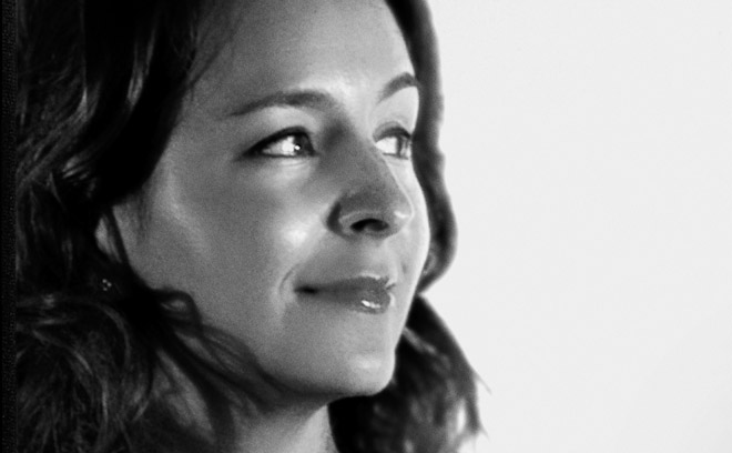
Title Designer Michelle Dougherty
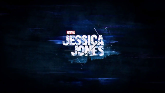
Michelle Dougherty is a creative director at Imaginary Forces. Since graduating with a degree in graphic design from Art Center in Pasadena, California, Michelle has spearheaded campaigns for clients such as Nike and E! Entertainment Networks and designed main title sequences for films including K-Pax, The Number 23, and Nightwatch. She has earned Emmy nominations for her work on the opening sequences of Band of Brothers and HBO’s Boardwalk Empire. For television, she has directed the title sequences to Black Sails and Marvel’s Jessica Jones.
Her work has been recognized by the AIGA and featured in numerous publications including Communication Arts, Step Inside Design, and Creativity. In 2011, Michelle’s work was featured in the Graphic Design: Now in Production show at the Walker Art Center in Minneapolis.
Marvel's Jessica Jones (2015)
CATEGORY: FILM
Marvel's Jessica Jones (2015) — main titles by Michelle Dougherty and Imaginary Forces
Get to know the darkest corners of Hell’s Kitchen through the eyes of Jessica Jones. Played by Krysten Ritter, the titular superhero-turned-private-investigator is a hard-drinking, hard-hitting misfit whose troubled past has finally caught up with her. The line between private eye and voyeur slowly blurs as Jones haunts the rain-soaked streets, peering down alleyways and into foggy tenement windows, always watching, always being watched. Composer Sean Callery’s theme starts out slow and jazzy, but then takes on a frantic, frenzied dimension as her shadowy hunt continues — a hint of purple ever on the periphery.
Produced by Imaginary Forces with Creative Director Michelle Dougherty at the helm, the Jessica Jones title sequence stunningly sets the stage for a complex and disturbing comic book yarn unlike anything Marvel has produced to date. Read more.
Elaine Bass
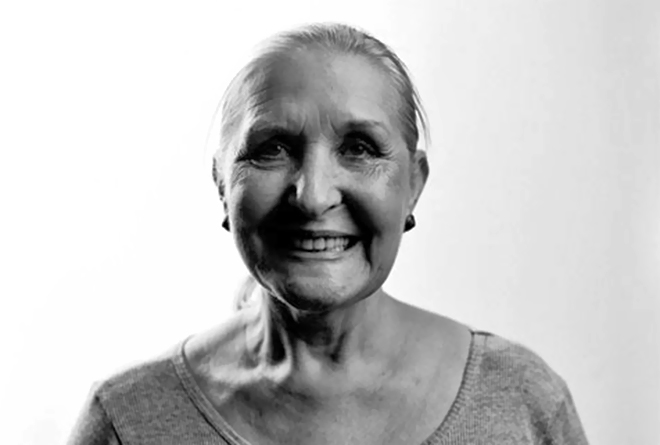
Filmmaker and Title Designer Elaine Bass
Elaine Bass is a title designer and filmmaker. Elaine began working in titles when she got a job as the assistant to graphic and title designer Saul Bass in 1955. By 1960, Elaine was directing title sequences in collaboration with Saul, beginning with the opening title sequence to Spartacus. The following year, Saul and Elaine married and much of Saul Bass’s title design work thereafter was made in close collaboration with her, including West Side Story (1961), Walk on the Wild Side (1962), Nine Hours to Rama (1963), The Victors (1963), Seconds (1966), and Grand Prix (1966).
In 1968, they made the short film Why Man Creates, which won an Oscar. In the late ’80s, James L. Brooks and Martin Scorsese urged the Basses to return to main title design. Saul and Elaine Bass created the title sequences for films Broadcast News, Big, Mr. Saturday Night, The War of the Roses, Higher Learning, and for Scorsese, Goodfellas, Cape Fear, The Age of Innocence, and Casino, their last title sequence together.
In 1998, Elaine collaborated with title designer Pablo Ferro to update Saul’s opening for the remake of Psycho. In a sense, all modern opening title sequences that introduce the mood or theme of a film are a legacy of the Basses’ work.
Casino (1995)
CATEGORY: FILM
Casino (1995) – main titles by Saul and Elaine Bass
The staggeringly beautiful title sequence for Casino was the last one made by Saul and Elaine. Screenwriter Nicholas Pileggi described it as “simply brilliant,” adding,
“I was so touched that they had understood the writing; that they knew what the film was trying to do. There must have been a hundred Hollywood films about Las Vegas that have tried to capture the essence of that city, but none quite like this. Part of the brilliance of the Bass opening is that their project is so clear. Elaine and Saul have found the perfect metaphor for the film as a whole — for Las Vegas in the 1970s, and for descent of the Mafia into Hell.”
Jessica Hische

Title Designer Jessica Hische
Jessica Hische is an American letterer, illustrator, and type designer based in San Francisco.
In 2006, Jessica graduated from the Tyler School of Art with a degree in Graphic and Interactive Design. Since then, she has worked for Headcase Design in Philadelphia and at Louise Fili Ltd. In 2009, she left Louise Fili Ltd. to embark on a freelance career.
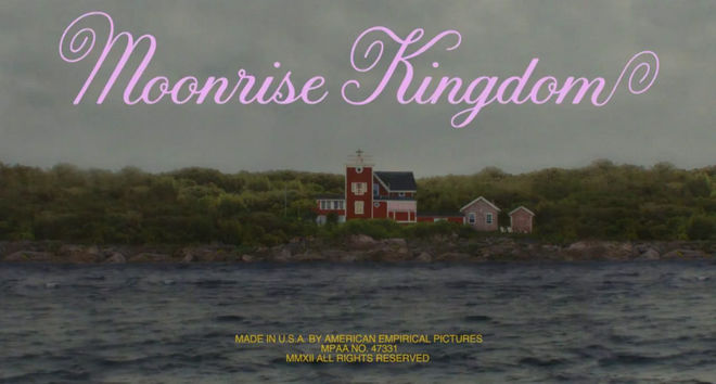
She has been featured in Forbes, Print, The New York Times, Wired, and many other publications, and designed book covers for American author Dave Eggers. She has worked with clients such as Penguin Books, Tiffany & Co., American Express, Target, Victoria's Secret, Nike, and Samsung. She has designed title lettering and branding for Wes Anderson's film Moonrise Kingdom and Christopher Guest's television show Family Tree.
Moonrise Kingdom (2012)
CATEGORY: FILM
Moonrise Kingdom (2012) – main titles by Jessica Hische
The opening sequence to Wes Anderson’s Moonrise Kingdom is a gorgeously intricate, moody, and playful introduction to a family apart. The meticulous framing and attention to detail is evident in every aspect of the film, from Robert D. Yeoman’s cinematography, to Kris Moran’s set decoration, right down to the typography designed by Jessica Hische. This elegant and warm lettering features graceful curves and friendly swashes that ultimately became a large part of the film’s distinct identity. Though grounded in a refined typographic tradition, the credits of the main cast alternate from yellow to an array of bright colours, giving the lettering an air of modernity and mischief. Read more.
Nina Paley
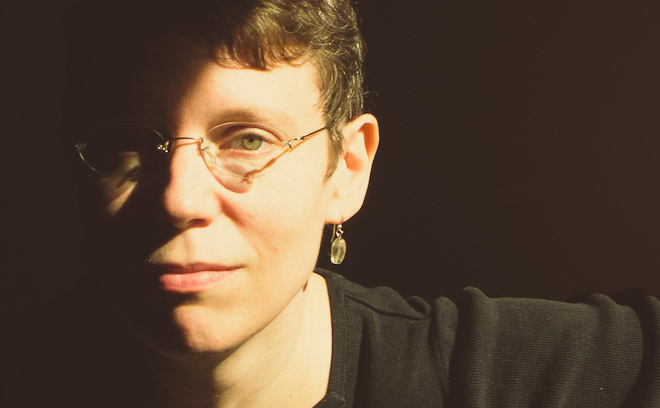
Animator and Director Nina Paley
Nina Paley is an animator, director, and longtime veteran of syndicated comic strips, creating Fluff, The Hots, and the alternative weekly Nina’s Adventures. In 1998 she began making independent animated festival films, including the environmental short, The Stork. In 2002 she followed her then-husband to Trivandrum, India, where she read her first Ramayana. This inspired her first feature, Sita Sings the Blues, which she animated and produced over the course of five years on a home computer.
Nina has taught at Parsons School of Design in Manhattan and was a 2006 Guggenheim Fellow.
Sita Sings the Blues (2008)
CATEGORY: FILM
Sita Sings the Blues (2008) – main titles by Nina Paley
The opening title sequence to Nina Paley’s Sita Sings The Blues features Indian goddess Sita with the curves of planets in her animated beauty. The film deftly weaves together the Indian Ramayana, the heartbreaking failure of Paley’s own marriage, and the 1920s jazz of Annette Hanshaw. Each story breathes a kind of refracted understanding in divine continual proportion.
Once the sequence bursts into effulgent, fuzzy light showers to Todd Michaelsen’s sitar-and-synth stabbing beat, we are introduced to characters of the Ramayana, each representing only one of the styles of animation found in the film. And at its center, the the human heart, beating fierce at Mother Earth. Read more.
Penelope Gottlieb

Title Designer and Fine Artist Penelope Gottlieb
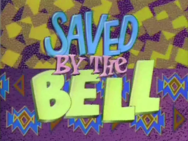
Penelope Gottlieb is a title designer and artist based in California. She received her BFA from Art Center College for Design in Pasadena and her MFA from the University of California in Santa Barbara. In the world of title design, Gottlieb is best known for her iconic work on the opening of the teen sitcom Saved by the Bell, and as a title designer on films such as Stakeout, Three Men and a Baby, Without a Clue, and Honey, I Blew Up the Kid.
Currently, Gottlieb works as a fine artist, creating ecologically-themed paintings and installations featuring plant and animal life. Her art is included in the collections of galleries and museums across the Southwestern United States.
Saved By The Bell (1989)
CATEGORY: TV
Saved by the Bell (1989) – main titles by Penelope Gottlieb
From 1989 to 1993, a generation of teenagers watched as Zack, Jessie, Slater, Lisa, Screech, Kelly, and Mr. Belding bounced off the walls of Bayside High. The sitcom, Saved By The Bell, was created after an earlier show, Good Morning, Miss Bliss, was rejected by NBC and retooled by Disney. When it reemerged, mashed together with tidbits snatched from Ferris Bueller and John Hughes, all of the archetypes were there: the hustler, the revolutionary, the beefcake, the princess, the nerd, and the cheerleader.
In the title sequence, a framed-face opener designed by Penelope Gottlieb, each character is given their own moment and shape in which to shine. Notably, the shape for Dustin Diamond’s character is, of course, a diamond. As the hand-drawn credits dart around and the colourful shapes and patterns swirl in and out of frame, that undeniably catchy theme scampers by, looping itself out and around. It’s alright, ‘cause you’re saved by the—
Mimi Everett
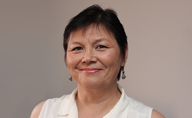
Title Designer Mimi Everett
Mimi Everett is a title designer and visual effects artist. She is best known for her work as one half of Balsmeyer & Everett, Inc. (now Big Film Design), a pioneering film title design and VFX company co-founded in 1986 by her and husband Randall Balsmeyer.
In her time with B & E, she collaborated with filmmakers such as Spike Lee, David Cronenberg, Woody Allen, Jim Jarmusch, Paul Thomas Anderson, and Joel and Ethan Coen, and produced groundbreaking motion control camera effects on films like Dead Ringers and Ghost. She has designed the titles for films such as The First Wives Club, Multiplicity, Fargo, Sleepless in Seattle, and Jungle Fever.
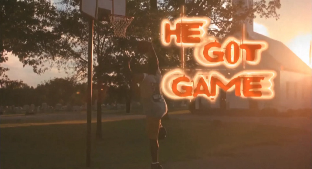
He Got Game (1998)
CATEGORY: FILM
He Got Game (1998) – main titles by Balsmeyer & Everett, Inc
In Spike Lee’s opening sequence to He Got Game, basketball is the myth, the great leveller, the new American dream. The combination of Malik Hassan Sayeed’s stunning cinematography and the grand orchestration of Aaron Copland’s “John Henry” takes the game to new heights. In using the slow, portentous music of Copland, Lee aligns his film with the American heartland, making the point that basketball is as American as cowboys and apple pie. The piece, dramatic and grave, underpins the action, lending the scenes of play a sense of burden, a great weight.
But what is it about sports in slow motion that gives it such elegance, such strange beauty? The emphasis of the physical form draws us in and the large movements, broken down into their smallest gestures, become a languorous ballet. Even the typography, orange and glowing, is on the move. Designed by Balsmeyer & Everett, the type is scratching and jittery, like it can’t decide what shape it should take, what place it should inhabit. The still shots of players, their fixed stares punching deep into the viewer, lay bare the humanity behind the sport, behind the aspiration to greatness in a jungle of steel and concrete. For Spike Lee, basketball is the game, and New York its greatest arena.
Upasana Nattoji Roy
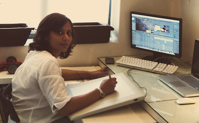
Title Designer Upasana Nattoji Roy
Upasana Nattoji Roy is a designer, filmmaker, and animator based in Mumbai. She studied design, film, and animation at the National Institute of Design in Ahmedabad.
In 2000, she began her career at Channel V, a music channel, and for the next three years she made several independent films, which were selected for inclusion in multiple international film festivals. She soon moved on to working on live-action shoots and animation for TV and film, accepting a senior producer position in Dubai at television channel Dubai One. In 2008, she moved back to India to work on Aagey se Right, a UTV Spotboy film, the titles of which were a finalist in the 2012 SXSW Excellence in Title Design competition.
Aagey Se Right (2009)
CATEGORY: FILM
Aagey Se Right (2009) – main titles by Upasana Nattoji Roy
The Aagey Se Right title sequence is "jigsaw puzzle in motion." Title designer Upasana Nattoji Roy stamps and stitches her inspirations into the opening of director Indrajit Nattoji’s 2009 Bollywood comedy. Taking cues from Kuntzel+Deygas' iconic Catch Me If You Can opener, the title sequence is an increasingly absurd chase, from small town to big city, from land to sea to sky, involving all manner of conveyance and then some. The truly bonkers sequence whisks the viewer into a licorice dervish where M.I.A., Nina Paley, and Gogol Bordello could easily be dance partners. Read more.
Florence Deygas

Title Designer Florence Deygas
Florence Deygas is a designer and illustrator based in Paris, France. She is a graduate of animated film imaging at Gobelins School in Florence. She entered the field of fashion illustration to much success and became a member of the “elegant drawing” school. She has collaborated with Big, Japanese Vogue, Colette, Yves Saint-Laurent fragrances, and Bourjois. She was part of the group exhibition Traits Très Mode and has several credits in fashion and history of fashion books.
In 1990, she formed Kuntzel+Deygas with Olivier Kuntzel and went on to create the opening credits to Steven Spielberg’s Catch Me If You Can (2003), the alternative title sequence to The Pink Panther (2006), and main titles to Le Petit Nicolas (2009). She has worked on advertising campaigns for American Express, Guerlain, and Renault, and has exhibited at Ici Paris Beaubourg, Joyce Gallery, Spree Gallery, at the MOMA in 1990, and at the Grand Palais in 2006.
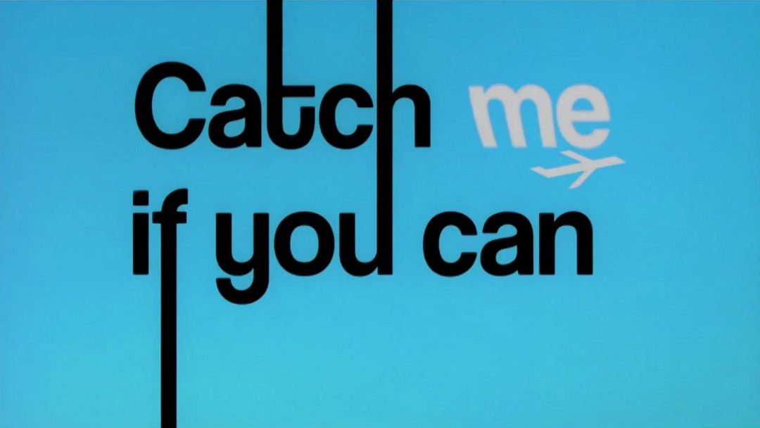
Catch Me If You Can (2003)
CATEGORY: FILM
Catch Me If You Can (2002) – main titles by Florence Deygas and Olivier Kuntzel
A gifted young grifter scamps and stamps across the screen, his fugitive flights aided by doctored documents and lying lawyers. Flowing type, smooth lines and cool jazz are a playground for this pursuit, snaking and sneaking across the colourful jet-set world of our confidence man’s creation, slowly fading to reveal the darkened truth.
Olivier Kuntzel and Florence Deygas of design duo Kuntzel + Deygas stylistically transpose the handmade aesthetics of Saul Bass using decidedly modern means. Accompanied by John Williams’ unexpectedly unctuous score, the duo’s title sequence for Steven Spielberg’s Catch Me If You Can is simply outta sight. Read more.
Audrey Davis
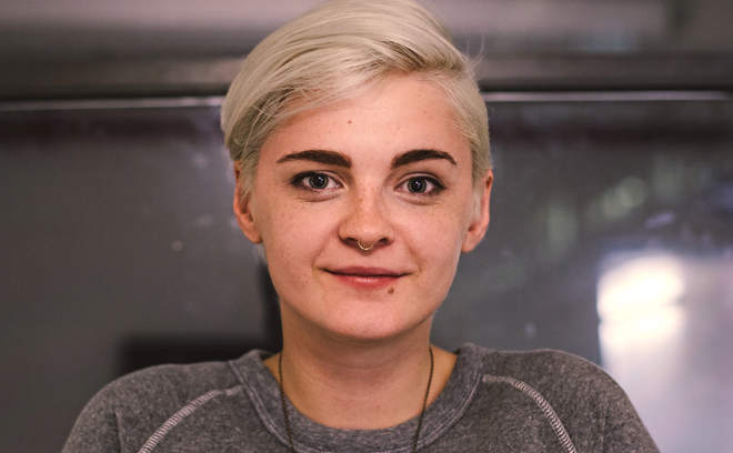
Title Designer Audrey Davis
Audrey Davis is a freelance creative and art director based in New York City. Born in Austin and raised in Atlanta, Audrey went to the Savannah College of Art and Design to study film and graphic design. She graduated with a BA in Broadcast Design and Motion Graphics in 2009.
After college, she worked at Digital Kitchen in New York City for two years. Since 2011, she has worked with studios including The Mill, Imaginary Forces, Gretel, Loyalkaspar, Logan, and Stardust. In 2013, her work on the opening title sequence to Vikings was nominated for an Emmy Award.
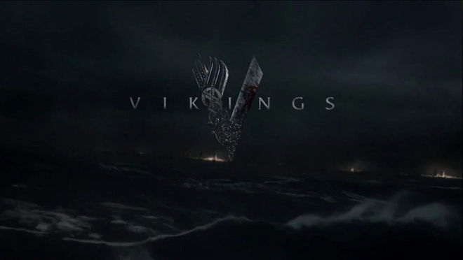
Vikings (2013)
CATEGORY: TV
Vikings (2013) – main titles by Audrey Davis and Rama Allen at The Mill
The success of the title sequence for History Channel’s series Vikings lies in its ability to establish the appropriate atmosphere. Submerging the viewer in the aftermath of a mythic conflict, it lays bare the thematic undercurrents of the show while leaving much of the barbarous detail to the imagination.
Coupled with Fever Ray’s dirge “If I Had a Heart,” The Mill’s sequence is enveloping, entrancing, and an excellent emotional primer for the visceral drama to follow — which, after all, is exactly the point. On its release in 2013, the title sequence pulled audiences into a world of rugged landscapes and haunting warriors. For the team behind the Vikings title sequence, the battle rages on, the war is never won. Read more.
Leanne Dare

Title Designer Leanne Dare
Leanne Dare is a designer, illustrator, and director based in Los Angeles. Although she initially studied mathematics at UCLA, her creative interests led her to a small studio in Venice, California. It was at Motion Theory where her passion for design and filmmaking was inspired and developed.
Now part of the creative team at Elastic, she has directed the main title sequence for Showtime’s Masters of Sex, co-art directed the main title sequence for FX’s The Americans, and was a designer on the Game of Thrones opening titles and the 87th Academy Awards Broadcast Design package.
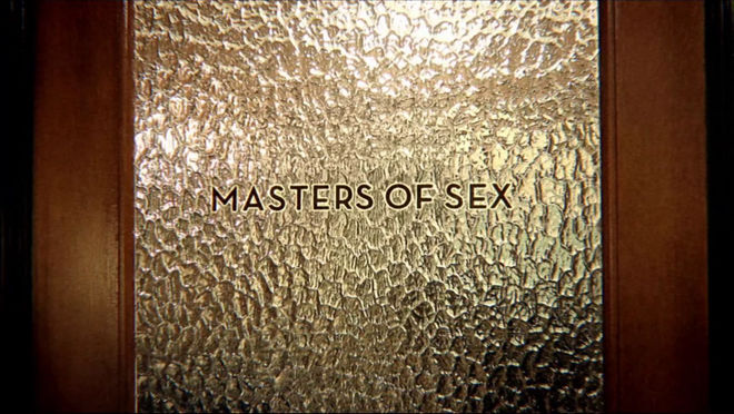
Masters of Sex (2013)
CATEGORY: TV
Masters of Sex (2013) – main titles by Leanne Dare and Elastic
Pet that pussycat, pop that cork, grab that bull by the horns. The titles for Showtime's series Masters of Sex take us on a cheeky ride of erotic euphemisms. Through liberal use of stock footage, animation, carnal close-ups, and clips of the clinical, Santa Monica-based studio Elastic playfully explores variations on taboo.
Like 21 Jump Street's hilariously explosive end title sequence, this opening is another example of how appropriately curated stock footage can be used to great comedic effect. As the show’s title appears on the frosted glass of an office door, the straightforwardly sharp Neutraface Bold typeface reminds us what this show’s really about – scientific research. Right?
—
For more great women title designers, take a look through our directory of designers. And if you know of any whose work we haven't yet featured on the site, let us know. We're dying to discover more exciting work and to keep these important conversations moving.
The entries for Sita Sings the Blues and Aagey Se Right feature notes from Alex Ulloa.

